Circular Concept Keynote Chart - Editable Keynote | ImagineLayout


Type: Keynote Charts template
Category: Pie
Sources Available: .key
Product ID: KC00642
Template incl.: 12 editable slides
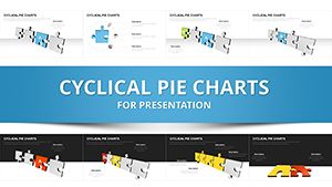
12 Circular Diagram Slides for Keynote - Animated Pie and Cycle Layouts, 16:9
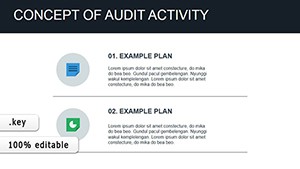
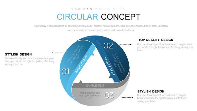
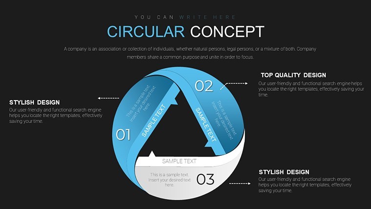
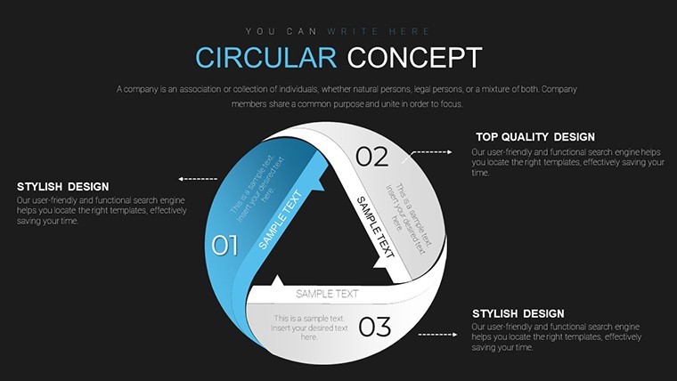
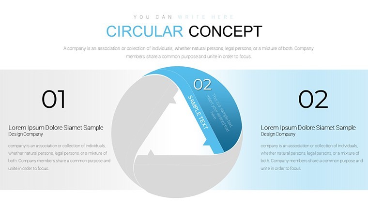
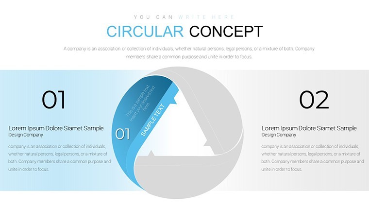
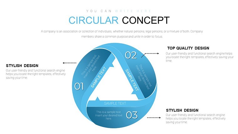
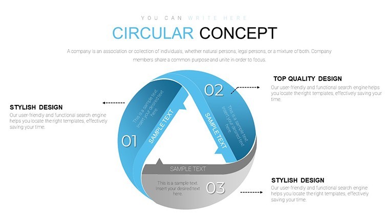
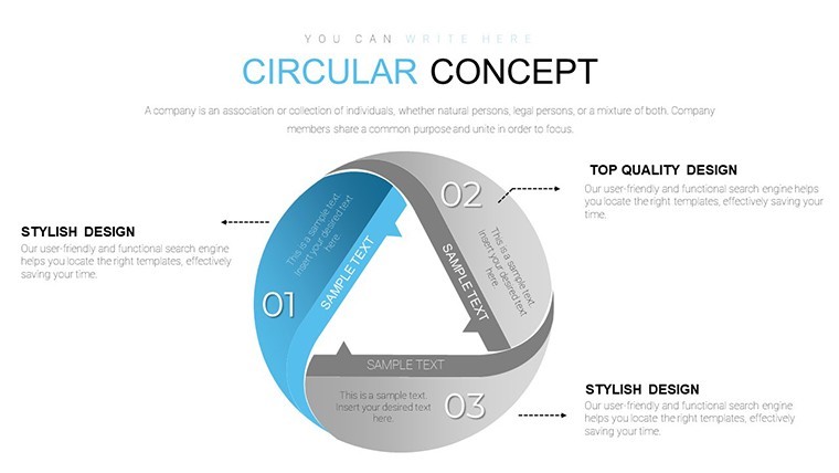
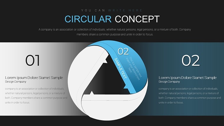
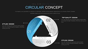
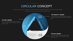
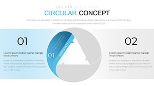
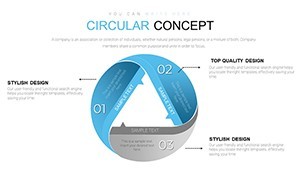
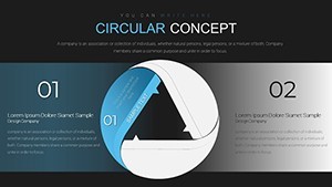
12 editable slides at $15, delivered as a .key file in 16:9 widescreen format - this Keynote chart file focuses on radial and circular diagram structures. The layouts include pie-style segments, concentric ring arrangements, and gear-like circular compositions, all designed around a center-out visual logic. Segments extend from a central point outward, with labels placed along the outer arc or beside each section.
The file is tagged as animated, meaning individual segments can be revealed sequentially during a live presentation rather than appearing all at once. This makes the layouts useful for walking an audience through a market share breakdown one category at a time, or revealing stages of a business cycle progressively without jumping ahead.
Circular diagrams are suited to proportion and relationship data - budget allocation across departments, product category distribution, or recurring operational cycles where the loop itself is part of the message. The structure is not designed for data with a strict linear timeline or a clear before-and-after narrative; for that, a horizontal flow or ladder layout works better.
When you need to show how a market divides among competitors, or how quarterly budget splits across categories, without drawing arcs and segments manually in Keynote, this file handles that geometry for you. You input the data, adjust segment sizes proportionally, and the visual is ready. Typically, analysts reuse the same circular layout across monthly or quarterly reporting cycles, updating segment values each period.
Color customization works at the individual segment level - each arc section has an independent fill, so you can apply brand colors or use contrast to highlight a dominant category. The file follows standard .key format compatible with Keynote 12 and later; the specific minimum version is not listed on the product page but the KEY format functions correctly on current macOS installations. No free version is available - the $15 purchase covers all 12 slides.
No extra setup required.
Download and start editing immediately
Specifications
| Feature | Details |
|---|---|
| Slides | 12 editable circular and pie diagram slides |
| File format | .key (Keynote) |
| Software version | Keynote 12+ (standard KEY format) |
| Color schemes | Not specified on page; segments recolor individually per fill |
| Editable elements | Circular segments, arc labels, center text, image mask slots |
| Aspect ratio | 16:9 widescreen |
| Free vs Paid | Paid only - $15.00 for all 12 slides; no free tier |
| Product ID | KC00642 |
Frequently Asked Questions
What Keynote version do I need for this file?
The file is delivered in standard .key format and opens in Keynote 12 and later on macOS. The product page does not specify an exact minimum version, but the KEY format is compatible with any current Keynote installation available through the Mac App Store. iPadOS Keynote also opens .key files, though animation behavior on iPad may differ slightly from the macOS version. Update your software before opening if you are on an older macOS release.
How do I change the color of individual circular segments?
Click the segment shape you want to recolor to select it. In the Format panel on the right, go to the Style tab and click the Fill color swatch. Choose your color from the picker or enter a hex value. Each arc segment is independent, so changing one does not affect the others. To apply a uniform palette across all segments, select them all with Shift-click and change the fill - though for pie layouts, unique colors per segment are typically more useful for distinguishing categories.
Can I use this file for commercial or client work?
The standard ImagineLayout license covers personal and commercial use, including presentations prepared for paying clients. The file may not be resold or redistributed as a template product. Review the full Terms of Use at imaginelayout.com/terms/ for the specific conditions that apply to commercial usage, particularly if the presentation will be published publicly or used in a licensed deliverable.
What is the refund policy for this purchase?
ImagineLayout's refund policy is published at imaginelayout.com/refund-policy/. If the downloaded .key file is technically defective - corrupted, incomplete, or failing to open correctly in Keynote - contact the support team at imaginelayout.com/contact-us/ with your order details. The policy covers technical delivery failures; change-of-mind refunds are subject to the conditions stated on the refund policy page.
Is there a free version of this circular chart template?
This product (KC00642) is available for purchase at $15.00 only - there is no free version or preview tier. ImagineLayout offers separate free Keynote chart files in the Free Templates category, some of which include circular or pie-style layouts. If you want to test the format before purchasing, browse the Free Keynote Charts collection on the site to find a comparable free option.
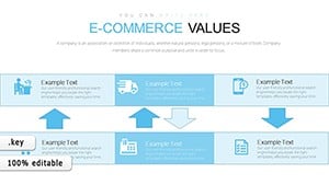
Browse more pie and circular layouts in the Pie Keynote Charts category. A related file worth checking is the E-commerce Value Keynote Charts.