Stripe Reports Keynote Charts - Editable Keynote | ImagineLayout


Type: Keynote Charts template
Category: Arrows
Sources Available: .key
Product ID: KC00620
Template incl.: 12 editable slides
Stripe Reports Keynote Charts Template: Editable Insights
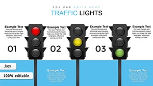
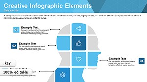
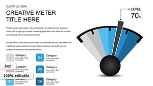
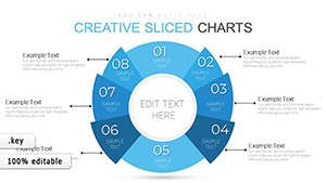
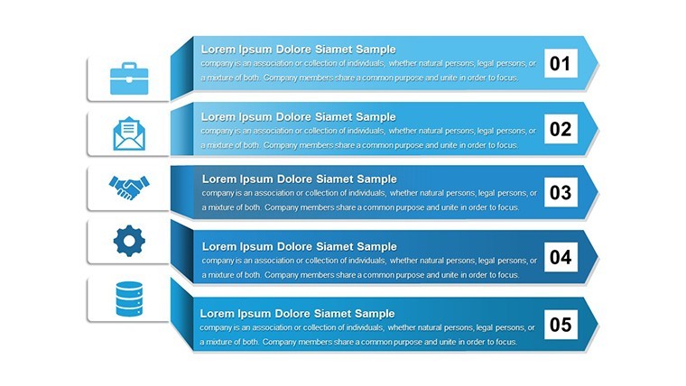
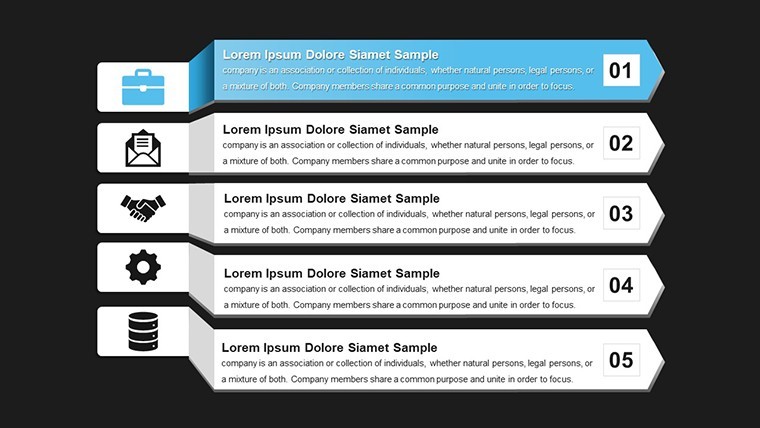
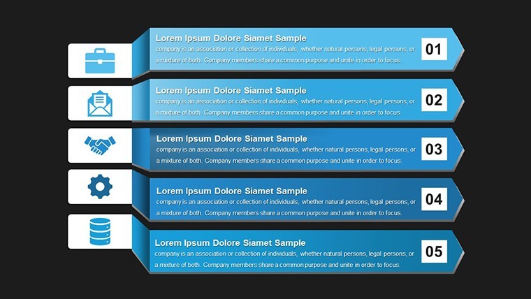
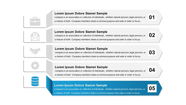
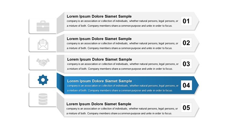
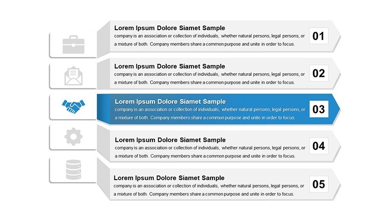
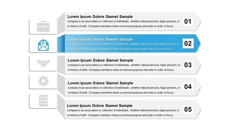
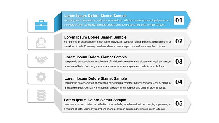
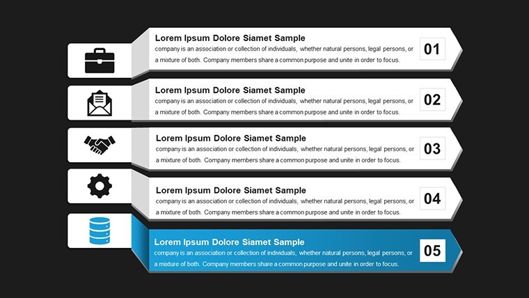
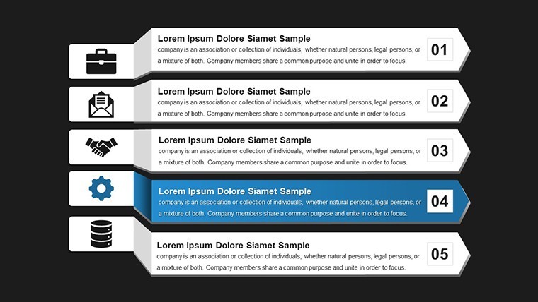
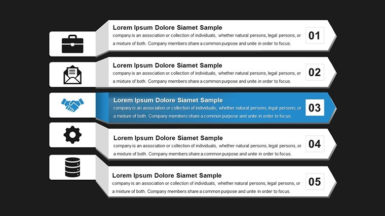
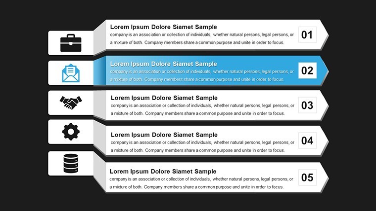
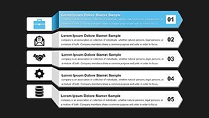
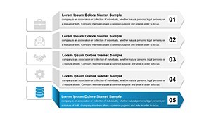
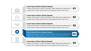
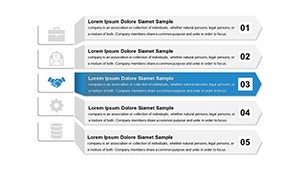
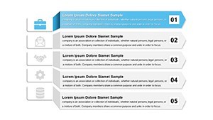
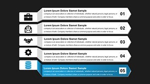
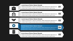
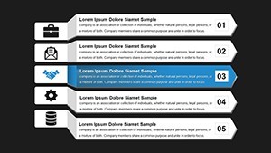
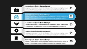
12 editable slides in .key format let you present stripe-based reports to teams without building arrow or stripe diagrams manually.
Open the .key file and you get instant alignment.
Every chart is fully customizable including data points colors fonts and layouts.
The page lists this as a paid template at $10.00 with no free version details provided.
Analysts use this when they need to show progress or flow data to executives in a single readable slide.
Use this instead of building diagrams manually in Keynote.
The predefined structure keeps everything aligned so you don't end up adjusting spacing slide by slide.
In most cases you only replace text and adjust colors.
Typically teams reuse the same diagram across monthly reports.
It works best for structured reports not creative storytelling slides.
Not ideal for photo-heavy pitch decks where images dominate the layout.
| Feature | Details |
|---|---|
| Slides / diagrams | 12 stripe charts |
| File format | .key |
| Software version | Apple Keynote current installations |
| Color schemes | Not specified on page switch via master |
| Editable elements | Data points colors fonts layouts resize recolor |
| Aspect ratio | Not specified on page |
| Free vs Paid | Paid version at $10.00 free not listed |
| Masters / Backgrounds | Master for instant color updates |
You open the file and start editing.
Download and start editing immediately
Does it work with Keynote 12+ on macOS?
The template uses standard KEY format compatible with Apple Keynote.
In most cases it runs on macOS 10.15 or later.
Test the file after download to confirm your version.
Can I use this for client work?
Yes the license allows client presentations.
You cannot resell the template file itself.
One license covers one user for commercial projects.
What is included in the free version?
The page does not list a free version.
The paid version delivers the full .key file with 12 editable slides.
All slides are ready to edit immediately.
What are the refund conditions?
The page does not list specific refund conditions.
Standard marketplace policy applies if the file does not open correctly.
Contact support within 14 days of purchase for assistance.
How do I change colors via slide master?
Open the slide master view in Keynote.
Select the chart elements and update fill colors.
Changes apply across all slides automatically.