Drowning in spreadsheets but struggling to make your insights shine? The Analytics Work Keynote Template flips the script, turning raw numbers into captivating stories that drive decisions. Tailored for data-savvy pros, it equips you with tools to engage stakeholders without the design hassle, making complex analytics accessible and actionable.
Built for Keynote 2016 and beyond on macOS, this template delivers editable .key files, theme packs in .kth, and preview JPGs with a single purchase for lifetime use. It`s more than slides - it`s your secret weapon for boardrooms and briefings, compatible across teams for collaborative polishing.
In today`s data flood, standing out means blending precision with persuasion. This template, honed by analysts, features sleek layouts that adapt to your brand, ensuring every chart tells a tale of growth or opportunity. Executives praise its speed: from import to impress in under an hour.
Core Features for Data Mastery
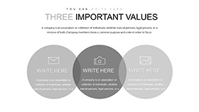
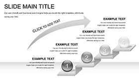
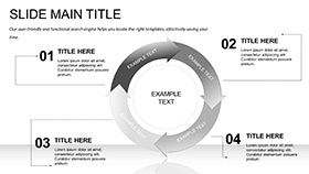
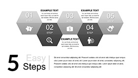
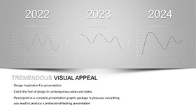
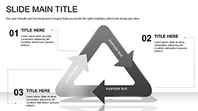
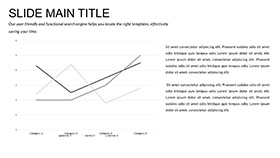
Three master slides and backgrounds provide a sturdy base, while 28 specialized diagrams span seven color palettes, from corporate blues to energetic greens. These aren`t basic graphs; they`re interactive powerhouses like drill-down pie charts for segment analysis or animated line trends for forecasting.
- Interactive Elements: Clickable charts let audiences explore layers, fostering deeper discussions.
- Scheme Variety: Match your firm`s palette for cohesive reports that reinforce identity.
- Seamless Updates: Link to live data sources for auto-refreshing visuals during presentations.
Workflow perks include vector scalability for any screen size and built-in infographic kits that simplify stats into stories. Share via Keynote`s cloud for real-time feedback, turning solo efforts into team triumphs.
Deep Dive into Diagram Dynamics
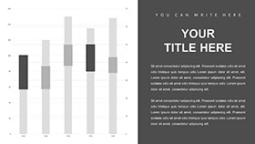
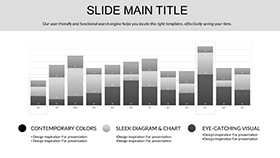
Start with the dashboard overview slide: a grid of key metrics with gauges that pulse like heartbeats of your business. Transition to bar comparisons for quarterly reviews, where stacked bars reveal hidden trends at a glance. For deeper dives, funnel diagrams map customer journeys, highlighting drop-offs with color-coded alerts.
Scatter plots for correlation studies use dot clusters that zoom on outliers, while heat maps illuminate regional sales hotspots. Each of the 28 slides supports 16:9 format with optional builds for phased reveals, keeping narratives tight and tension high. Customization? Swap fonts or icons effortlessly to echo your data`s voice.
Practical Use Cases Across Industries
A marketing lead at a tech firm uses it for campaign ROI breakdowns, layering heat maps over timelines to justify budgets. In academia, professors illustrate statistical models with regression lines that animate step-by-step, demystifying concepts for students. Consultants craft client recaps, employing Venn diagrams for overlap analyses that spark strategic chats.
Versus Keynote defaults, which demand custom builds for interactivity, this template arrives ready-to-analyze, slashing creation time and elevating polish. Users note 50% faster prep, freeing focus for insights over ink.
Edge Over Standard Tools
- Built-In Interactivity: Defaults lack native clicks; here, engagement is embedded.
- Analyst-Tested: Diagrams mirror real workflows, not generic guesses.
- Scalable Stories: Grow with your data, unlike rigid stock options.
Empower your next review - grab the Analytics Work Keynote Template today and let data dance.
Expert Strategies for Peak Performance
Pair with Keynote`s presenter notes for hidden annotations, guiding live narration. For virtual webinars, export animated GIFs of key slides to tease findings. Feedback loops show 35% better retention when visuals match audience expertise - tailor schemes accordingly. In finance, it`s gold for earnings calls; in healthcare, for outcome visualizations.
This template isn`t just functional - it`s a confidence booster, helping you navigate skepticism with clarity. Data teams collaborate seamlessly, iterating on shared decks for unified fronts.
Wrap-Up: Data`s New Best Friend
Step beyond basics into analytics artistry with this template. One-time buy unlocks endless potential, sans subscriptions. Transform reports into rallying cries - customize now and lead with luminosity.
Frequently Asked Questions
How does it handle large datasets?
Diagrams link directly to Excel or CSV for auto-updates, managing thousands of points smoothly.
Is it suitable for non-technical users?
Yes - drag-and-drop simplifies edits, with presets for quick starts.
Can I integrate it with other Apple tools?
Perfectly; export to Pages or Numbers for hybrid workflows.
What if my brand colors don`t match the schemes?
Full customization allows hue tweaks to fit precisely.
Does it include accessibility features?
High-contrast options and alt-text placeholders ensure inclusive design.
Support for team licensing?
Multi-user options available; inquire for volume deals.
