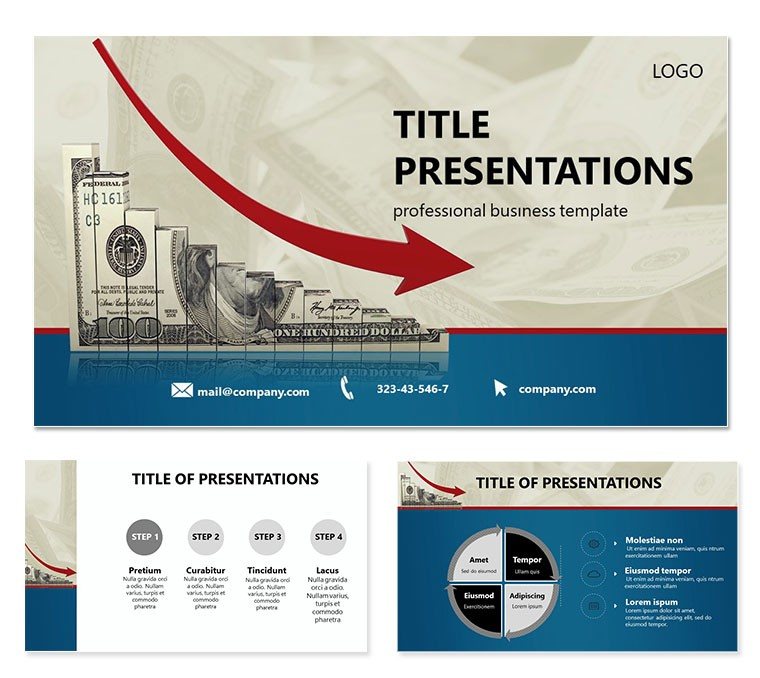
Imagine stepping into a boardroom where your financial forecasts don`t just inform - they inspire action. The Dollar Decline Keynote Template is crafted for finance professionals who need to turn complex data into clear, visually arresting stories. With its sleek designs centered around currency fluctuations and economic shifts, this template helps you dissect market declines without overwhelming your audience. Whether you`re an analyst preparing quarterly reports or an executive pitching investment strategies, these slides make every point land with precision.
At its core, this template offers 28 meticulously designed diagrams that cover everything from trend lines to comparative charts, all optimized for Keynote`s fluid animations. You`ll find 3 master slides to maintain brand consistency and 3 background options to suit light or dark modes in your presentations. Plus, with 7 color schemes ranging from cool blues for stability to stark reds for warnings, you can tailor the visuals to match the gravity of your message. It`s not just about looking good - it`s about making your data speak volumes, ensuring stakeholders grasp the nuances of dollar devaluation or global trade impacts right away.
Unlocking the Power of Visual Finance Storytelling
Diving deeper, consider how this template shines in real-world scenarios. Picture a financial advisor using the decline arrow diagrams to illustrate portfolio risks during client meetings. The editable vectors allow you to swap in real-time data, like exchange rates from the latest Fed report, while the built-in icons - think downward graphs intertwined with currency symbols - add a layer of intuitive symbolism. No more fumbling with generic shapes; these are purpose-built for economic narratives.
Customization is a breeze in Keynote. Start by selecting a master slide, then drag and drop your logos onto the header placeholders. Adjust the color scheme via the theme editor to align with your firm`s palette, and watch as all 28 diagrams update seamlessly. For those tense strategy sessions, the timeline slides let you map out recovery projections step by step, fostering discussions that lead to smarter decisions. It`s like having a design co-pilot that anticipates your needs, freeing you to focus on the insights that matter.
Key Diagrams That Drive Decisions
- Trend Analysis Charts: Visualize currency drops over quarters with smooth line graphs that animate on click, revealing layered data like inflation correlations.
- Comparative Bar Sets: Stack economic indicators side by side, perfect for contrasting U.S. dollar performance against euro or yen trends.
- Pie Breakdowns for Market Shares: Slice through sector impacts with exploded views that highlight vulnerable areas, editable down to the label fonts.
- Flow Process Maps: Trace supply chain disruptions leading to value declines, using connected nodes that mimic economic flows.
Each of these elements is vector-based, ensuring crisp scaling on any display, from laptop screens to conference projectors. And since it`s fully compatible with Keynote 2016 and later versions, you can collaborate effortlessly across teams using iCloud sharing.
Real-World Applications for Finance Teams
Think of a scenario where a hedge fund manager needs to brief partners on a sudden dollar slide triggered by policy changes. With this template, you assemble a deck in under an hour: import your Excel data into the charts, tweak the narrative text boxes for context, and add subtle transitions to guide the eye. The result? A presentation that not only conveys the `what` but sparks the `so what` - prompting questions on hedging tactics or diversification.
For consulting firms, the template`s modularity supports client-specific adaptations. A retail banker might emphasize consumer spending dips with heatmap overlays, while a corporate treasurer uses the balance sheet visuals to forecast liquidity crunches. These aren`t one-size-fits-all slides; they`re flexible tools that adapt to your story, much like how seasoned economists layer assumptions into their models.
Integrating this into your workflow means less time on design tools like Illustrator and more on analysis. Export previews as PDFs for quick reviews, or embed hyperlinks to live data sources for interactive sessions. The payoff is evident in follow-up emails praising the clarity - turning routine updates into strategic dialogues.
Step-by-Step: Building Your First Decline Deck
- Launch and Import: Open Keynote, insert the template, and pull in your raw data from spreadsheets.
- Customize Visuals: Select a diagram, edit colors via the inspector panel, and replace placeholders with your metrics.
- Add Narrative: Use the text hierarchies to weave in explanatory notes, ensuring accessibility with high-contrast modes.
- Animate and Rehearse: Apply build effects to reveal data progressively, then run through timings for a polished flow.
- Share and Iterate: Export to video for remote teams or present live, gathering feedback to refine future uses.
This process streamlines what used to be a multi-day ordeal, letting you iterate based on audience reactions - like emphasizing recovery levers if the room leans optimistic.
Why This Template Stands Out in Crowded Finance Tools
Compared to stock PowerPoint options, which often feel clunky for Mac users, this Keynote-native design leverages Apple`s ecosystem for smoother edits and exports. No pixelation issues here; everything scales vector-perfect. And unlike free templates that skimp on variety, these 28 diagrams span radial, linear, and hierarchical formats, covering the full spectrum of financial visualizations.
For teams juggling multiple platforms, the .key and .kth files ensure seamless handoffs, while JPG previews aid in storyboarding. It`s backed by designs tested in high-stakes environments, akin to those used in annual reports from firms like Deloitte - though tailored for your immediate needs.
Ready to make your next financial pitch unforgettable? Download the Dollar Decline Keynote Template today for just $22 and start crafting slides that don`t just report declines - they chart paths to growth.
Frequently Asked Questions
Is the Dollar Decline Keynote Template compatible with older versions of Keynote?
Yes, it works with Keynote 2016 and newer, including the latest macOS updates for optimal performance.
How many customization options are available?
With 7 color schemes and editable vectors across 28 diagrams, you have extensive flexibility to match any brand or theme.
Can I use this for non-finance presentations?
Absolutely - the diagrams adapt well to any data-driven topic, like sales trends or project timelines.
Does it include animation presets?
Keynote`s native builds are pre-set for smooth reveals, but you can customize timings and effects easily.
What file formats are provided?
You`ll get .key for editing, .kth for themes, and .jpg previews for quick shares.
Is there support for team collaboration?
Yes, via iCloud or shared links, making it ideal for distributed finance teams.