Data doesn`t whisper secrets - it shouts when visualized right. The Analytical Graphics Keynote Template hands analysts, marketers, and tech leads the megaphone, rendering raw metrics into riveting revelations. This powerhouse packs 28 diagrams dissecting trends like a surgeon`s scalpel, anchored by three masters: a dashboard prelude for snapshots, a deep-dive chassis for dissections, and a synthesis capstone for takeaways. Backgrounds weave in subtle gridworks or spectral gradients, framing facts without fanfare.
Aimed at those knee-deep in numbers, from fintech forecasters to marketing metric mavens, it bridges bytes to boardrooms with seven schemes - crisp monochromes for reports, vivids for ventures. Forget fumbling with formulas; focus on foresight as slides auto-align inferences. Adapt it immediately and let analytics align ambitions.
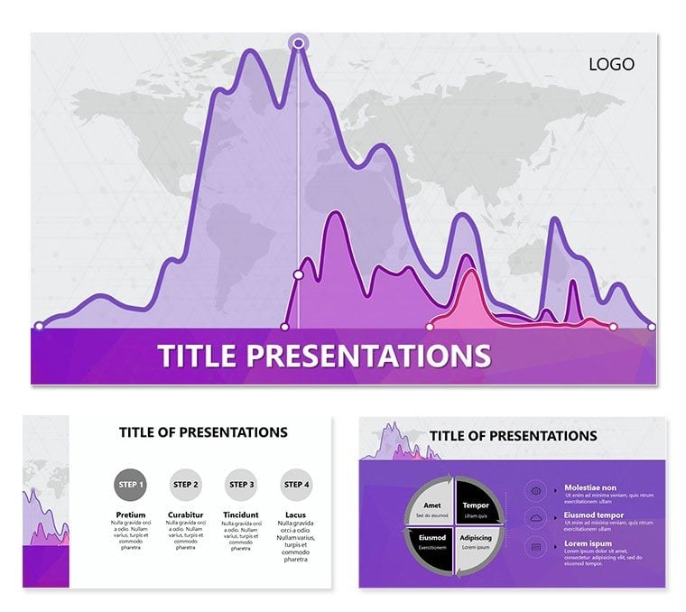
Cornerstone Components
Masters trio: Entry for exec summaries, core for correlations, exit for extrapolations. Backgrounds trio: Lattice for logic, haze for hypotheses, void for verity. Diagrams dominate with 28 variants - scatterplots for correlations, heatmaps for hotspots - all infinitely iterable.
Tailor trivially: Pivot pivot tables, hue histograms, embed equations. Schemes span seven, suiting sterile labs to lively launches. Keynote 2016+ compliant, 4:3 to 16:9 scalable.
- Metric Maps: Voronoi for variances, treemaps for totals.
- Reveal Rhythms: Phased pops for progressive parses.
- Notation Nest: 55+ sigils for stats, sigma to subsets.
Syncing with Spreadsheets
Link ledgers live - updates ripple real-time. A quant quipped it quartered query quests, quickening quarterly quests.
Deployments That Decode
Finance forecasts: Funnel forecasts from flux to fix, flagging frailties. Marketing mixes: Matrix models media ROI, ranking reach. Tech telemetries: Timeline traces uptime, tagging thresholds. Risk rundowns: Radar radars red flags, ranking reliabilities.
A portfolio planner plotted paths with parallels, paring perils that propelled promotions. These tactics transmute terabytes to truths, tipping scales toward savvy.
Dissecting a Deck Deliberately
- Amass Analytics: Aggregate in Airtable for agile access.
- Mount Master: Metric one; modulate motif.
- Infuse Infographics: Slot Sankey, segment segments.
- Hone Harmony: Headline highlights, hyphenate hierarchies.
- Diffuse Deliverables: Dissolve dissolves, dispatch digitally.
This method molds masses into meaningful missives.
Surpassing Stock Setups
Defaults dull with drab defaults; this dazzles with deliberate depths, like dendrograms delving dependencies. Presets preempt pains, prepping pros for prowess. Auditors acclaim its acuity in audits, authoring accords.
Equity ensures: Enlarged elements for elders, encoded for echoes. Fuse with Tableau tableaux for turbocharged tells.
Refining Rigor
Elite edit: Etch edges on ellipses for emphasis, emulating Eames` exactitude. Excise excess per Tufte`s tenets, treasuring truths. For forums far-flung, flatten for fleet-footed feeds.
Decode Destinies Decisively
Where data dances, decisions dawn. Acquire Analytical Graphics for $22 and orchestrate outputs that outshine. Your quanta quest quickens - quantify quintessentially.
Frequently Asked Questions
Supports statistical software links?
Yes, embeds from R or Python outputs via images or tables.
Diagram variety for multivariate analysis?
Ample, including parallel coordinates and box plots.
Animation for sequential stats?
Affirmative - build orders for step-wise stories.
Background adaptability?
Absolute, from fills to filters for focal fits.
Finance-focused tweaks?
Built-in, with ledger lines and currency cues.