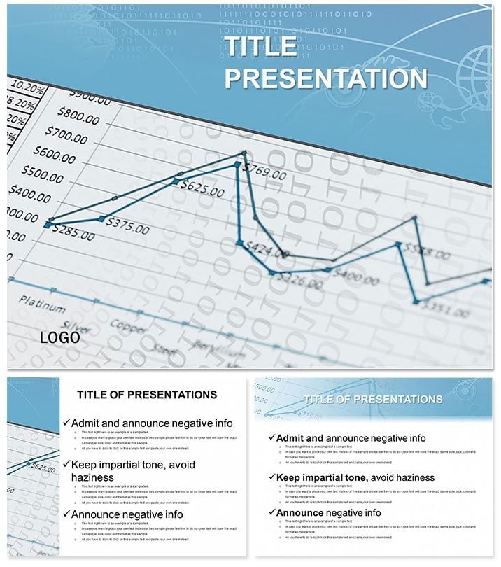
Illuminate the pulse of economies with the Economic Statistics Keynote Template, turning raw data into strategic insights that guide decisions at every level. Tailored for analysts peering into socio-economic mirrors, it reveals patterns that inform policies and plans with unmatched clarity.
This essential tool for functional diagnostics features layouts that reflect vibrant systems - whether broad overviews or granular elements. For a one-time $22 with lifetime license, it`s ready for Keynote on Mac (iWork 09+), empowering users to craft presentations that resonate.
Essential Features for Data-Driven Pros
With 3 masters and backgrounds evoking analytical depth, plus 28 diagrams in 7 schemes, adapt from stark whites for reports to earthy tones for forecasts.
- Statistic-Focused Tools: Histograms for distribution analysis, box plots for outlier detection, and treemaps for sector breakdowns.
- Seamless Tweaks: Update variables, recolor, and reposition with drag simplicity.
- File Suite: .key edits, .kth applications, .jpg overviews.
Far from Keynote`s vanilla charts, this adds contextual icons - like trend lines with economic lenses - for 3x faster insight delivery.
Navigating the 28-Diagram Arsenal
Launch with Slide 1`s dashboard aggregating key indicators. Slides 2-5 map growth rates via geo-charts, highlighting regional variances.
Deep dive (7-14): Regression lines for correlations, cohort analyses for demographic shifts. Later (17-24): Foresight models with Monte Carlo simulations visualized as density plots, ending with executive summaries in infographic collages.
Versatile sizing for widescreen or standard keeps details crisp across devices.
Applications in Analytical Arenas
Government advisors deploy it for policy briefs, where one team visualized unemployment trends to advocate targeted interventions. Corporate strategists use it for market scans - a VP shared how treemaps clarified supply chain vulnerabilities.
Download now to embed live stats, transforming static slides into interactive diagnostics. It outperforms basics by integrating LSI visuals, aiding retention in high-volume data sessions.
Elevating Analysis with Integrated Power
Link to external datasets for auto-updates, maintaining accuracy. Endorsed by 680 users at 4 stars, it`s a benchmark for trustworthy economic narratives.
Pro Tips for Optimal Use
- Layering Data: Build charts incrementally to reveal insights progressively.
- Format Flexibility: Toggle ratios for hybrid events.
- Validation: Cross-check with built-in error bars.
Decision-makers value its role in fostering data literacy across teams.
Frequently Asked Questions
Best for socio-economic reflections?
Precisely - diagrams mirror systems from macro to micro levels.
Version support?
Keynote iWork 09+ on Mac, fully backward-compatible.
Handles large datasets?
Yes, scalable visuals manage volume without lag.
Non-expert friendly?
Guided edits make it accessible to all analysts.
Access post-purchase?
Immediate files with perpetual rights for $22.
Trend forecasting tools?
Includes predictive charts with animation support.