For policy presentations that demand instant compatibility, the template loads 28 diagrams in Keynote 12+.
Seven color schemes ship inside the single .key file. Political analysts rely on this Keynote diagram template when they map election cycles or global alliances. The paid version unlocks every diagram while previews limit you to samples.
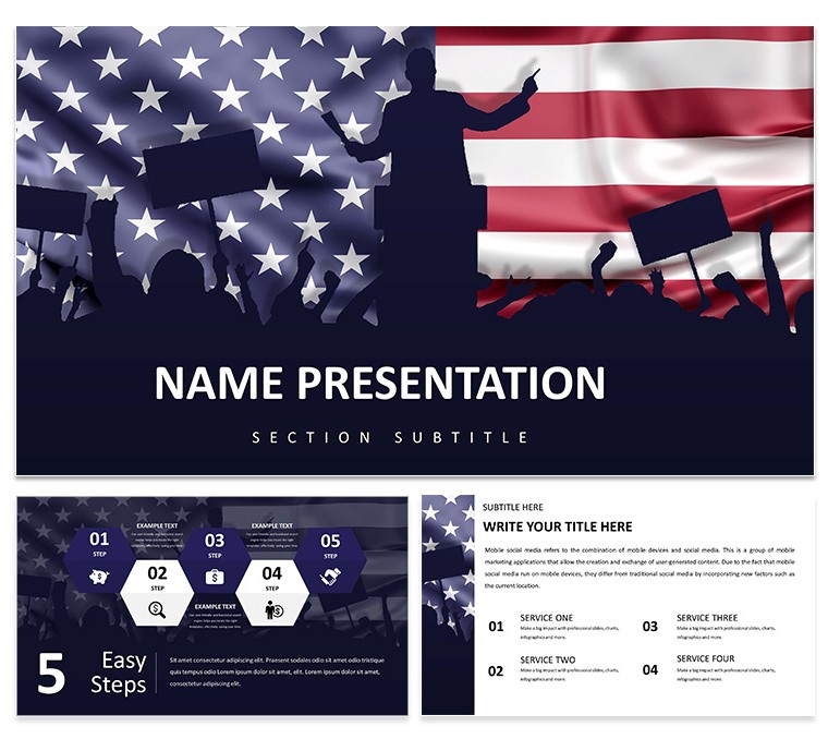
Color changes run through the slide master. Open View > Master Slides, pick the scheme, swap to any of the seven palettes, and all 28 diagrams refresh at once. The design employs bold icon style with map and flag elements in a horizontal grid structure.
No photo placeholders appear. Every element stays fully vector. You drag any diagram into an existing slide and it inherits the current theme automatically. This Keynote diagram template keeps focus on data relationships instead of decoration.
Text and icons resize independently. The left-to-right layout ensures quick scanning during committee sessions. Related options include the European Union and United States Relations Keynote Template and the Geopolitics US-EU Relationship Keynote Template. Browse the full category at Business - Global Keynote Theme.
Twelve diagrams handle comparison views. The remaining sixteen cover timelines and hierarchy structures. The KTH theme file applies the palette to new slides in one action.
Government staff reuse the file across briefings. Master-based editing guarantees consistency every time.
| Feature | Details |
|---|
| Slides / diagrams | 28 diagrams including flowcharts, timelines, org charts |
| File format | KEY, KTH, JPG |
| Software version | Keynote 12+ |
| Color schemes | 7 - switch via slide master in three clicks |
| Editable elements | All vector icons and text resize and recolor independently |
| Aspect ratio | 16:9 |
| Free vs Paid | Paid version delivers full 28 diagrams and all color schemes |
| Masters / Backgrounds | 2 masters with 7 color schemes |
Download and start editing immediately
Which Keynote version and macOS requirement does the template have?
The template works with Keynote 12 and newer versions. It requires macOS 13 Ventura or later for full compatibility. Older versions may miss some vector effects yet still open the core diagrams.
How do I change colors via the slide master?
Color change via slide master works in three steps. First open View > Master Slides. Then select the color scheme thumbnail and replace it with one of the seven included palettes. The update applies to all 28 diagrams automatically. This saves hours when you switch from blue tech theme to green innovation palette.
Does the license allow client work?
Yes, the license allows client work. You can deliver presentations built with this template to clients. You cannot resell the template file itself or claim it as your own design.
What is the difference between free and paid versions?
The paid version includes the complete 28 diagrams and 7 color schemes in the .key file. Free previews show only three sample slides. You get the full editable package once purchased.
What are the refund conditions?
Refund is available within 30 days if the file does not open correctly in your version of Keynote. Contact support with the purchase receipt. Full refund issued upon verification of the issue.