When numbers tell a story, the right visuals make it unforgettable. The Data-Driven Growth Keynote Template is your ally in turning spreadsheets into strategic masterpieces, ideal for analysts, entrepreneurs, and growth-focused teams who thrive on evidence-based narratives. This deck isn't about overwhelming with data - it's about illuminating paths forward with precision and poise.
Boasting 28 specialized diagrams in seven data-friendly color sets, it covers everything from scatter plots for correlation analysis to heat maps for trend spotting. Grounded in three versatile masters and backgrounds that fade from cool azures to warm ambers, it adapts to your report's tone. Use it to dissect performance metrics in team huddles or forecast expansions in investor calls - each slide is a canvas for your insights.
Its strength? The emphasis on interactivity: hover effects on charts reveal details, and modular builds let you pace revelations. Growth hackers appreciate how such tools distill chaos into clarity, much like how data pros at scaling firms layer narratives to rally stakeholders around key levers.
Key Components for Analytics Excellence
This template shines through its diagram diversity. Expect bubble charts for multi-variable comparisons, Sankey diagrams for resource flows, and waterfall charts for variance breakdowns - all vector-editable for instant updates. Icons tailored to growth themes, like upward arrows and metric gauges, integrate fluidly, enhancing without distracting.
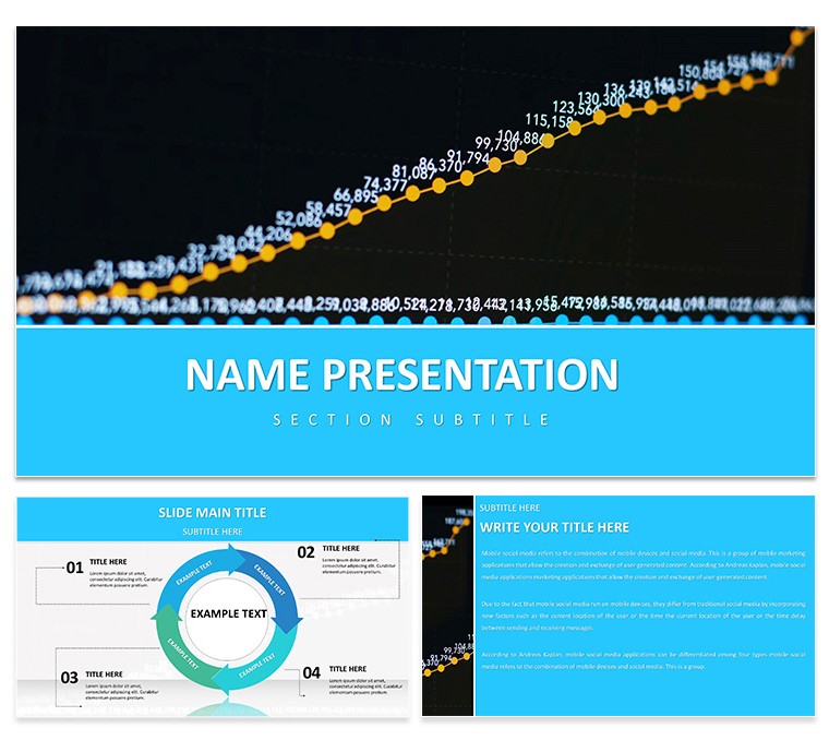
Animations are purposeful: sequential reveals on bar stacks build suspense, mirroring how insights unfold in real analysis. With Keynote 2016+ compatibility, it handles large datasets smoothly, even linking to external sources for live updates during presentations.
The layouts prioritize scannability - ample whitespace around axes and legends ensures focus stays on the story behind the stats.
Practical Scenarios for Growth Narratives
Think of a marketing analyst prepping a campaign ROI review. They slot quarterly data into the cohort analysis slide, using line overlays to trace retention curves - transforming raw exports into a tale of optimization wins.
Or a startup ops lead mapping supply chain efficiencies: The process flow diagram becomes a visual audit trail, with nodes highlighting bottlenecks and gains.
- Strategy Sessions: Deploy pyramid charts to hierarchy business objectives, layering sub-goals for drill-down discussions.
- Performance Reviews: Leverage gauge dials for OKR progress, rotating needles to reflect attainment levels.
- Forecasting Pitches: Build scenario trees with branching paths, illustrating best- and worst-case projections.
These uses echo how analysts in consulting and fintech convert data dumps into decision-making dynamos.
Hands-On Customization Roadmap
Harness the template's potential with this efficient process:
- Launch and Orient: Open in Keynote and browse thumbnails to select your starting slide.
- Tune Visuals: Switch color schemes from the format sidebar, ensuring accessibility with high-contrast options.
- Load Your Data: Paste values into chart sources; auto-scaling handles the rest.
- Enhance with Assets: Embed screenshots or icons via drag-and-drop, snapping to guides for alignment.
- Refine Delivery: Adjust animation timings in the animate tab for a natural rhythm.
Quick hack: Use the master slide's footer for consistent data sourcing notes, building trust slide by slide.
Superior to Standard Spreadsheets
While Excel excels at crunching, this template bridges to storytelling - its pre-built axes and labels eliminate formatting drudgery, letting you emphasize trends over tweaks. The growth-specific icons add narrative depth, turning flat figures into forward-looking forecasts that resonate.
Chart Your Growth Path Immediately
Empower your data stories with the Data-Driven Growth Keynote Template for only $22. Download now and watch your presentations propel progress.
Frequently Asked Questions
What types of charts are featured?
The 28 diagrams include specialized options like scatter plots, heat maps, and Sankey flows for comprehensive data visualization.
Is it easy to update with new data?
Yes, charts are linked to editable tables, allowing quick refreshes without redesigning layouts.
Which platforms does it run on?
Designed for Keynote 2016 and above on macOS, with robust support for animations and interactions.
Can it handle large datasets?
Absolutely - optimized structures prevent lag, even with hundreds of data points.
Are there tips for mobile viewing?
Built-in responsive elements ensure clarity on iPads; test with presenter's remote for seamless control.