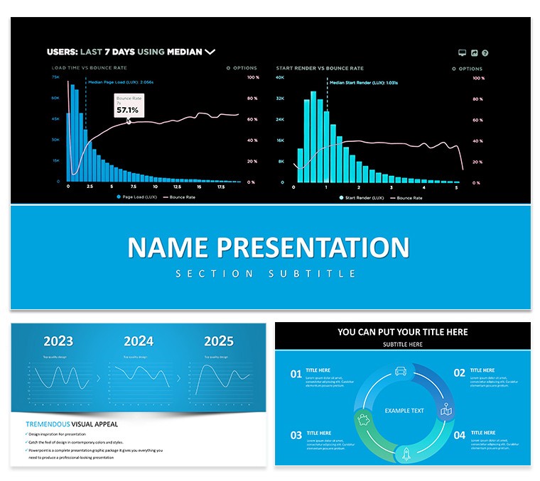
Imagine stepping into a boardroom where your data doesn't just speak - it captivates. The Analytics and Metrics Keynote Template is your go-to tool for transforming raw numbers into visual narratives that drive decisions. Designed specifically for data professionals who juggle spreadsheets and stakeholder expectations, this template features 28 meticulously crafted diagrams, from sleek bar charts to dynamic line graphs, all ready to plug in your latest metrics. Whether you're dissecting website traffic patterns or forecasting sales trajectories, these slides help you highlight key performance indicators (KPIs) without the hassle of starting from a blank canvas.
With three master layouts and three background options, plus seven versatile color schemes, you can tailor the look to match your brand's vibe - think crisp blues for tech firms or vibrant greens for growth-focused teams. Each element is fully editable in Keynote, so swapping datasets or tweaking fonts takes minutes, not hours. This isn't just a set of slides; it's a framework for clearer communication, helping you focus on the story behind the stats rather than wrestling with design tools.
Picture a marketing director unveiling campaign ROI during a quarterly review. Using the pie diagrams here, she layers in conversion rates and engagement metrics, instantly revealing what worked and what needs tweaking. Or consider a data scientist at a tech conference, employing the timeline graphs to map user behavior evolution - suddenly, abstract algorithms become relatable journeys. These real-world applications underscore how this Keynote diagram template empowers you to connect dots that others miss, fostering buy-in from even the most numbers-averse audiences.
Core Features That Power Your Data Storytelling
At the heart of this template lies a suite of intuitive visuals built to handle everything from basic overviews to deep dives. The 28 diagrams cover a spectrum: start with simple bar charts for comparing quarterly revenues, move to scatter plots for correlation analysis, and cap it off with funnel visuals for conversion paths. Each one supports drag-and-drop data import, ensuring your Excel exports flow seamlessly into Keynote without reformatting headaches.
- Modular Layouts: Three masters let you switch between minimalist, data-dense, and illustrative styles mid-presentation, keeping things fresh.
- Color Harmony: Seven schemes, including monochromatic for formal reports and contrasting palettes for interactive sessions, all with accessible contrast ratios.
- Icon Integration: Built-in symbols for metrics like growth arrows or alert icons, saving you from generic clipart hunts.
- Animation-Ready: Subtle transitions baked in, like sequential bar builds, to reveal insights progressively without overwhelming viewers.
Customization is straightforward: open in Keynote, select a diagram, and edit via the inspector panel. For instance, to update a line graph, just paste your time-series data, adjust the axis labels, and align with your theme colors - all while preserving vector sharpness for any screen size.
Practical Use Cases: From Dashboards to Executive Briefs
This template shines in scenarios where clarity trumps complexity. Take financial reporting: use the stacked area charts to illustrate budget allocations over fiscal years, making variances pop without dense tables. A business analyst might leverage the heatmap diagrams to spotlight regional sales hotspots, guiding strategy shifts with visual precision.
In product management, the Gantt-style timelines help roadmap feature releases, syncing milestones with resource needs. For a step-by-step example, begin by importing your project CSV into the timeline slide: align dates on the x-axis, color-code tasks by priority, and add milestone markers. Then, duplicate for variants, like best-case vs. actual progress, to facilitate what-if discussions.
- Prep your data in Excel for quick Keynote import.
- Select a base diagram and apply your color scheme.
- Layer in annotations, like callout boxes for outliers.
- Test animations in presenter view for smooth flow.
- Export as PDF for handouts, retaining interactivity.
Compared to vanilla Keynote charts, this template cuts setup time by offering pre-aligned elements and thematic consistency, letting you iterate faster on feedback loops. It's particularly potent for remote teams, where screen-shared visuals need to stand alone without verbal crutches.
Enhancing Engagement with Targeted Tips
To maximize impact, pair diagrams with narrative anchors - start each slide with a one-liner question, like "What drove our 15% uplift?" then reveal the chart. For diverse audiences, toggle to simpler views mid-deck, using the background swaps to signal shifts from data to recommendations. This approach, reminiscent of how consultants like McKinsey structure decks, ensures your metrics resonate across levels.
Workflow integration is seamless: link to live Google Sheets for auto-updates during ongoing campaigns, or embed Tableau exports for advanced interactivity. Users report that swapping out default icons for sector-specific ones, like server graphics for IT metrics, adds that professional polish without extra tools.
Why This Template Fits Your Workflow
Beyond the visuals, it's the thoughtful details that elevate this from good to essential. Compatible with Keynote 2016 and later, it handles high-res exports flawlessly, ideal for printed reports or video recordings. The clean aesthetic avoids clutter, focusing eyes on insights - perfect for high-stakes pitches where every second counts.
Ready to make your data unforgettable? Download the Analytics and Metrics Keynote Template today and watch your presentations gain traction.
Frequently Asked Questions
How editable are the diagrams in this Keynote template?Fully editable - adjust colors, fonts, data points, and layouts directly in Keynote's native tools without losing quality.
Can I integrate real-time data from Excel?Yes, copy-paste or link Excel data into charts for automatic updates, supporting dynamic presentations.
What file formats are included?You get .key for Keynote, .jpg previews, and .kth themes for easy import.
Is this suitable for non-data experts?Absolutely; the intuitive designs simplify complex info, making it accessible for executives or clients.
Does it support animations?Built-in subtle animations enhance flow, customizable via Keynote's animate tab.