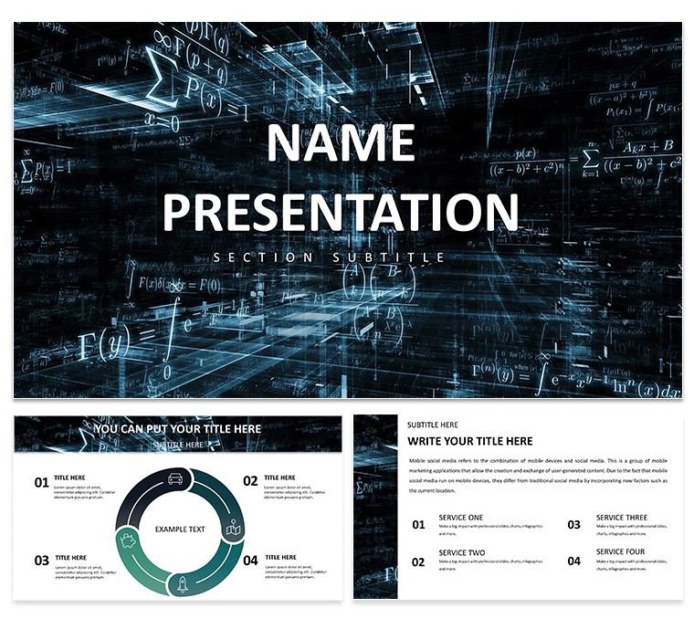
In the world of data science, where numbers swirl like abstract art, clarity is king. Enter the Abstract Geometric Keynote Template - a sleek fusion of bold shapes and dynamic patterns that transforms raw analytics into compelling narratives. Tailored for data scientists unpacking algorithms or financial analysts charting market fluxes, this template uses neutral tones and geometric precision to make intricate insights accessible and stylish.
Ideal for tech briefings or educational deep dives, it packs 3 masters and 3 backgrounds for effortless navigation. With 28 diagrams spanning 7 color schemes, you can map trends, hierarchies, or forecasts without the drag of blank slates. It's your secret weapon for startup pitches, where a single polygon can spotlight growth trajectories, or classroom sessions demystifying stats.
Flawless on Keynote for macOS 10.14+, it empowers quick iterations, letting you focus on revelations over rendering. Analysts love how pre-built graphs handle big data visuals; educators appreciate the icons that symbolize variables intuitively. Snag the Abstract Geometric Keynote Template for $22 now and geometrize your genius.
Core Components: What Powers the Geometric Edge
This template's strength lies in its modular build. The 28 diagrams range from scatter plots for correlations to Venn sets for overlaps, all vector-based for crisp scalability.
- Master Precision: Three layouts anchor your deck - opt for angular for data dives or fluid for overviews.
- Background Balance: Three subtle patterns, like interlocking hexagons, provide depth without dominating.
- Color Calibration: Seven schemes, from monochromatic blues to vibrant contrasts, align with your data's mood.
Integrated icons - think nodes for connections - add layers, turning flat charts into interactive stories. It's engineered for precision, much like tools favored in analytics firms for report polish.
Navigating Creation: A Geometric Workflow
Assembly is intuitive: Open Keynote, insert the .key file, and select a master. Here's how to build a slide for an analytics report:
- Shape Selection: Choose the line graph on slide 10; populate with your metrics and rotate axes for optimal angles.
- Theme Tuning: Engage scheme 2's grays in the inspector, then layer your firm colors for branded geometry.
- Element Enrichment: Embed datasets via tables - the placeholders align shapes automatically.
- Flow Check: Animate builds sequentially; fades reveal layers like unfolding a puzzle.
This mirrors workflows in data viz pros, yielding decks that parse complexity cleanly. For finance, tweak bubble charts to bubble up investment risks vividly.
Geometric in the Wild: Analytics Applications
A tech lead harnessed this for a product demo: The network diagram on slide 20 linked features with polygonal bonds, clarifying integrations at a glance. In academia, professors mapped statistical models using pyramid structures, aiding student comprehension without jargon.
Business devs use it for KPI dashboards, where abstract bars quantify ROI with elegant restraint. Superior to Keynote's stock options, its shapes foster focus - eyes follow contours to conclusions, boosting retention in high-stakes settings.
Refining Your Geometric Masterpiece
Enhance with restraint: Limit shapes to three per slide for scannability. For virtual keynotes, ensure high contrast in schemes to combat screen glare. Import from Numbers for live-linked data, keeping forecasts fresh.
Pro move: Use build orders to sequence reveals, unveiling insights progressively. Accessibility-wise, tag visuals as "Geometric scatter plot of user engagement metrics." Such practices, drawn from analytics bests, ensure inclusive impact. From trend analyses to risk models, this template geometrizes success.
Structuring Success with Abstracts
Outpacing plain designs, Abstract Geometric delivers sophistication through smart abstraction. Shape your narrative - download for $22 and let data dance.
Frequently Asked Questions
What Keynote versions support this template?
Compatible with Keynote 6.0 and later on macOS, including the latest iCloud sync.
Is it only for data science fields?
No - its versatile shapes suit finance, tech, education, and any data-driven talk.
How editable are the diagrams?
All 28 are fully vector-editable, from resizing to recoloring paths.
Does it include data viz tools?
Yes, pre-built charts, graphs, and icons streamline complex visualizations.
Can I adjust color schemes?
Easily - seven options via master, or custom blends in the color wheel.
Download contents?
.key files, theme sources, and preview assets for instant deployment.