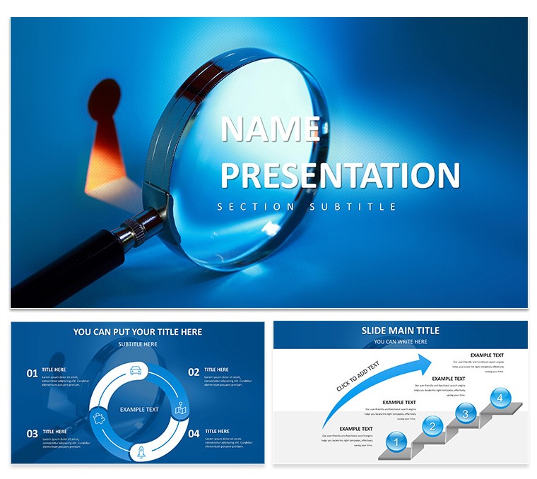
Data doesn't speak for itself - it needs a translator. The In-Depth Analysis Keynote Template steps in as that expert guide for Apple Keynote users, turning spreadsheets into strategic masterpieces. Geared toward business analysts, financial advisors, and marketing whizzes who wrestle with trends and metrics daily, this template distills complexity into digestible visuals that spark insights and decisions. Its professional layouts, infused with clean geometry and strategic whitespace, ensure every slide advances your argument without overwhelming the viewer. Free to download, it's a boon for teams seeking depth without design detours, letting you spotlight patterns that propel progress.
Built on three master slides and three backgrounds - from stark whites for objectivity to subtle grids for analytical edge - this template houses 28 diagrams primed for scrutiny. Seven color schemes range from corporate blues to vibrant accents, making it easy to highlight variances in forecasts or segment customer behaviors. Whether dissecting market shares or forecasting budgets, these tools empower you to reveal the 'why' behind the 'what,' echoing how top consultants unpack layers to uncover value.
Delving into Features: The Backbone of Analytical Power
This template's strength lies in its data-centric DNA. The masters cover essentials: a header-focused one for executive summaries, balanced content for breakdowns, and grid-based for metrics. Backgrounds reinforce focus, with options that frame info like a lab notebook - precise and unadorned.
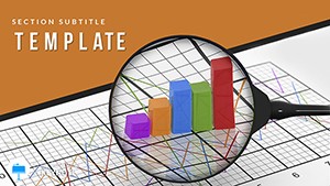
- Data-Driven Diagrams: 28 strong, including heat maps for risk assessment or funnel charts for conversion paths. Tune with seven schemes to differentiate KPIs visually.
- Infographic Integration: Prepped elements like icon arrays for qualitative insights or layered timelines for historical contexts, all editable down to the node.
- Layout Logic: Slides engineered for flow, with alignment guides ensuring consistency across consulting reports or academic reviews.
Financial pros often pair scatter plots with trend lines here, tracing portfolio volatilities to inform reallocations. It's that level of detail that turns observations into opportunities.
Workflow Mastery: Analyzing with Ease, Step by Step
Transform insights from hunch to headline with this methodical approach. Launch in Keynote, selecting a master that mirrors your report's structure - perhaps the analytical one for metric-heavy opens.
- Frame the Foundation: Populate the outline with sections: hypotheses, evidence, implications. Slot diagrams accordingly, like Sankey flows for resource allocations.
- Input Intelligence: Feed data into charts - Keynote auto-formats axes and legends. Annotate with callouts for outliers, drawing eyes to pivotal points.
- Refine for Revelation: Choose a scheme that codes urgency - reds for alerts, greens for gains. Layer subtle builds to unveil layers progressively.
- Validate Vision: Rehearse with notes view, correlating slides to talking points. Output as interactive PDFs for stakeholder feedback loops.
Such steps have helped marketers map campaign ROIs, using cohort analyses to refine targeting. Precision begets persuasion.
Strategic Scenarios: Applying Depth Across Domains
This template thrives in high-analysis arenas. Consultants wield it for SWOT dissections, quadrant diagrams balancing strengths against threats in client strategies. Researchers layer statistical visuals, box plots revealing variances in experimental sets for peer reviews.
In finance, advisors chart asset correlations, matrix layouts exposing diversification gaps. Marketing teams dissect A/B tests via comparative bars, quantifying uplift to justify budgets. E-commerce analysts track user funnels, waterfall charts cascading from acquisition to retention.
Software devs extend to sprint retrospectives, burndown graphs pacing deliverables. Each application leverages the template's knack for clarity, turning dense datasets into dialogue starters.
Optimization Insights: Elevating Your Analytical Edge
Sharpen your deck with targeted tweaks. Select fonts like Arial for universality, bolding axes labels for scanability. Embed dynamic elements - linked Excel pulls for live updates in iterative reviews.
For infographics, sequence reveals to mimic detective work, building case by case. Opt for high-contrast schemes in dim venues, and include source footnotes for credibility. Advanced: Use hyperlinks in diagrams to drill-down appendices, fostering interactive explorations.These enhancements, drawn from analytical best practices, ensure your presentations not only inform but interrogate, prompting deeper discussions.
Secure the In-Depth Analysis Keynote Template today - download and decode your data's full story.
Frequently Asked Questions
What types of charts are best for financial data in this template?
Line graphs for trends, pie charts for allocations, and heat maps for correlations work seamlessly.
Can I import external data directly?
Yes, Keynote supports CSV or table pastes that auto-populate editable diagrams.
Is it optimized for large datasets?
The layouts handle complex visuals, but simplify for performance on older devices.
How do the color schemes aid analysis?
They differentiate variables intuitively, like sequential hues for progressions.
Does it support collaborative editing?
Through iCloud, multiple users can refine in real-time.
Are there templates for non-numerical insights?
Yes, mind maps and flowcharts accommodate qualitative narratives too.