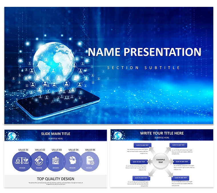
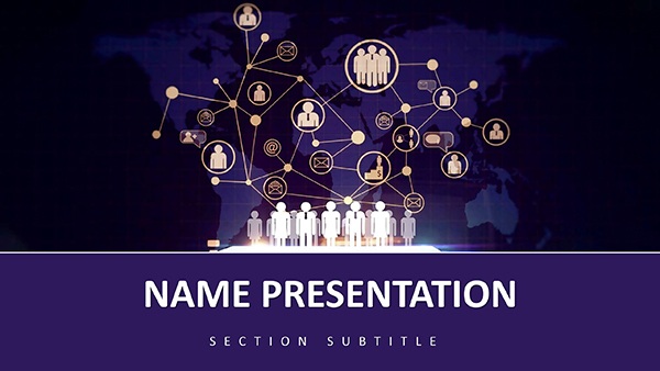
Picture a boardroom buzzing with international stakeholders, your Keynote alive with maps that pulse like living arteries of commerce. The Global Connectivity: Dynamic Keynote Template brings that vision to life, a dynamic toolkit for professionals bridging borders through presentations. Geared toward business leaders charting expansion paths or educators unpacking globalization's threads, this template turns sprawling concepts into focused, flowing visuals that resonate across cultures.
Boasting 28 diagrams that span continents in a single swipe, it's your ally for narrating the interconnected now. From swirling timelines that trace supply chain evolutions to layered infographics dissecting trade winds, every slide invites exploration. And with Keynote's native power, customization feels organic - reshape a world map to spotlight your market, or infuse timelines with milestone markers that align with your fiscal calendar. It's the difference between a flat report and a global conversation starter.
Discover the Building Blocks of Borderless Design
At the heart are three master layouts, each a scaffold for connectivity: one for geographic overviews, another for temporal progressions, and a third for relational webs. Three backgrounds - ethereal globe motifs or networked constellations - provide atmospheric depth without distraction.
The diagram collection is a treasure trove: 28 layouts including choropleth maps for regional insights, Gantt-style timelines for project globetrotting, and Sankey diagrams flowing resources across oceans. Seven color schemes evoke unity, from oceanic teals to earthen warms, ensuring your palette speaks to diverse audiences. Icons, though not overflowing, include essentials like arrows for migrations and nodes for partnerships, all scalable vectors.
- Map-Centric Visuals: Overlay datasets on world projections, with zoomable regions for granular focus.
- Timeline Mastery: Curved or linear paths that accommodate multi-year spans or quarterly pulses.
- Infographic Flows: Modular blocks that stack to build narratives on collaboration or convergence.
Harmonizing with Keynote's Global Stage
This template thrives in Keynote's ecosystem, from macOS desktops to iPad portability. Masters enforce thematic unity, while .key exports facilitate cross-timezone teamwork. Graphics remain sharp across resolutions, ideal for virtual summits where clarity crosses oceans.
Use Cases That Span the Globe
Think of a consultant advising on market entry: they deploy a connectivity matrix to link consumer behaviors across APAC and EMEA, with animated lines drawing correlations live. The template's structure elevates dry demographics into dynamic dialogues, fostering buy-in from afar.
In academia, a lecturer on international relations uses radial timelines to interlace historical events with current policies, icons pinpointing flashpoints. Students grasp the web of influences, not as isolated facts but as a living lattice.
- Strategy Sessions: Funnel diagrams channeling global opportunities into prioritized actions.
- Trend Forecasts: Scatter plots plotting tech diffusion rates by latitude and longitude.
- Initiative Pitches: Hero maps framing NGO impacts, with inset charts quantifying reach.
Outshining ad-hoc designs, it streamlines the journey from brainstorm to broadcast, emphasizing essence over effort.
Strategic Tweaks for Transnational Talks
Align visuals to cultural contexts - use directional flows respecting reading habits. For animations, opt for gentle orbits on maps to simulate expansion. Preview in multiple languages via Keynote's text tools, ensuring icons transcend tongues. Balance data density; let whitespace breathe like open skies.
The Thread That Ties It All
This template excels by mirroring the world's weave - interlinked, adaptable, profound. It empowers presenters to not just show connections but forge them, turning slides into bridges. For NGOs mapping aid routes or firms forecasting fusions, it's the visual vernacular of our shared sphere.
Responsive elements adapt to portrait or landscape, while font pairings evoke universality. In collaborative edits, changes ripple globally, mirroring the theme.
FAQ
What types of diagrams are in the Global Connectivity template?
It features 28, including maps, timelines, and infographics tailored for international themes.
Compatibility details for Keynote?
Works with Keynote 2019+, supporting high-res exports for worldwide sharing.
How to edit global maps?
Select the shape layer, input coordinates or colors via the inspector - updates reflect instantly.
Suitable for educational use?
Yes, ideal for lectures on economics or relations, with flexible layouts for student engagement.
Color scheme options?
Seven schemes, from neutrals to vibrants, for matching diverse presentation tones.