Imagine stepping into a boardroom where every slide pulses with the raw energy of modern industry - pipes gleaming under factory lights, charts mapping out production flows like vital arteries. That's the essence of the Versatile Industrial Keynote Template, crafted for professionals in energy, engineering, and manufacturing who need to convey complex operations with clarity and impact. This template isn't just a set of slides; it's a toolkit for turning technical data into narratives that resonate, whether you're briefing stakeholders on renewable energy projects or outlining supply chain optimizations for a production line overhaul.
With 59 fully editable slides built on three master layouts and three background options, this Keynote template adapts seamlessly to your brand's voice. Dive into 28 specialized diagrams across seven color schemes, from bold industrial blues evoking steel and machinery to earthy greens signaling sustainable practices. Compatible with Keynote 2016 and later versions, it ensures smooth integration into your workflow, letting you focus on your message rather than design tweaks. For teams racing against deadlines - like those in fast-paced engineering firms - this means hours saved on formatting, allowing more time to refine arguments that win contracts.
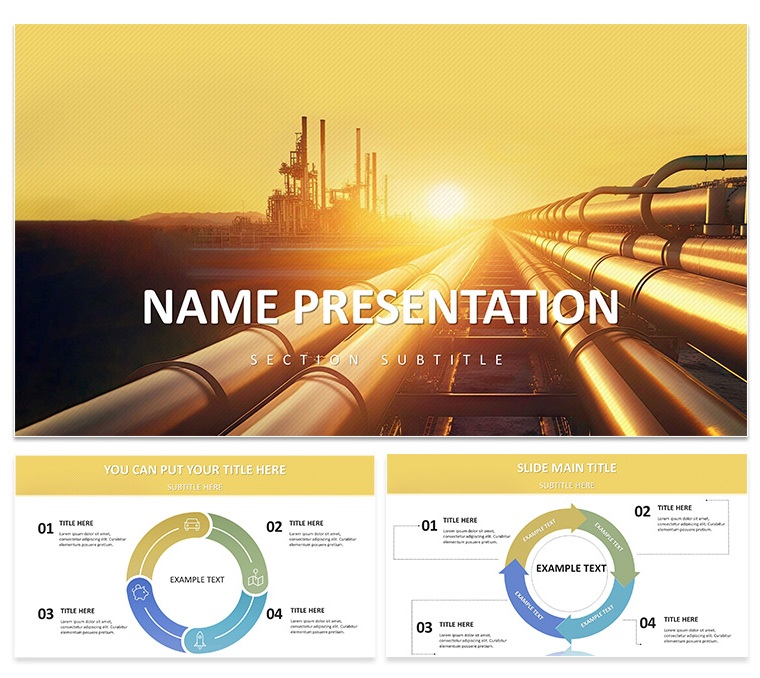
Picture a project manager at a leading engineering firm, much like those behind the iconic Sydney Opera House structural analyses, using these slides to visualize load-bearing simulations. The template's hero slide, with its striking image of interlocking industrial pipes, sets a tone of reliability and forward momentum right from the start. As you progress, bullet-point lists morph into hierarchical org charts, while comparison tables juxtapose old versus new production metrics side-by-side, making inefficiencies pop without overwhelming the viewer.
Harnessing Dynamic Features for Industrial Narratives
The true strength of this industrial Keynote template lies in its dynamic features, designed to mirror the interconnected world of energy and production. Start with the customizable title slides, where you can overlay your company logo atop a backdrop of subtle gear motifs, ensuring every presentation feels bespoke. These aren't static placeholders; they're flexible canvases that respond to your inputs, scaling text for readability on any screen size.
Delve deeper into the diagram library, where process flows illustrate everything from oil extraction stages to wind turbine assembly lines. Each of the 28 diagrams comes pre-animated for subtle transitions - think a pipeline filling with color as data points activate - keeping audiences engaged without distracting from your points. And with seven color schemes, you can align visuals to sector-specific palettes: vibrant oranges for high-energy solar initiatives or muted grays for heavy machinery overviews.
- Picture Galleries for Impact: Embed high-res photos of site inspections or equipment prototypes directly into gallery layouts, with built-in cropping tools to maintain aspect ratios.
- Infographic Timelines: Map project milestones along a conveyor-belt style axis, perfect for demonstrating phased rollouts in manufacturing upgrades.
- Data Tables with Visual Cues: Highlight key figures - like throughput rates or energy yields - with conditional formatting that echoes your chosen color scheme.
Customization is intuitive: select a diagram, swap in your dataset via Keynote's native charts, and watch it reform instantly. For environmental organizations pitching conservation efforts, swap the industrial theme for eco-tones, transforming a standard report into a persuasive call to action.
Step-by-Step: Building Your First Industrial Deck
- Select Your Master: Choose from three layouts - minimal for data-heavy talks, illustrative for creative pitches, or balanced for mixed audiences.
- Populate Core Slides: Insert your agenda into the opener, then layer in diagrams for key sections like "Operational Efficiency" or "Sustainability Metrics."
- Refine Visuals: Adjust color schemes to match client branding, and add hyperlinks to detailed appendices for deeper dives during Q&A.
- Test Flow: Rehearse with Keynote's presenter view, ensuring animations align with your pacing for a seamless delivery.
- Export and Share: Output to PDF for handouts or video for remote teams, preserving all interactive elements.
This workflow has powered countless engineering reviews, turning dense specs into digestible stories that secure buy-in from executives who speak in bottom-line terms.
Real-World Applications in Energy and Production
Beyond the basics, this template shines in targeted scenarios where precision meets persuasion. For energy companies unveiling quarterly performance, leverage the comparison slides to juxtapose fossil fuel dependencies against rising renewables adoption, using pie charts that segment market shares with precision lines. An engineering firm might deploy the timeline diagrams to chart a bridge construction sequence, annotating delays with corrective icons for transparent stakeholder updates.
In production enterprises, the gallery layouts become showcases for product prototypes - think automotive parts rendered in 3D alongside spec tables. Environmental groups, drawing inspiration from reports like those from the International Energy Agency, can adapt the process flows to depict carbon capture cycles, emphasizing closed-loop systems that appeal to policy makers.
What sets this apart from vanilla Keynote defaults? Where basic templates offer rigid grids, this one provides layered vectors that scale without pixelation, ideal for large-format projections at industry conferences. Plus, the embedded icons - a library of 50+ symbols from valves to solar panels - let you punctuate points with relevance, avoiding the generic clipart trap.
Consider a sales engineer preparing for a client demo: instead of fumbling with ad-hoc builds, they drag-and-drop a flowchart to outline integration steps, color-coding phases for quick comprehension. The result? A deck that not only informs but inspires confidence in your expertise.
Tips for Maximizing Template Impact
To elevate your presentations, pair diagrams with concise narratives - aim for no more than five lines per slide to combat audience fatigue. Integrate subtle animations, like fade-ins for data reveals, to build suspense around key insights. For hybrid events, ensure font choices (sans-serif like Helvetica for body text) render crisply on both Mac and shared screens.
Workflow integration tip: Link this template to your project management tools via Keynote's export features, creating live-updating charts from Google Sheets for real-time production dashboards. It's these thoughtful touches that transform a good pitch into a great one.
Why This Template Fits Your Industrial Needs
In a field where first impressions can clinch multimillion-dollar deals, the Versatile Industrial Keynote Template delivers reliability wrapped in visual sophistication. It's not about flashy effects; it's about amplifying your voice through designs that underscore dependability and innovation. Whether you're an energy executive mapping grid expansions or a production lead forecasting yields, these slides bridge the gap between raw data and strategic vision.
Ready to forge connections that power progress? Download this versatile industrial Keynote template today for just $22 and start building decks that stand as strong as the industries they represent.
Frequently Asked Questions
Is this industrial Keynote template compatible with older versions?
Yes, it's fully compatible with Keynote 2016 and later, ensuring smooth performance across recent macOS updates.
How many color schemes are included?
There are seven color schemes tailored for industrial themes, from high-contrast for technical charts to softer palettes for sustainability focuses.
Can I customize the diagrams for my branding?
Absolutely - each of the 28 diagrams is vector-based and editable, allowing you to swap colors, fonts, and data effortlessly.
What file formats are provided?
You'll receive .key, .kth, and .jpg files for full Keynote integration and preview purposes.
Is it suitable for non-designers?
Yes, the intuitive layouts and drag-and-drop elements make it accessible for anyone familiar with basic Keynote functions.