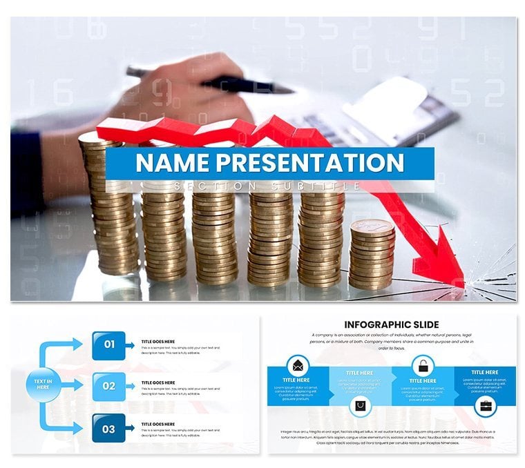
In the fast-paced world of business analysis, where data deluges threaten to drown key messages, a standout presentation can be the lifeline that pulls stakeholders aboard. Enter the Analytical Reports Keynote Template - a streamlined powerhouse designed for finance whizzes, consulting teams, and business analysts who need to dissect numbers and narratives with surgical precision. This template isn't about flashy distractions; it's about forging paths through complexity, turning raw metrics into compelling stories that drive decisions.
Crafted with a minimalist aesthetic in cool blues and grays that evoke trust and focus, it packs 28 versatile diagrams across seven sophisticated color schemes. Whether you're charting quarterly earnings trends or breaking down market forecasts, these elements scale to fit your data's depth. Three master layouts provide a consistent backbone - ideal for reports that span executive summaries to granular appendices - while the intuitive Keynote interface lets you iterate without friction.
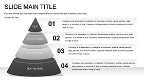
Think of a consulting firm wrapping up a client audit: the funnel diagram visualizes revenue leaks with layered transparency, revealing bottlenecks that prompt immediate action. Or a finance lead presenting variance analysis, where the waterfall chart cascades adjustments like a balanced ledger. Compatible with Keynote 2016+, it slots right into your macOS routine, complementing tools like Excel for seamless data imports. The payoff? Reports that don't just inform but inspire confidence, positioning you as the go-to expert in the room.
Essential Features for Precision Reporting
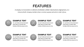
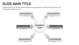
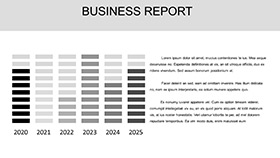
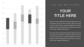
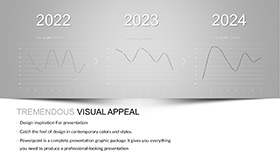
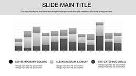
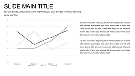
This template's strength lies in its deliberate design choices, prioritizing readability and adaptability over ornamentation. The three backgrounds - subtle gradients from slate to steel - frame content without competing, ensuring your analytics take center stage. Dive deeper, and the 28 diagrams reveal a toolkit honed for analytical rigor: bar clusters for multi-series comparisons, line graphs that trace correlations with elegant curves, and scatter plots pinpointing outliers like hidden gems in a dataset.
- Seven Tailored Color Schemes: From monochromatic neutrals for formal audits to accented palettes that highlight KPIs, each scheme maintains accessibility standards for color-blind viewers.
- Modular Diagrams: Vector graphics that resize flawlessly, with editable axes and legends that update automatically as you tweak inputs.
- Smart Layouts: Pre-set alignments for text and charts reduce manual fiddling, letting you focus on interpretation over formatting.
Such features prove invaluable in high-stakes scenarios. A business analyst might layer the matrix diagram with SWOT elements, color-coding strengths in green to mirror growth potential - echoing how firms like McKinsey structure their diagnostic slides for maximum impact.
Real-World Applications: From Boardroom to Briefcase
For finance teams, this template excels in earnings calls, where the stacked area chart illustrates portfolio performance over time, segmenting asset classes with precision that uncovers allocation insights. It sidesteps the clutter of default Keynote charts, offering instead a clean canvas that amplifies trends without visual noise.
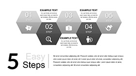
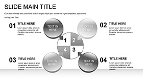
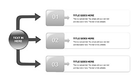
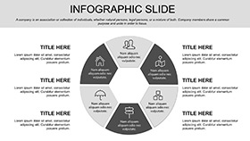
Consultants will find it indispensable for client deliverables. Use the process flow to map operational efficiencies, arrowing through stages with data annotations that quantify ROI - transforming abstract recommendations into tangible roadmaps. In one instance, a strategy advisor adapted the radial distribution for customer segmentation, radiating personas from a central metric hub, which clarified targeting strategies in a way that sparked immediate buy-in.
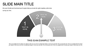
Even solo analysts benefit, crafting internal memos with the gauge diagram to benchmark KPIs against targets, the needle's arc providing an at-a-glance verdict on progress. These applications highlight the template's edge over basic tools: it doesn't just plot data; it contextualizes it, fostering discussions that lead to smarter strategies.
Mastering Customization: A Quick Workflow
- Import Your Data: Link to spreadsheets via Keynote's table tools, populating placeholders in seconds.
- Refine Visuals: Select a diagram, adjust scales in the inspector panel, and apply your chosen color scheme for instant cohesion.
- Enhance Narratives: Add callout boxes to charts, using build effects to reveal insights sequentially during delivery.
- Export and Share: Render to PDF for distribution or rehearse in presenter view for polished delivery.
This process integrates fluidly with analysis software, turning hours of manual charting into minutes of refinement. Versus piecing together ad-hoc slides, it delivers consistency that builds your professional brand.
The Edge That Defines Professional Analysis
What elevates this template beyond standard fare is its commitment to subtlety - diagrams that whisper insights rather than shout, layouts that breathe space around numbers for better comprehension. It's informed by best practices in data visualization, much like Edward Tufte's principles of graphical integrity, ensuring every element serves the story.
Feedback from users underscores this: a finance director noted how the template's clean lines made variance reports digestible for non-experts, bridging the gap between quants and executives. It's these bridges that matter, turning data dumps into decision drivers.
Step up your reporting game - grab the Analytical Reports Keynote Template now and let your insights roll out with undeniable clarity.
Frequently Asked Questions
Can I input complex datasets?
Yes, diagrams support dynamic linking to external sources, handling large arrays with ease.
Is design experience necessary?
No, the drag-and-drop interface and auto-formatting make it accessible to all levels.
Does it support animations for reports?
Built-in builds reveal data progressively, ideal for guided walkthroughs.
How do color schemes affect accessibility?
All schemes follow WCAG guidelines, with high contrast for readability.
Is it compatible with older Keynote versions?
Optimized for 2016+, but backward-compatible tweaks are straightforward.
