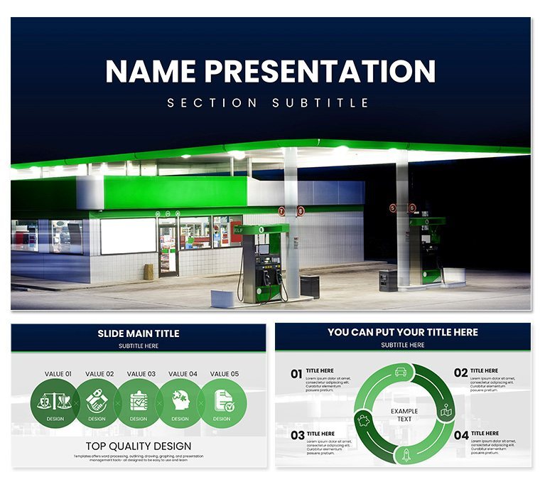
In the fast-paced world of fuel retail, where margins are tight and competition pumps harder every day, your presentations need to deliver impact as reliably as a full tank. Enter the Gas Station Business-Themes Keynote Template, a powerhouse designed for station owners, energy executives, and operations managers who turn data into decisions. Boasting 28 dynamic diagrams in seven tailored color schemes, this template fuels your narrative with visuals that resonate - think pump icons syncing with sales timelines or efficiency maps plotting route optimizations. It's not just about showing numbers; it's about igniting strategies that keep your business running smooth and profitable.
Engineered for High-Octane Presentations
This template's foundation rests on three master layouts and three background styles, offering the structural integrity to build decks that withstand scrutiny. Editable in Keynote from version 2016 up, it supports Mac and iPad workflows, with .key and .kth files ready for immediate integration. Customize pump graphics to reflect your branding, adjust fuel flow charts to highlight peak-hour surges, or layer in geo-tagged station photos for a localized touch - all without breaking a sweat.
The real drive comes from its thematic depth: elements like nozzle silhouettes and tank gauges aren't gimmicks; they're intuitive cues that make complex logistics feel approachable. Whether forecasting inventory or analyzing competitor pricing, these slides accelerate understanding, turning passive viewers into active allies.
Standout Features for Fuel Industry Wins
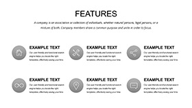
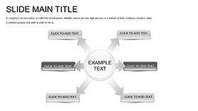
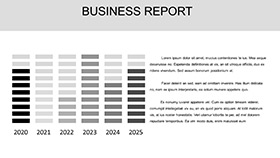
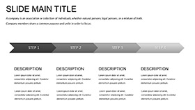
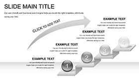
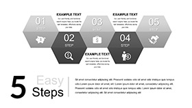
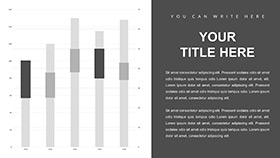
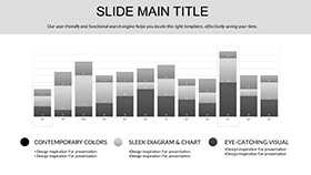
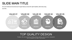
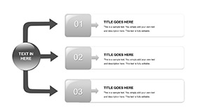
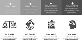
- Diagram Diversity: 28 options, from bar graphs tracking fuel volumes to process flows for supply chain tweaks.
- Brand-Aligned Customization: Swap colors to match your station's signage, ensuring every slide feels like home turf.
- Intuitive Navigation: Layered masters simplify updates, keeping your focus on strategy over styling.
- Impactful Calls: Embedded prompts for next steps, like investment asks, phrased to propel discussions forward.
Practical Scenarios That Power Progress
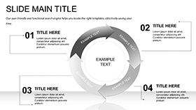
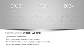
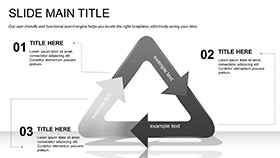
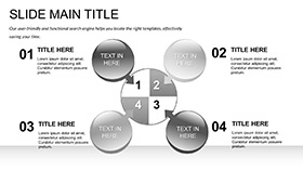
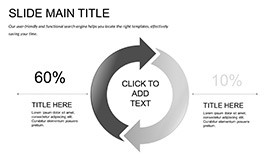
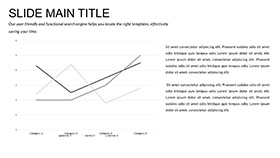
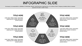
Envision a regional manager gearing up for a franchise review: she populates the template's radial charts with station performance metrics, contrasts year-over-year growth via line graphs, and spotlights efficiency gains from LED upgrades in a dedicated infographic. The outcome? Stakeholders nod in approval, budgets expand, and expansion plans accelerate. Or take a consultant advising on green initiatives - use the template's cycle diagrams to illustrate biofuel transitions, weaving in regulatory nods for credibility, all while the earthy tones ground the eco-message.
For daily ops, it's invaluable in shift briefings. Map delivery schedules with timeline slides, forecast demand spikes using predictive scatters, and debrief incidents via cause-effect layouts. This isn't filler; it's fuel for informed actions that cut costs and boost uptime, proving your template investment pays off in operational edge.
Your Roadmap to a Polished Deck
- Pick Your Palette: Opt for metallic blues for corporate polish or fiery oranges to energize investor meets.
- Input Essentials: Load sales data into core charts, resizing icons to fit your station's scale.
- Enhance with Insights: Annotate diagrams with notes on market trends, drawing from recent industry shifts.
- Refine Flow: Sequence slides logically, testing transitions for that seamless drive-through feel.
- Launch and Learn: Present confidently, then iterate based on feedback for even sharper future runs.
Versus cobbling together basic Keynote shapes, this template revs up efficiency, delivering pro-level polish that basic tools just can't match.
The Edge That Keeps You Ahead
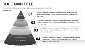
What sets this apart in a sea of bland business slides? Precision engineering, inspired by lean design thinking where every pixel propels purpose. The funnel diagrams for lead conversion, for example, mirror actual station queues, making abstract sales funnels concrete. And with restrained animations that simulate fuel flow, your deck moves with momentum, holding attention like a well-timed price drop.
Energy presentations often stall on dry data dumps, but here, thematic cohesion keeps the throttle open. Three backgrounds prevent visual fatigue, while the masters enforce uniformity, crafting a deck that's as dependable as your pumps. It's the subtle difference between informing and inspiring action.
Time to shift your presentations into high gear? Secure this template for $22 and start driving those breakthroughs today.
Frequently Asked Questions
Does it work with older Keynote versions?
Yes, fully compatible from 2016, ensuring broad accessibility across your team.
Are the diagrams vector-based?
Indeed, scalable vectors keep quality crisp at any zoom, perfect for large-screen displays.
Can I add my own photos?
Easily - drag in station shots or charts, with placeholders guiding seamless integration.
Is there support for animations?
Built-in options add subtle motion, like flowing lines for trend visuals.
How versatile are the color options?
Seven schemes cater to everything from conservative reports to bold pitches.
What's the aspect ratio?
Standard 16:9 for widescreen compatibility in meetings and projections.
