In a data-saturated world, standing out means visualizing with intent. The Analytical Graphics Keynote Template arms finance and accounting experts with tools to transform spreadsheets into strategic showcases, perfect for client deep-dives or team huddles. Featuring 28 diagrams across three masters and backgrounds, its sleek lines and neutral tones - punctuated by strategic greens - convey reliability and revelation.
From Sankey flows tracing transaction paths to bubble charts clustering risk factors, every element invites exploration. A portfolio manager customized the trend analyzer to forecast portfolio shifts, clinching a major allocation by making volatility vivid. Built for Keynote 2016+, it syncs effortlessly with your tools. Acquire it for $22 and elevate from reports to revelations.
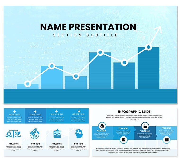
Foundational Tools for Visual Victory
Seven color schemes per diagram ensure thematic alignment, while layouts range from dense matrices to airy overviews. Icons for metrics like variances and benchmarks add precision, with scalable vectors guarding against distortion in zooms.
- Graphic Arsenal: Heat maps for outlier detection, Gantt for project timelines in audits.
- Slide Strategies: Comparison panels for scenario modeling, dashboard hubs for KPI tracking.
- Adaptability Aids: Layered placeholders for annotations, enhancing interpretability.
Together, they forge presentations that dissect and delight.
Refining for Relevance
Select a master, input variables, and iterate - recolor a radar chart to spotlight strengths in competitor analyses. Key hack: Use grouping to isolate data series, streamlining multi-variable reveals.
- Feed in CSV files for chart auto-population.
- Overlay trend lines manually for nuanced forecasts.
- Calibrate builds to unveil insights progressively.
This yields tailored visuals that speak your language.
Scenarios That Spotlight Strength
Accountants deploy the ledger flow for reconciliation walkthroughs, clarifying discrepancies with arrowed paths. Consultants harness the matrix for SWOT integrations, balancing qualitative with quantitative. Unlike rigid stock options, its finance-tuned motifs - like balance scales - lend authority.
In board settings, the projection slide simulates outcomes, outpacing basic builds with interactive toggles. LSI integration, such as "variance thresholds," embeds naturally for contextual depth.
Edges Over Everyday Edits
Plain Keynote lacks the analytical edge; this template delivers with pre-vetted diagrams that import cleanly from tools like Tableau. Print-ready masters suit formal distributions.
Collaborate via shared links, then lock in with watermarks for IP protection. Result: Analytics that advance agendas.
Boost Your Briefing Bandwidth
Outline with the navigator slide, segment into analytics blocks. Appendix templates host raw data dumps. Export to web for ongoing dashboards.
A risk officer used the sensitivity grid for stress tests, sharpening executive focus. Versatility defines its value in fiscal flows.
Unlock analytical artistry - download for $22 and graph your gains.
Frequently Asked Questions
Are diagrams vector-based?
Yes, ensuring scalability and crispness at any resolution.
Supports external data imports?
Fully, from Excel to JSON for dynamic content.
Customization time estimate?
Minutes per slide with intuitive drag tools.
Finance-specific features?
Tailored icons and layouts for ledgers and forecasts.
Export options available?
PDF, video, and interactive web formats.