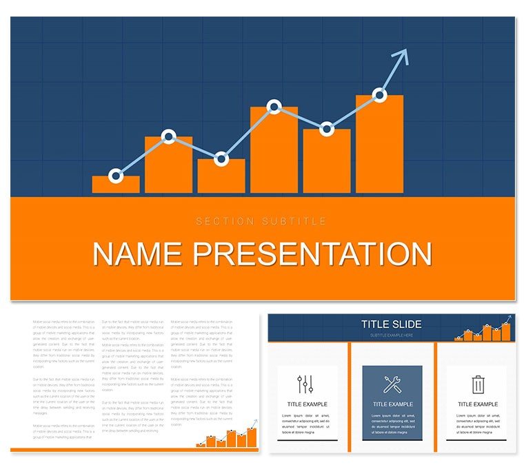
Navigating the world of finance demands clarity amid numbers, and that's where the Financial Graphics Keynote Template steps in as your strategic ally. Tailored for accountants, financial analysts, and business leaders, this collection of 28 diagrams transforms dry data into digestible stories. With three master slides and backgrounds, plus seven color palettes echoing corporate blues and greens, it's primed for boardroom battles or client reviews. Think of it as a ledger that lives - each slide poised to chart revenues, forecast trends, or dissect expenses with precision.
The template's appeal starts with its balance-focused designs. Diagram 3, for example, features a seesaw infographic equating assets and liabilities, perfect for quick balance sheet overviews. Or leverage the funnel in Diagram 10 to illustrate cash flow from inflows to outflows, annotating stages with real metrics. Built for Keynote 2016+, editing is intuitive: resize charts, swap icons for currency symbols, and align everything to your firm's guidelines without a hitch.
Key Elements That Drive Financial Narratives
What sets this apart is the depth of infographic variety. From pie charts segmenting investment portfolios in Diagram 15 to line graphs tracking quarterly performance in Diagram 22, every piece supports data-driven decisions. The three backgrounds - abstract grids, ledger textures, or minimalist whites - let you set a tone that's professional yet approachable.
- Versatile Diagrams: 28 layouts covering timelines, matrices, and radial charts for comprehensive reporting.
- Color Harmony: Seven schemes ensure accessibility and brand alignment, with options for dark mode previews.
- Master Flexibility: Three templates for headers, footers, and transitions that maintain consistency.
These aren't mere placeholders; they're frameworks for insight. A CFO might use the pyramid structure in Diagram 8 to layer budgeting priorities, from essentials at the base to strategic spends at the peak.
Crafting a Balance Sheet Presentation: A Quick Guide
- Choose Your Base: Opt for the ledger background to evoke trust in financial discussions.
- Insert Core Data: Drop Diagram 5's bar comparison into your deck for assets versus liabilities at a glance.
- Enhance with Annotations: Add callouts for variances, linking to detailed appendices.
- Polish Transitions: Use subtle fades between slides to guide viewers through fiscal narratives smoothly.
This approach not only organizes your content but amplifies its impact, making complex figures feel straightforward.
Practical Use Cases in Finance and Beyond
For quarterly earnings calls, adapt Diagram 18's cycle diagram to depict revenue streams - starting with sales, looping through operations, and closing on profits. One financial advisor shared how they repurposed the network map in Diagram 25 for client portfolio diversification, connecting nodes for stocks, bonds, and alternatives.
In consulting gigs, this template excels at scenario planning. Visualize risk assessments with heat maps or SWOT analyses framed as interconnected gears. The beauty lies in scalability: scale up for enterprise reports or down for one-on-one advisory sessions, always retaining sharp visuals.
Pro Tips for Polished Financial Decks
Start with audience empathy - tailor diagrams to their expertise level, simplifying jargon visuals for executives. Integrate live data links if using iWork integrations, updating charts in real-time. And remember, white space is your friend; let numbers breathe to avoid overload. Versus vanilla Keynote tools, this template's pre-built alignments mean less fiddling, more focusing on the fiscal story.
Elevating Your Business Communication Game
Financial pros know that trust hinges on transparency, and this template delivers with clean, authoritative designs. Subtle elements like arrow flows for transaction histories or stacked bars for year-over-year growth add layers of professionalism. Pair it with Keynote's build effects for phased reveals, building suspense around key metrics.
Workflow-wise, export sections to PDF for handouts or embed in reports via Pages. It's a toolkit that grows with you, from startup pitches to annual audits.
Seize the moment to refine your financial storytelling - grab the Financial Graphics Keynote Template today and balance your presentations with ease.
Frequently Asked Questions
Does it integrate with Excel for data import?
Yes, copy-paste charts from Excel into Keynote for seamless updates.
What diagram types are most common?
A mix of bars, lines, pies, and flows tailored to finance visuals.
Can I use it on Windows?
It's Keynote-native, but export to PowerPoint for cross-platform sharing.
How editable are the masters?
Fully - adjust fonts, colors, and layouts globally for consistency.
Is there support for animations?
Built-in options, plus easy addition of Keynote's transitions.
What's the file size for quick loading?
Optimized at under 10MB, ensuring smooth performance.