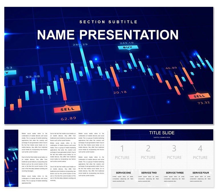
In the fast-paced world of finance, where numbers tell stories of growth, risk, and opportunity, your presentations need to cut through the noise. Enter the Trend Line Graphs Keynote Template, a powerhouse for market analysts, accountants, and business strategists who demand precision and polish in every slide. With 28 specialized diagrams focused on line graphs that trace market movements, revenue trajectories, and investment forecasts, this template transforms raw data into compelling visuals that drive decisions. Backed by three master slides for structured layouts and three background styles - from sleek gradients to subtle grids - this design ensures your financial narratives flow seamlessly, whether in a boardroom briefing or a client webinar.
What sets this apart is its laser focus on usability amid deadline pressures. Forget wrestling with default Keynote tools; here, editable line graphs auto-scale with your datasets, color-coded peaks and valleys highlight bullish or bearish turns, and forecast extensions project future scenarios with ease. Seven color schemes cater to corporate palettes or thematic reports, like warm tones for bullish markets or cools for risk assessments. It's crafted for those moments when a single glance at a slide can sway investors or align teams, turning what could be a monotonous data dump into a strategic conversation starter.
Essential Features Powering Your Financial Visuals
The template's backbone is its trio of master slides: one optimized for executive summaries with prominent graph placeholders, another for detailed breakdowns featuring multi-axis lines, and a third for appendices with expandable notes. Backgrounds provide flexibility - a clean white for print-ready reports, a dark mode for late-night strategy sessions, or a textured overlay evoking stock tickers.
At the heart are the 28 diagrams, each a refined tool for financial storytelling. Core line graph slides allow multi-series plotting for comparing stock performances, while advanced ones incorporate error bars for volatility analysis. You'll appreciate the scatter plot hybrids for correlation studies between interest rates and asset values, all with drag-and-drop data import from Excel.
- Dynamic Graph Tools: Lines that curve smoothly for exponential growth models, with markers for key data points like quarterly earnings.
- Integrated Icons: Finance-specific symbols such as arrows for trends and shields for risk indicators, scalable without pixelation.
- Build Animations: Sequential reveals that trace lines from origin to endpoint, building suspense in trend reveals.
These elements combine to create decks that not only inform but persuade, saving hours on revisions.
Practical Use Cases in Market Analysis and Beyond
Envision a portfolio manager prepping for a client review: she pulls up slide 15, a multi-line graph template, inputs recent ETF performances, and adjusts the scheme to match her firm's branding - voilà, a slide that spotlights diversification benefits. Or a startup CFO mapping cash flow projections; using the timeline-infused line graphs on slide 22, he layers in scenario branches, making 'what-if' discussions tangible.
Getting hands-on is straightforward: Launch in Keynote, choose your master, and populate graphs via copy-paste from spreadsheets - formulas even carry over for live updates. Step three: Fine-tune axes for logarithmic scales in volatile markets, then test animations to ensure smooth playback. This template excels in annual reports, where stacked lines dissect revenue streams, or pitch decks illustrating growth trajectories to venture capitalists.
For team collaborations, the editable masters facilitate version control, ensuring everyone - from interns to execs - stays on-brand.
Pro Tips for Data-Driven Presentations
To amplify impact, layer subtle shadows on lines for depth without clutter, and limit series to three per graph for focus. During rehearsals, toggle backgrounds to match venue lighting - dark schemes shine in dim conference halls. Hyperlink trend peaks to source footnotes, fostering trust in your analysis. In a recent trading seminar, an analyst used these graphs to demo pattern recognition, turning abstract concepts into actionable insights that attendees applied immediately.
Effortless Compatibility for Busy Professionals
Built for Keynote 2016+, it syncs across devices, with .key files for full edits and .th for themes. Export to PDF or video for hybrid events. For $22, unlock visuals that elevate your financial expertise.
Seize the trends - download today and graph your path to persuasive presentations.
Frequently Asked Questions
Are the line graphs data-linked in this Keynote template?
Yes, they support direct import from spreadsheets, updating automatically as data changes.
What file formats are included?
.key for editable files and .th for theme imports, compatible across platforms.
Can I customize colors beyond the schemes?
Absolutely, each element's colors are individually adjustable for perfect brand alignment.
Is it suitable for non-finance trends?
The graphs adapt easily to sales, population, or any time-series data.
How many diagrams focus on lines?
All 28 are line-centric, with variations for single, multi, and projected series.
Does it include export options?
Yes, seamless exports to PDF, images, or video for versatile sharing.