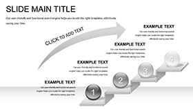
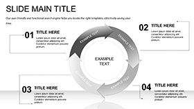
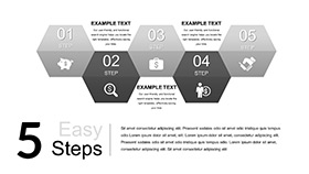
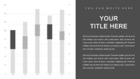
The cryptocurrency world moves at lightning speed - prices soaring one hour, dipping the next - and your presentations must match that dynamism to keep traders, investors, and analysts engaged. The Bitcoin: Cryptocurrency Prices Keynote Template is your ally in this volatile arena, offering 28 diagrams precision-built for charting price histories, volume spikes, and blockchain metrics. With three master slides for varied layouts and three backgrounds that evoke digital ledgers or futuristic grids, this tool empowers finance pros to dissect market narratives without getting lost in code or charts.
Designed for the crypto enthusiast who juggles wallets and whitepapers, it tackles the challenge of making abstract data tangible. Editable price line slides capture candlestick patterns or OHLC bars, while seven color schemes - from metallic silvers for blockchain themes to fiery reds for alert zones - let you signal bull runs or corrections intuitively. Whether explaining wallet security to newbies or forecasting token valuations in a fund pitch, these visuals bridge the gap between tech jargon and strategic insight, ensuring your deck doesn't just show numbers but sparks informed dialogue.
Key Components for Crypto Presentation Mastery
Start with the masters: a header-focused one for session titles with crypto icons, a data-dense variant for multi-chart dashboards, and a closer slide for Q&A prompts. Backgrounds include a subtle hex pattern for tech vibe, solid blacks for dramatic reveals, and light modes for daylight demos.
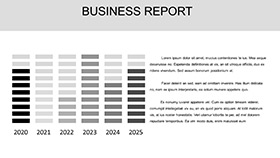
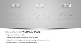
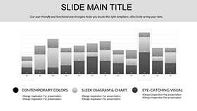
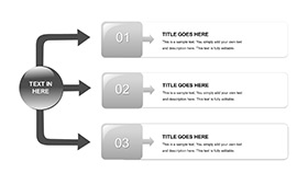
The 28 diagrams cover the crypto spectrum - bar charts for transaction volumes, pie slices for market caps, and specialized radar plots for token comparisons. A standout is the volatility heatmap slide, where you layer historical data to visualize risk clusters, all scalable for altcoins beyond Bitcoin.
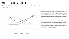
- Price Tracking Tools: Line and area graphs with logarithmic scales for exponential price histories.
- Crypto Icons Set: Symbols like coins, keys, and nodes for annotating blockchain flows.
- Transition Effects: Fade-ins that simulate price ticks, adding real-time feel to static slides.
Together, they form a robust system for presentations that adapt as fast as the markets.
From Trade Floors to Investor Meets: Targeted Scenarios
Think of a day trader recapping weekly swings: on slide 18, he customizes a combo chart to overlay Bitcoin with Ethereum, tweaking colors to highlight correlations - suddenly, his insights on diversification land with visual punch. A venture scout pitching a DeFi project might use the funnel diagrams on slide 25 to map user adoption, inserting live metrics for credibility.
Implementation is a breeze: Import into Keynote, select a diagram, and paste CSV price feeds - the graphs refresh instantly. Next, align axes for multi-timeframe views, like daily vs. monthly, and preview builds to time reveals with your narrative. Ideal for webinars on NFT trends or reports on mining economics, where clarity wins trust.
Collaborators appreciate the theme files for consistent styling across team decks.
Strategies to Amplify Your Crypto Decks
Enhance with tooltips on interactive exports, or embed QR codes linking to live charts for follow-ups. Choose schemes that contrast for color-blind viewers, and rehearse with varied data sets to handle surprises. During a recent crypto summit, a presenter leveraged these for a halving event breakdown, using radial timelines to project post-event shifts - the session became a highlight, drawing follow-on consultations.
Plug-and-Play for Modern Workflows
Works with Keynote 2016 onward, across Apple ecosystem, with easy .key sharing. At $22, it's the smart buy for staying ahead in crypto comms.
Don't let prices puzzle - grab the template and chart your crypto success story.
Frequently Asked Questions
Does this template support candlestick charts?
Yes, several diagrams include candlestick formats, editable for custom time intervals.
Is data import from exchanges possible?
It handles CSV/Excel imports seamlessly, ideal for feeds from major exchanges.
Can I add altcoin data easily?
Absolutely, the multi-series graphs accommodate any crypto pair or token set.
What backgrounds are themed for crypto?
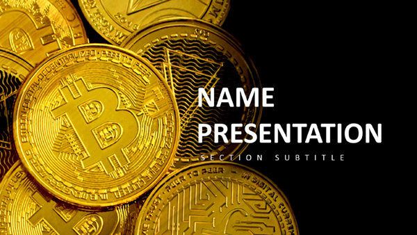
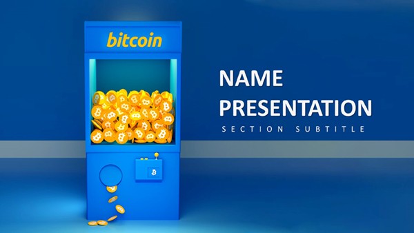
Three options, including digital grid and metallic gradients for a blockchain aesthetic.
Are animations crypto-specific?
They include tick-like builds to mimic price movements, fully customizable.


