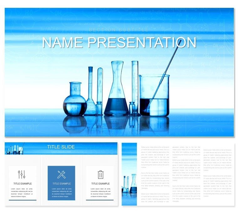
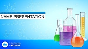
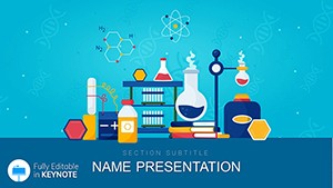
Picture this: your slides aren't just charts on a screen - they're windows into a healthier planet, where every pollutant trend and remediation strategy comes alive with purpose. The Environmental Chemistry Keynote Template is crafted for environmental scientists, policy advocates, and sustainability consultants who aim to turn dense data into persuasive narratives. Boasting 28 specialized diagrams - like pollutant dispersion maps and biodegradation cycles - this set equips you to tackle topics from water quality assessments to climate impact models. Three masters provide structural variety, while seven color schemes draw from earth's palette: lush greens for growth phases, stark grays for contamination zones, all editable to reflect your fieldwork hues.
Ideal for NGO briefings, academic symposia, or corporate ESG updates, this template bridges the gap between lab results and real-world action. Fully compatible with Keynote 2019+, it supports effortless tweaks, from resizing ecosystem icons to syncing timelines with seasonal data. For $22, you gain a toolkit that not only saves design drudgery but amplifies your message, inspiring change one slide at a time.
Essential Features Tailored for Eco-Chemistry Narratives
At its heart, this template excels in features that mirror the interconnectedness of environmental systems. The 28 diagrams cover essentials like Sankey flows for energy transfers in ecosystems and radial plots for biodiversity metrics, each with layered elements for depth without complexity. Vector graphics ensure they scale for billboards or laptops alike, maintaining sharpness in any venue.
- Versatile Masters: Opt for the overview master to frame global issues, the detail-oriented one for site-specific analyses, or the call-to-action style for policy recommendations, all unified by eco-friendly sans-serif fonts.
- Background Choices: Three themes - a textured earth layer for organic feels, a circuit-like pattern for tech interventions, and a pristine blue for aquatic focuses - set contextual moods subtly.
- Color Harmony: Seven schemes calibrated for visibility in dim conference halls, with high-contrast options for projecting soil pH gradients or atmospheric CO2 levels.
Workflow perks include direct data linking from CSV files, auto-updating your contamination heatmaps as new samples arrive. It's like having a field notebook that animates itself.
Guided Workflow: Crafting Impactful Eco-Presentations
Launch into your project by selecting a master that aligns with your talk's arc - perhaps the narrative one for a river restoration case. Populate with your TOC levels via the bar chart slide, adjusting scales to highlight thresholds, then adorn with icons of wetlands or recyclers from the built-in library.
- Structure your content: Leverage the mind-map slide to outline from pollution sources to mitigation tactics.
- Embed real data: Import spectrometry readings, letting the template's smart guides align legends automatically.
- Enhance engagement: Add gentle transitions to reveal before-and-after bioremediation photos.
- Finalize delivery: Export to video for virtual webinars, preserving interactive hyperlinks to source studies.
This methodical approach ensures your presentation flows as naturally as a restored watershed.
Practical Use Cases: Driving Environmental Advocacy
Deploy this template in the trenches of change-making. An ecotoxicologist might use the cycle diagrams to illustrate microplastic lifecycles during a UN forum, making abstract threats tangible for diplomats. In academia, professors adapt the infographics for soil remediation lectures, swapping in regional data to spark student debates on sustainable agriculture.
For corporate users, it's perfect for annual sustainability decks: visualize carbon footprints with donut charts, customizing segments to track offsets accurately. Even community organizers find value, simplifying groundwater reports for town halls with clear icons that demystify nitrate levels.
Pro Tips for Eco-Visual Excellence
Maximize reach by incorporating Keynote's build effects - staggered reveals on food web diagrams build suspense around keystone species. Stick to one focal visual per slide to combat audience overload, using the template's generous margins for breathing room. For global teams, the universal .kth export keeps formats intact across time zones.
Versus vanilla Keynote slides, this elevates with purpose-built assets, freeing you to emphasize solutions over setup.
Elevate Your Green Story with This Template
Distinctive for its fusion of scientific accuracy and advocacy appeal, this template outpaces generics with foliage motifs and equilibrium symbols that resonate deeply. The color sets prioritize sustainability - recycled hues that pop without waste. Edit every node in your process maps to evolve with emerging research.
Secure your Environmental Chemistry Keynote Template for $22 now and let your slides cultivate the urgency our planet needs.
Frequently Asked Questions
Is this template suitable for non-scientists?
Yes, its intuitive designs make complex eco-data accessible for advocates and policymakers alike.
How many customization options are available?
With 28 diagrams and 7 colors, plus full editability, options are extensive for personalization.
Can I use it for virtual presentations?
Absolutely, optimized for screen sharing with hyperlinks and animations intact.
What file formats are provided?
Includes .key and .kth for easy Keynote import and sharing.
Are eco-specific icons included?
Yes, featuring leaves, water drops, and recycling symbols for thematic depth.
Does it support data imports?
Yes, compatible with CSV and Excel for dynamic chart updates.