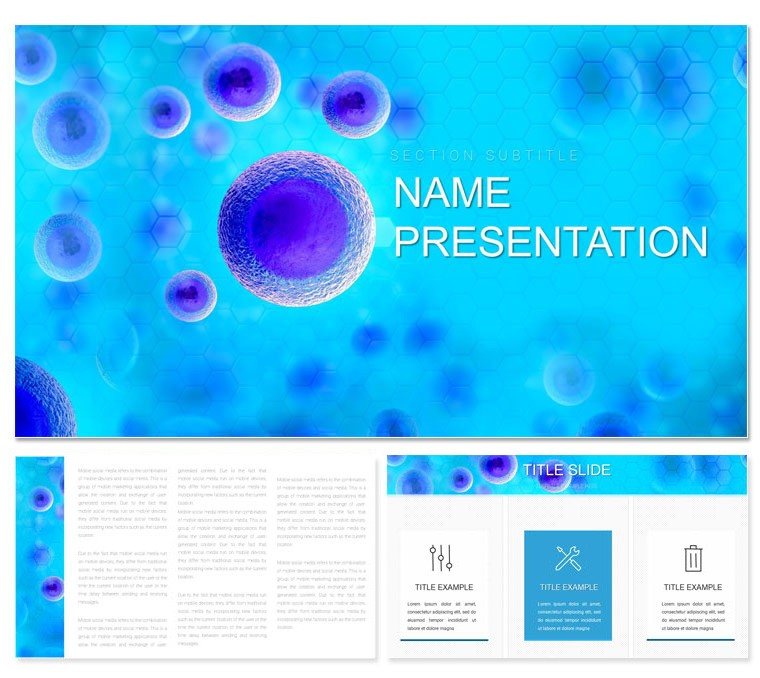
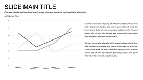
Picture a conference hall where your breakthrough in microbial genomics doesn't get lost in jargon but sparkles through crystal-clear visuals. The Microbiology and Bioinformatics Keynote Presentation Template turns that vision into reality, empowering researchers to distill intricate datasets into compelling narratives. With 59 editable slides, including 28 specialized diagrams in seven soothing color schemes of greens and blues - echoing the vibrant hues of petri dishes and sequence maps - this tool is a game-changer for anyone navigating the micro-world.
Tailored for bioinformaticians who spend hours wrangling code and cultures, it features three master layouts for seamless section transitions and three backgrounds that evoke lab sterility with a touch of organic flow. Forget fumbling with default charts; here, a network diagram can map gene interactions with drag-and-drop nodes, or a heatmap slide reveals mutation patterns at a glance. Compatible with Keynote from version 09, it integrates effortlessly into your workflow, whether prepping for a grant panel or a classroom demo.
This isn't just about aesthetics - it's about acceleration. Educators use these to break down CRISPR mechanics for undergrads, while industry pros pitch pipeline efficiencies to stakeholders. The subtle sophistication lies in its balance: clean lines that respect scientific rigor without sacrificing engagement. Step up your presentations and let your discoveries drive the conversation. Download now for $22 and code your way to clearer communication.
Essential Features for Scientific Precision
Precision defines your field, and this template delivers it in spades. The 28 diagrams are engineered for bioinformatics demands - think scatter plots for sequencing alignments or Sankey flows for metabolic pathways, all vector-sharp and resizable. Seven color schemes adapt to data types: verdant greens for healthy samples, oceanic blues for fluid dynamics, ensuring readability under any lighting.
- Three Master Layouts: Dedicated setups for abstracts, methods, and results keep your structure intuitive, freeing mental bandwidth for content refinement.
- Three Background Options: From grid-patterned labs to faint waveform overlays, they ground your slides in thematic relevance without clutter.
- Interactive Elements: Layered builds let you animate phylogeny trees, revealing evolutionary branches step by step for audience absorption.
These features shine in practice: A postdoc might customize a Venn diagram to overlap microbiome datasets, highlighting overlaps in antibiotic resistance - editable labels make iterations painless.
Practical Use Cases in Research and Academia
Envision pitching your latest algorithm at a symposium. Launch with a mind map outlining your pipeline, then pivot to bar graphs comparing runtimes - colors pop to differentiate variants. As Q&A looms, a flexible pie chart summarizes findings, ready for on-the-spot tweaks based on tough questions. This template's modularity turns potential stumbles into confident strides.
In educational webinars, layer sequence logos over alignments to teach motif detection, with animations unveiling conserved regions progressively. Lab directors have leveraged the Gantt-style timelines for project roadmaps, syncing milestones with funding cycles for board buy-in. It's versatile across scales - from journal club recaps to TED-style keynotes on synthetic biology.
- Outline Import: Paste your abstract into title masters, auto-formatting for consistency.
- Data Visualization: Link diagrams to external spreadsheets for live updates during rehearsals.
- Polish and Present: Apply transitions mimicking molecular bonds - subtle snaps that underscore connections.
- Archive for Impact: Share static exports with collaborators for asynchronous feedback.
Such applications not only convey complexity but cultivate curiosity, turning viewers into collaborators.
What Sets This Template Apart in Science Communication
Amidst a flood of generic science decks, this stands tall with its domain-specific intuition. Default Keynote tools often force square pegs into round data holes; here, radial charts naturally depict viral phylogenies, complete with customizable arcs for confidence intervals. The palette's biological inspiration - chlorophyll greens fading to azure skies - enhances without distracting, ideal for color-blind inclusive designs.
Researchers in pharma pipelines value the stacked area graphs for throughput tracking, while ecologists adapt bubble charts for species diversity metrics. Cross-platform syncing with iCloud means your MacBook tweaks travel to iPad pros for impromptu office hours. It's not flashy; it's functional, amplifying your expertise where it counts.
Workflow hacks abound: Group diagram sets for themed sections, or embed hyperlinks to GitHub repos within methodology slides. The outcome? Presentations that parse dense info into digestible insights, earning nods from peers and funders alike.
Mastering Customization for Your Lab's Narrative
Your research tells a unique story - let the template echo it flawlessly. Begin with a background that mirrors your focus: waveform for electrophysiology tie-ins or cellular grids for tissue engineering. Diagrams yield to your command - recolor a box plot's whiskers to flag outliers in RNA-seq data, or font-swap to monospace for code snippets.
Advanced users: Leverage shape libraries for custom icons like helices or plasmids, locking groups for repetitive assays. For hybrid events, optimize for remote viewing with high-contrast modes. This adaptability ensures your visuals evolve with your hypotheses, from draft to defense.
Quick Customization Guide
- Batch-apply schemes via the color picker for dataset harmony.
- Use alignment tools to snap elements, mimicking crystal lattices.
- Preview in presenter mode to fine-tune build timings against your script.
These steps transform raw data into riveting reveals, tailored precisely to your voice.
Elevate Your Scientific Storytelling Now
As frontiers in microbiology push boundaries, your presentations deserve tools that match that momentum. The Microbiology and Bioinformatics Keynote Template equips you to navigate narratives with finesse, from lab benches to lecture halls. Secure it for $22 today and watch your insights illuminate minds. Your next big share starts here - make it unforgettable.
Frequently Asked Questions
How does this template handle large datasets?
Diagrams support dynamic linking to external files, updating visuals in real-time without manual redraws.
Is it suitable for interdisciplinary talks?
Absolutely, modular layouts bridge biology and computing, ideal for collaborative symposiums.
What file formats are provided?
Downloadable in .key and .kth, fully native to Keynote for zero conversion issues.
Can animations be adjusted for pacing?
Yes, granular controls let you sync builds to your delivery, from quick pops to slow dissolves.
Does it include accessibility features?
High-contrast options and alt-text prompts ensure inclusive viewing for all audiences.
Are updates included post-purchase?
Lifetime access to revisions keeps your template aligned with Keynote evolutions.
