Data isn't just numbers - it's the pulse of progress, beating through boardrooms, clinics, and city halls. The Data Analytics Keynote Template equips you to capture that rhythm, turning vast datasets into compelling tales of trends and transformations. Aimed at analysts in business, healthcare, and public sectors, this collection of 28 diagrams bridges raw info to actionable wisdom, all within Keynote's intuitive frame.
Envision a dashboard slide aggregating metrics from disparate sources, or a cluster map revealing patient outcomes in healthcare - each visual crafted to illuminate without overwhelming. From economic forecasts to educational benchmarks, these slides, optimized for Keynote 2020+, let you embed interactive elements like drill-down tables, fostering discussions that drive change. It's about making the invisible visible, one slide at a time.
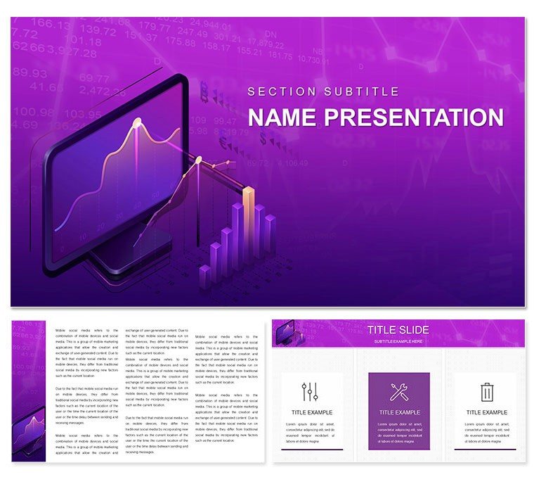
Analytics Arsenal: Features Engineered for Depth and Clarity
Grounded in three masters that balance density with whitespace - think subtle node graphs mimicking neural nets - the template includes three backgrounds for context: a techy grid for IT talks, or a serene blue for policy briefs. The 28 diagrams cover the analytics lifecycle, from data ingestion flows to predictive modeling canvases.
Spotlight the funnel analysis: it narrows user journeys, drop-off points glowing like warning lights in e-commerce reviews. Or the correlation matrix, a heatmap decoding variable ties in economic models. Seven color schemes adapt from cool analytics blues to warm insight ambers, with vector icons scaling for any zoom.
- Interactive Layers: Build-on reveals, like peeling back a Sankey diagram to trace energy flows in sustainability reports.
- Data Binding: Pull from CSV or SQL previews, auto-refreshing as queries evolve.
- Accessibility Built-In: Alt-text ready elements and high-contrast modes for inclusive presentations.
Drawing from practices like those in Google's data studios, a public health coordinator layered incidence rates onto geographic plots, pinpointing outbreak hotspots that informed rapid response plans.
Hands-On Guide: From Dataset to Dashboard
- Open in Keynote: Choose a master and import your dataset - diagrams like scatter plots populate axes instantly.
- Refine patterns: In the regression line slide, add confidence intervals via shape tools for robust forecasts.
- Enhance engagement: Hyperlink clusters to detail views, turning a broad overview into a navigable story.
- Polish transitions: Use Keynote's draw tool to animate data points emerging like stars in a constellation.
These moves streamline your process, emphasizing discovery over drudgery.
Domain Deep Dives: Analytics in Action Across Fields
In business intelligence, the cohort retention curve tracks customer lifecycles, curves bending to reveal churn risks in subscription models. Healthcare pros? Deploy survival analysis timelines to chart treatment efficacies, Kaplan-Meier estimators visualized as stepping paths.
Educators mapping student progress use box plots to compare cohorts, whiskers flagging outliers for interventions. A policy analyst once adapted the network graph for social connections, exposing influence webs in community programs that reshaped outreach strategies.
Versus Vanilla: Why This Template Accelerates Insights
Standard Keynote shapes fall flat on complex correlations; here, pre-built heatmaps and Voronoi partitions add sophistication, saving design detours. For economics, the input-output matrix models sector interlinks, arrows weighted by impact - far beyond basic tables.
In education, radar charts benchmark skills across rubrics, polygons pulsing with progress. It's geared for collaboration too, with shareable .kth files that teams can iterate on in real-time.
Seamless Sync: Fitting Analytics into Your Toolkit
Integrate with Tableau exports or Python plots via image embeds, maintaining fidelity. Schemes include dark modes for late-night crunches. Quick win: Use Keynote's presenter notes for methodology footnotes, keeping slides clean yet comprehensive.
Secure this Data Analytics Keynote Template and let patterns propel your projects to new heights.
Frequently Asked Questions
Which Keynote versions does it support?
Compatible with Keynote 2020 and beyond, including seamless iCloud syncing.
Can diagrams handle large datasets?
Yes, with optimization for up to thousands of points, plus tips for sampling in notes.
How flexible are the color options?
Beyond seven schemes, full RGB control lets you match any corporate or thematic palette.
Is it adaptable for educational analytics?
Perfectly, with simplified visuals for student performance tracking and curriculum mapping.
What file types are included?
.key for detailed work and .kth for theme applications across projects.
Does it include export options for other tools?
Export to PDF or PowerPoint, preserving interactions where possible.