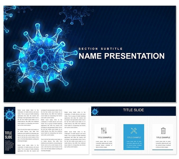
When explaining viral threats, clarity can save lives - or at least reputations. The Virus Infographics Keynote Template equips healthcare presenters with precise visuals to demystify pathogens, from replication cycles to outbreak timelines. Aimed at physicians, researchers, and public health educators, it delivers 28 diagrams via three masters and backgrounds, plus seven color schemes in muted reds and grays that underscore urgency without alarm.
Think of a virologist unpacking mutation patterns: populate a sequence diagram with genomic data, fade in variants step-by-step, and engage your panel effortlessly. This design prioritizes accuracy, with editable elements that honor scientific rigor while inviting adaptation for lectures or grant proposals in Keynote.
Foundational Elements for Precise Communication
Three masters anchor your flow, standardizing notations like scale bars or source citations. Backgrounds vary from sterile lab whites to subtle waveform patterns evoking viral envelopes, setting a tone of controlled inquiry.
Diverse Diagrams for Biological Narratives
The 28 diagrams span essentials: network maps for transmission webs, area charts for epidemic curves. Vectors allow precise tweaks - elongate virion icons, align labels for host-pathogen interactions, or embed hyperlinks to studies.
- Process flows for infection stages
- Ven diagrams comparing strains
- Heat maps for symptom distributions
- Tree structures for evolutionary branches
These tools distill dense info, aiding comprehension in high-stakes settings.
Schemes That Reflect Clinical Depth
Seven options balance visibility: crimson accents for alerts, neutrals for overviews. Recolor to match institutional guidelines, ensuring diagrams remain legible in dim conference halls.
Targeted Uses in Health Education
Public health campaigns demand visuals that stick. For a webinar on containment, use bubble diagrams to size risks by population density, linking to intervention icons. Guide: import prevalence data, scale bubbles dynamically, then sequence pops to simulate spread control.
Researchers presenting at symposia might layer Sankey diagrams for resource flows in trials, customizing widths to reflect funding shifts. This has streamlined defenses in outbreak response teams, fostering informed decisions.
Assembling an Outbreak Briefing
- Pick a focused background to center on urgency.
- Build a core cycle diagram, animating phases from exposure to recovery.
- Add polar area charts for demographic impacts, rotating for emphasis.
- Conclude with a resource slide, integrating contact grids.
This method sharpens focus, turning data deluges into directed dialogues.
Edges Over Generic Slides
Beyond stock images, this template offers scalable precision, exporting crisply to journals or social shares. It syncs with HealthKit for real-time stats or Illustrator for advanced edits, suiting interdisciplinary workflows.
Group viral motifs for thematic consistency, applying uniform glows to highlight mechanisms. It's crafted for those who present truth, not fluff.
Editing Strategies for Accuracy
Align globally with ruler tools, ensuring measurements match biological scales. For teams, version via iCloud, noting changes in comments. Test projections on external displays to verify contrast in varied lights.
Empower your discourse - secure the Virus Infographics Keynote Template and illuminate the unseen.
Frequently Asked Questions
What diagrams are included?
28 specialized ones, from flows to trees, all virus-themed.
Compatibility details?
Works with Keynote 2016+, in .key and .kth.
Customization ease?
Full vector access for shapes, colors, and animations.
Suitable for non-experts?
Yes, intuitive drags simplify scientific tweaks.
Export options?
Supports PDF, video, and image formats natively.