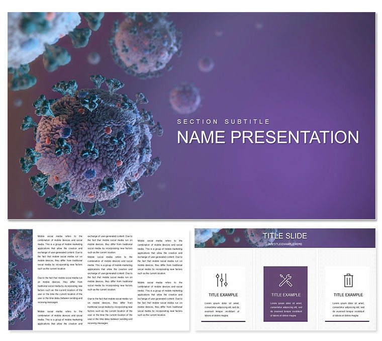
When viral threats loom large, your presentations need to cut through the noise with precision and poise. This Keynote theme emerges as a beacon for those navigating the intricacies of infections like COVID, influenza, or herpes viruses, equipping you with visuals that demystify symptoms and spotlight relief measures. Aimed at pharmaceutical specialists, infectious disease experts, and health policy makers, it delivers 28 diagrams that dissect pathogen behaviors, immune responses, and therapeutic interventions, transforming dense data into compelling stories.
Its framework is elegantly simple yet robust: three masters ensure thematic unity, complemented by three backgrounds that shift from stark clinical to softly illustrative, suiting boardrooms or breakout sessions alike. The seven color schemes - think pathogen reds fading to recovery greens - let you underscore narratives visually, while full editability means infusing your surveillance data or trial visuals without friction. It's Keynote at its most intuitive, turning preparation from chore to craft.
Visualize it in action during a policy briefing: a radial diagram radiating symptom impacts from a central virus icon, guiding stakeholders toward resource allocation. Or in a lab meeting, where sequence timelines chart mutation paths alongside antiviral targets, igniting innovative hypotheses. This theme fosters understanding, turning passive listeners into active allies in the fight against infections.
Discover the Building Blocks of This Infection-Focused Design
Unpack the elements that make this theme indispensable. The 28 diagrams anchor it all, from line graphs tracking epidemic curves to Venn diagrams overlapping comorbidity risks, all calibrated for scientific rigor.
- Targeted Visuals: Maps for geographic spreads or cycle icons for replication phases, designed to illuminate without oversimplifying.
- Flexible Data Frames: Embeddable tables for serology results and scalable images for viral structures, ready for your inputs.
- Interactive Potential: Build in transitions that reveal layers, like unfolding immune cascades, for deeper engagement.
Modularity is key - reorder for outbreak retrospectives or forward-looking prophylactics. Auto-resizing texts keep legibility sharp, ideal for dense audiences.
Your Roadmap: Implementing the Theme Effortlessly
Embark with confidence; the .key file opens to reveal organized masters for swift setup.
- Scheme Selection: Browse the seven options, picking one that echoes your focus - vibrant for alerts, muted for reviews.
- Content Injection: Target a diagram; populate radial charts with variant prevalences or adjust flows for quarantine logics.
- Personalization Layer: Overlay org charts via masters or insert field photos for contextual grounding.
- Flow Check: Simulate delivery, smoothing handoffs from infection slides to mitigation ones.
- Output Options: Render as shareable links or printed aids, retaining high-res details.
Epidemiologists swear by this for condensing weeks of modeling into minutes of mastery.
In the Trenches: Applications That Resonate
At an international summit, a public health officer deploys the theme's heat map to correlate strains with seasonal peaks, shaping global responses. In academia, professors harness symptom matrices for lectures on differential diagnostics, clarifying confusions that textbooks can't.
For outbreak coordinators, process visuals streamline after-action reviews, pinpointing bottlenecks. In drug development pitches, efficacy timelines persuade investors by sequencing milestones. It's a versatile ally, adapting to the rhythm of infection control.
Fine-Tuning for Authentic Delivery
Tune to your crowd: amplify metrics for quants, humanize with case vignettes for broader groups. Backgrounds add nuance - one neutral for facts, another evocative for impacts.
Structure for momentum: hook with prevalence openers, delve into mechanisms, conclude with horizon scans. This echoes time-tested briefing techniques, ensuring retention.
Cross-check on varied screens - tablet tests refine for portability. In essence, it amplifies your voice in the viral dialogue.
Beyond Basics: What Elevates This Theme
Standard themes lack the depth; this delivers with non-distorting scales for accurate depictions, crucial for peer scrutiny. From Keynote 2016 up, it meshes with collaboration suites.
Its prescience includes snap-to guides and preset themes. Sync with databases for dynamic updates. Deliverables? Decks that diagnose, strategize, and unite.
Fortify your infection narratives - download this theme and lead with lucidity.
Frequently Asked Questions
What viruses does this theme cover?
It addresses common ones like COVID, influenza, adenoviruses, and more through adaptable diagrams.
Can colors be adjusted per slide?
Indeed, the seven schemes apply globally, but individual tweaks are simple in Keynote.
Minimum Keynote version required?
Works from 2016 onward, covering most modern installations.
Number of included assets?
Three masters, three backgrounds, and 28 diagrams form the complete set.
Support for custom graphics?
Fully - import vectors or rasters to enrich the medical motifs.
Download file types?
.key and .kth for direct Keynote compatibility.