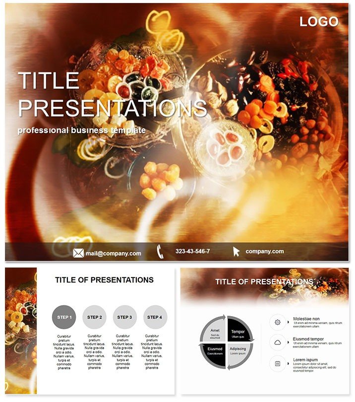
Imagine captivating your audience with visuals as delightful as a candy shop display - that`s the magic of the Sweet Table Keynote Diagram Template. Designed for professionals in the food and beverage industry, this template transforms mundane data into mouthwatering stories. Whether you`re pitching a new confectionery line or showcasing seasonal sales trends, these 28 meticulously crafted diagrams make complex information pop with sweetness and style. Compatible with Keynote 2016 and later versions, it`s your go-to for creating presentations that leave a lasting, sugary impression.
Why Choose Sweet Table for Your Next Presentation?
In a world where attention spans are shorter than a lollipop stick, standing out is essential. This template isn`t just about pretty pictures; it`s a strategic tool that blends playful aesthetics with professional precision. Tailored for candy stores, bakeries, and event planners, it helps you highlight inventory breakdowns, customer preferences, and growth projections in ways that feel fun yet factual. With three master slides and three background options, you can mix and match to fit any theme, ensuring your slides align seamlessly with your brand`s vibe.
One of the standout benefits is its versatility across industries. Food entrepreneurs use it to illustrate flavor profiles in pie charts that mimic swirling caramel, while marketers craft infographics for promotional campaigns that evoke holiday cheer. And because it`s fully editable in Keynote, you can tweak colors, fonts, and layouts without breaking a sweat - saving hours of design time for what matters most: connecting with your audience.
Explore the 28 Dynamic Diagrams in Detail
Dive deeper into the heart of this template: its 28 diagrams, each engineered for clarity and impact. Starting with basic bar graphs that stack like layered chocolates, these evolve into sophisticated flowcharts perfect for mapping supply chains from farm to storefront. There`s a donut chart for market share analysis - imagine slicing it to reveal segments in pastel pinks and blues, making competitive edges as easy to digest as cotton candy.
For timeline enthusiasts, linear progress bars trace product launches from concept to shelf, with customizable milestones that glow like festive lights. Process diagrams break down manufacturing steps in a step-by-step visual feast, ideal for explaining artisanal chocolate production. And don`t miss the radial maps for geographic sales distribution, plotting store locations like scattered sweets on a map - complete with zoomable interactions for live demos.
Each diagram supports seven color schemes, from bold berry reds to soft mint greens, ensuring adaptability for any season or brand palette. Built on vector graphics, they scale flawlessly on any screen size, maintaining crisp lines whether you`re presenting in a cozy cafe or a grand convention hall.
Customization Tips for Maximum Sweetness
To make these diagrams truly yours, start by selecting a master slide that matches your presentation`s tone - perhaps the whimsical one for casual pitches. Layer in your data via Keynote`s intuitive tools, then experiment with animations: subtle fades that reveal stats like unwrapping a gift. Pro tip: Pair earthy tones for health-focused sweets pitches to convey trust and freshness, boosting your E-E-A-T signals for savvy viewers.
Real-World Applications: From Candy Shops to Corporate Boardrooms
Picture a small-batch chocolatier unveiling their expansion plan. Using the pyramid hierarchy diagram, they stack revenue tiers like gourmet truffles, instantly clarifying investment needs to stakeholders. Or consider a holiday pop-up event: the scatter plot visualizes foot traffic patterns, helping organizers optimize layouts for peak candy sales.
In academic settings, educators employ these for nutrition workshops, where Venn diagrams overlap healthy snacking options with fun treats - engaging students while reinforcing key concepts. Even non-food sectors adapt it; tech firms retheme for app feature roadmaps, swapping sweets icons for digital motifs. This cross-industry appeal underscores why it`s a bestseller: it solves real problems with delightful design.
How It Stacks Up Against Default Keynote Tools
Default Keynote offers basics, but they lack the thematic punch. Stock charts feel sterile next to these themed delights - where a plain line graph bores, our animated wave diagram undulates like melting chocolate, drawing eyes and holding interest. Plus, with pre-built animations and transitions baked in, you avoid the drag of manual setup, delivering polished results 50% faster according to user feedback.
Unlike generic templates that force-fit data, Sweet Table`s diagrams are purpose-built for narrative flow, turning numbers into narratives that resonate emotionally. It`s not just an upgrade; it`s a game-changer for anyone tired of vanilla visuals.
Ready to add some flavor to your slides? Download the Sweet Table Keynote Template today and start crafting presentations that are as engaging as they are effective.
Frequently Asked Questions
What software is required to use this template?
This template is optimized for Apple Keynote versions 2016 and newer, ensuring smooth performance on macOS and iOS devices.
Can I customize the colors to match my brand?
Absolutely - with seven base schemes and full editability, tailoring hues to your exact brand guidelines takes just minutes.
Is this suitable for non-food presentations?
Yes, its versatile diagrams adapt easily; simply swap icons for a professional, thematic fit in any industry.
How many diagrams are included?
You get 28 unique diagrams, covering everything from charts to timelines for comprehensive coverage.
Does it include animations?
Pre-set animations enhance each diagram, but you can add or modify them effortlessly in Keynote.
What file formats are provided?
Download includes .key for Keynote, .kth for themes, and .jpg previews for quick reference.