Illustrations Keynote Shapes
These Keynote templates come loaded with editable shapes and illustrations ready for real business storytelling. Whether a strategy consultant is outlining a new operating model for an executive team or a product manager is mapping feature dependencies ahead of an investor update, this collection removes the blank-canvas barrier.
Instead of wrestling with alignment and grouping on every slide, you open the file and the visual hierarchy is already decided. The focus stays on the argument, not the drawing.
Download the set that fits your next presentation deadline.
 (242)
(242) Christmas Toys Shapes Template for Keynote: 11 SlidesID: #KS00046$10.00
 (633)
Creative Christmas Keynote Shapes TemplateID: #KS00045$10.00
(633)
Creative Christmas Keynote Shapes TemplateID: #KS00045$10.00 (974)
Festive Christmas Bells Keynote Template: Ring in the Holidays with StyleID: #KS00044$8.00
(974)
Festive Christmas Bells Keynote Template: Ring in the Holidays with StyleID: #KS00044$8.00 (1012)
Christmas Decor Keynote Shapes: Adorn Your Slides with Holiday EleganceID: #KS00043$10.00
(1012)
Christmas Decor Keynote Shapes: Adorn Your Slides with Holiday EleganceID: #KS00043$10.00 (961)
Cozy Christmas Interior Keynote Template: Design Warmth into Every SlideID: #KS00042$10.00
(961)
Cozy Christmas Interior Keynote Template: Design Warmth into Every SlideID: #KS00042$10.00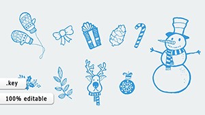 (864)
Christmas Traditions Keynote Shapes Template: Revive Holiday Customs in Your SlidesID: #KS00041$8.00
(864)
Christmas Traditions Keynote Shapes Template: Revive Holiday Customs in Your SlidesID: #KS00041$8.00 (319)
(319) Happy Holiday Keynote Shapes Template: Infuse Festivity into Every SlideID: #KS00040$12.00
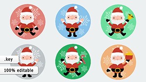 (1043)
Santa Clauses Keynote Shapes Stickers: Add Whimsical Charm to Festive SlidesID: #KS00039$8.00
(1043)
Santa Clauses Keynote Shapes Stickers: Add Whimsical Charm to Festive SlidesID: #KS00039$8.00 (831)
Christmas Wishes Keynote Shapes: Ignite Holiday AnticipationID: #KS00038$14.00
(831)
Christmas Wishes Keynote Shapes: Ignite Holiday AnticipationID: #KS00038$14.00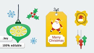 (237)
Stickers Christmas Keynote Shapes: Fun for Kids' Holiday TalesID: #KS00037$12.00
(237)
Stickers Christmas Keynote Shapes: Fun for Kids' Holiday TalesID: #KS00037$12.00 (117)
(117) Christmas Badges Keynote Shapes: Festive Icons for Holiday NarrativesID: #KS00036$12.00
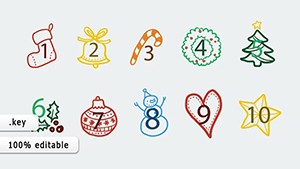 (515)
Numbers Christmas Keynote Shapes: Festive Data DecorationID: #KS00035$8.00
(515)
Numbers Christmas Keynote Shapes: Festive Data DecorationID: #KS00035$8.00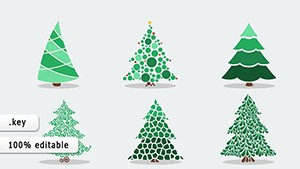 (419)
Force Growth PowerPoint Diagrams: Visualize Momentum and Drive SuccessID: #KS00034$5.00
(419)
Force Growth PowerPoint Diagrams: Visualize Momentum and Drive SuccessID: #KS00034$5.00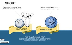 (306)
Energize Your Presentations with Sport Keynote Shapes TemplateID: #KS00033$21.00
(306)
Energize Your Presentations with Sport Keynote Shapes TemplateID: #KS00033$21.00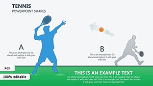 (335)
Tennis Keynote Shapes Template: Serve Up Winning PresentationsID: #KS00031$19.00
(335)
Tennis Keynote Shapes Template: Serve Up Winning PresentationsID: #KS00031$19.00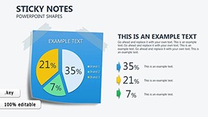 (122)
Sticky Notes Keynote Shapes: Pin Your Ideas into Presentation PerfectionID: #KS00028$12.00
(122)
Sticky Notes Keynote Shapes: Pin Your Ideas into Presentation PerfectionID: #KS00028$12.00 (282)
Merry Christmas Keynote Shapes: Infuse Holiday Magic into Your SlidesID: #KS00027$18.00
(282)
Merry Christmas Keynote Shapes: Infuse Holiday Magic into Your SlidesID: #KS00027$18.00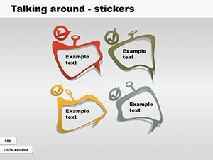 (88)
Stickers Keynote Shapes Template - Editable Designs for Dynamic PresentationsID: #KS00021$6.00
(88)
Stickers Keynote Shapes Template - Editable Designs for Dynamic PresentationsID: #KS00021$6.00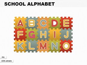 (858)
Alphabet Keynote Shapes - Engaging Tools for LearningID: #KS00020$10.00
(858)
Alphabet Keynote Shapes - Engaging Tools for LearningID: #KS00020$10.00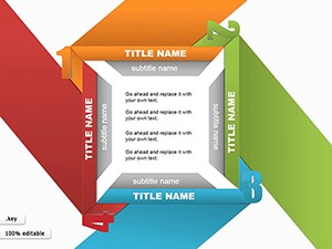 (56)
Four Title Shapes Keynote Presentation TemplateID: #KS00019$8.99
(56)
Four Title Shapes Keynote Presentation TemplateID: #KS00019$8.99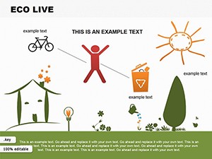 (1125)
Eco Renewable Energy Keynote Shapes - Instant Download | ImagineLayoutID: #KS00018$10.00
(1125)
Eco Renewable Energy Keynote Shapes - Instant Download | ImagineLayoutID: #KS00018$10.00 (211)
Medicine Pills Keynote Shapes for Pharma ProsID: #KS00015$20.00
(211)
Medicine Pills Keynote Shapes for Pharma ProsID: #KS00015$20.00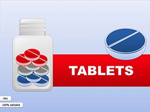 (311)
(311) Tablets Keynote Shapes for Medical ExpertsID: #KS00014$20.00
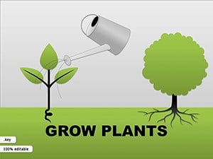 (48)
Grow Plants Keynote Shapes: Cultivate Visual Stories in Your DecksID: #KS00013$22.00
(48)
Grow Plants Keynote Shapes: Cultivate Visual Stories in Your DecksID: #KS00013$22.00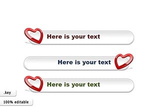 (1114)
Love & Birthday Keynote Shapes: Crafting Heartfelt CelebrationsID: #KS00004$19.00
(1114)
Love & Birthday Keynote Shapes: Crafting Heartfelt CelebrationsID: #KS00004$19.00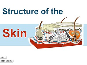 (1078)
Skin Structure Keynote Template: Layering Clarity in Medical PresentationsID: #KS00010$24.00
(1078)
Skin Structure Keynote Template: Layering Clarity in Medical PresentationsID: #KS00010$24.00 (1111)
Male Reproductive System Keynote Shapes - Instant Download | ImagineLayoutID: #KS00009$15.00
(1111)
Male Reproductive System Keynote Shapes - Instant Download | ImagineLayoutID: #KS00009$15.00 (292)
Prostate Anatomy Keynote Shapes - Instant Download | ImagineLayoutID: #KS00008$15.00
(292)
Prostate Anatomy Keynote Shapes - Instant Download | ImagineLayoutID: #KS00008$15.00 (116)
System Heart Keynote Shapes Template - Download Now!ID: #KS00007$18.00
(116)
System Heart Keynote Shapes Template - Download Now!ID: #KS00007$18.00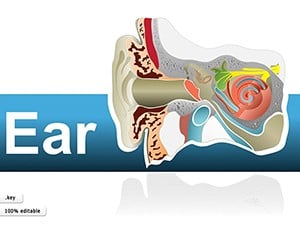 (895)
Human Ear Keynote Shapes: Illustrate Anatomy with PrecisionID: #KS00006$25.00
(895)
Human Ear Keynote Shapes: Illustrate Anatomy with PrecisionID: #KS00006$25.00
How Shapes and Illustrations in Keynote Drive Better Business Decisions
When the slide must carry part of the message, a well-placed illustration does more than decoration. A finance director reviewing quarterly forecasts can show cash-flow cycles with connected arrows that resize automatically when data updates. A marketing lead explaining customer journeys uses grouped icons that keep proportions even after animation. These templates supply the building blocks so the logic appears instantly.
The Real Cost of Designing Custom Shapes on a Deadline
Starting from a blank Keynote file forces a chain of micro-decisions: which line weight for connectors, how to distribute spacing across ten process steps, whether the bezier handles stay consistent when copied to the next slide. Each choice pulls focus from the story. By the time the deck reaches the rehearsal stage, half the thinking time has vanished into formatting. These templates eliminate that chain before the first slide opens.
Four Moments These Templates Changed the Outcome
Sarah, head of operations at a logistics firm, had forty-eight hours to present supply-chain optimizations to the board. The existing deck used mismatched boxes; swapping in the process-flow shapes let her show parallel tracks and bottlenecks in one glance. The discussion shifted from "what does this mean" to "how soon can we implement."
At a SaaS scale-up, the VP of product used the feature-relationship illustrations to explain roadmap trade-offs to investors. The grouped diagrams scaled cleanly on the projector and stayed editable when last-minute priority changes arrived. Questions focused on strategy, not slide legibility.
An HR director rolling out a new competency framework to two hundred managers needed icons that represented each skill cluster. The illustration library allowed color-coding by department without breaking the layout. The session ended with clearer adoption plans than any prior rollout.
A management consultant mapping post-merger integration for a manufacturing client relied on the timeline shapes to align workstreams across time zones. The client team could follow each milestone without asking for clarification slides later.
Setting Up Your Keynote File for Consistent Shape Usage
Copy the master slide that holds the shape library into your own deck. Grouped elements remain fully vector and respond to Keynote`s alignment guides. For recurring decks, lock the illustration groups on the master so updates propagate across all slides. Watch the aspect ratio when exporting to PDF - Keynote preserves crisp edges at 16:9 even with heavy grouping.
What Sets These Templates Apart for Corporate Use
Every shape was drawn to support an argument, not to fill space. You can change line styles, fill colors, and text hierarchy without breaking connections or losing editability. The collection skips decorative flourishes that look good in previews but collapse under real data.
Finding the Right Companion Templates for Your Workflow
If your next deliverable is a printed proposal rather than a live deck, explore the food and beverage Word templates for formatted contracts and menus. Teams running global strategy reviews often pair these shapes with global business PowerPoint templates when the audience expects 16:9 data slides instead of Keynote animations. For pure illustration needs in other formats, the cross-platform links keep your options open without starting over.
Download the pack that matches your current project and adjust one shape at a time until the story lands.
Are these Keynote shapes templates compatible with the newest version?
Yes, every file opens cleanly in Keynote 14.0 and above on both macOS and iPadOS. Vector shapes stay editable, groups respond to the format painter, and master-slide elements update across the deck. If a shape group appears flattened after import from an older file, simply ungroup and regroup once to restore full control.
Can I share the templates with my team?
Team sharing is allowed under the included license for anyone inside your organization. Each user can open, edit, and present the files. The only restriction is redistribution outside the company. Embedded fonts travel with the file, so recipients see the layout exactly as you intended.
Do the illustrations remain editable after animation?
Yes. Keynote`s shape animations act on groups without converting them to images. You can still select individual elements inside an animated group, adjust bezier points, or change colors mid-presentation build. Test the build order on your target projector to confirm timing.
What file format do I receive and how large are the downloads?
You receive native .key files. Most packs sit under 8 MB because shapes use vectors rather than embedded photos. Opening on an iPad or Mac takes seconds; the slide master loads the full illustration library automatically.
Can I export to PowerPoint if the client requests it?
Keynote exports to PPTX preserve most shapes and connections, though complex bezier paths may simplify slightly. For best results, simplify animations before export and check alignment on the receiving side. The core visual hierarchy survives the handoff.