Medicine - Pharma Keynote Shapes
This collection includes Keynote templates built for medical and pharmaceutical communication - clinical results, research summaries, drug pipelines, and healthcare briefings. The layouts are structured for people who present complex information under time pressure: analysts, researchers, product managers, and medical educators. A clinical research lead preparing a quarterly update for stakeholders doesn`t need decoration - they need slides that handle dense data without collapsing. These templates use clear hierarchy, controlled spacing, and consistent color systems so tables, charts, and annotations remain readable even when the content gets heavy. In practice, that`s what makes them usable in real meetings. If you`re building a report or presentation where accuracy matters more than style, start here and adapt the structure to your data. Download the layout that fits your next clinical review.
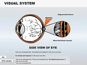 (586)
(586) Visual System Keynote Shapes: Detailed Eye Anatomy VisualsID: #KS00026$18.00
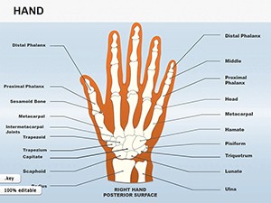 (1108)
Hand Shapes Keynote Icons - 25 Medical Slides | ImagineLayoutID: #KS00025$18.00
(1108)
Hand Shapes Keynote Icons - 25 Medical Slides | ImagineLayoutID: #KS00025$18.00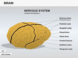 (851)
(851) Medicine Brain Shapes Template: Innovate Your Keynote PresentationsID: #KS00024$15.00
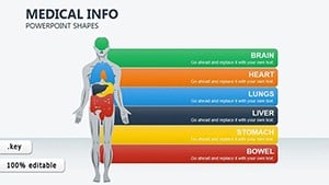 (1048)
 Medical Info-Charts Keynote Template: Visualize Insights with ClarityID: #KS00023$20.00
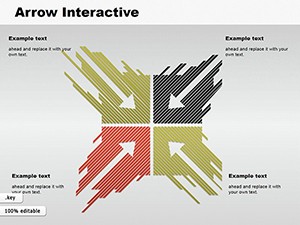 (263)
Interactive Arrows Keynote Template: Direct Your Pharma NarrativesID: #KS00022$16.99
(263)
Interactive Arrows Keynote Template: Direct Your Pharma NarrativesID: #KS00022$16.99 (211)
Medicine Pills Keynote Shapes for Pharma ProsID: #KS00015$20.00
(211)
Medicine Pills Keynote Shapes for Pharma ProsID: #KS00015$20.00 (1078)
 Skin Structure Keynote Template: Layering Clarity in Medical PresentationsID: #KS00010$24.00
 (1111)
Male Reproductive System Keynote Shapes - Instant Download | ImagineLayoutID: #KS00009$15.00
(1111)
Male Reproductive System Keynote Shapes - Instant Download | ImagineLayoutID: #KS00009$15.00 (292)
Prostate Anatomy Keynote Shapes - Instant Download | ImagineLayoutID: #KS00008$15.00
(292)
Prostate Anatomy Keynote Shapes - Instant Download | ImagineLayoutID: #KS00008$15.00 (116)
System Heart Keynote Shapes Template - Download Now!ID: #KS00007$18.00
(116)
System Heart Keynote Shapes Template - Download Now!ID: #KS00007$18.00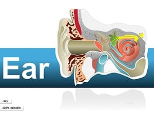 (895)
Human Ear Keynote Shapes: Illustrate Anatomy with PrecisionID: #KS00006$25.00
(895)
Human Ear Keynote Shapes: Illustrate Anatomy with PrecisionID: #KS00006$25.00
What makes medical slide structure different from generic business decks
Medical and pharma presentations carry a different kind of density. It`s not just more data - it`s layered meaning: outcomes, methodology, limitations. A generic business slide often breaks here because it assumes one message per slide. In practice, clinical slides often carry three: result, context, and implication. These templates reflect that. You`ll see multi - zone layouts where charts sit next to explanatory text, not below it. Slightly unusual at first. But it mirrors how medical professionals read - scanning data and interpretation together. Also, color use is restrained. That matters more than it sounds. Inconsistent color in medical slides quickly creates confusion - especially when categories repeat across multiple slides. Here, the palette stays stable across layouts, which helps when presenting sequences of results.
Five real - world scenarios where these medical slides solved the communication problem
Pharmaceutical product manager, pipeline update for internal leadership
Working with fragmented inputs - trial phases, timelines, regulatory notes. The challenge wasn`t collecting the data, it was structuring it so the audience understood progression and risk at a glance. These slides helped because the layout already separated phases, milestones, and notes into predictable zones. No rethinking the structure - just fill it in.
Clinical research lead, quarterly update for stakeholders
Needed to present dense efficacy data without overwhelming the audience. The multi - zone layout - result, context, implication - kept the slide readable. When I opened this template for a client quarterly review, the response was immediate: less explanation, more discussion of the actual findings.
Hospital administrator, operational metrics presentation to senior staff
Mixed audience. Some wanted numbers, others wanted context. These templates handled that split reasonably well: headline claim at the top, supporting data below, and space for short interpretation. The consistency across slides reduced the need to explain the slide itself.
Medical educator, teaching material for pharmacology course
Needed repetition across multiple sessions. Same structure, different content. These templates held up - duplicate, adjust, move on. The restrained color palette kept students focused on the data, not the design.
Regulatory affairs specialist, submission briefing for cross - functional team
Needed to present trial data with clear separation between results and limitations. The layout`s built - in zones made the distinction visible. No one had to ask "is that an outcome or an assumption?" because the slide answered that visually.
When to choose medicine pharma Keynote shapes over adjacent categories
If you`re comparing options, it helps to know where this category sits relative to others. Use general Keynote templates if you need broader presentation structures across industries. Those are more flexible but less specialized. Use Keynote diagram templates when your focus is on visual explanation - processes, flows, relationships. Those are better for conceptual slides. However, for dense medical data that requires layered interpretation - outcomes, methodology, limitations - this medical collection gives you the structural zones that general templates lack. The difference becomes obvious when you try to paste a full paragraph of clinical commentary next to a chart. General templates don`t leave space for that. These do.
Why rebuilding a medical slide from scratch wastes time you don`t have
Building a clinical results slide from scratch in Keynote sounds simple until you try to align a chart, its legend, a footnote about p - values, and a two - sentence interpretation - all without creating visual chaos. The templates here solve that. They provide slide master layouts with locked zones, so when you paste in a large block of text, the chart doesn`t shift down, and the footnote doesn`t disappear off the slide. Also, consistent color mapping across slides means you don`t have to manually match colors for each new data series. Change one accent color on the master slide, and all charts across all slides update. That`s a time - saver when you`re under deadline.
A technical observation specific to medical slides in Keynote
These templates rely heavily on the slide master to define color behavior and spacing rules. That`s intentional. Medical decks often have 30 - 50 slides. Without a master, you`re manually adjusting each slide. However, one thing to watch: when you duplicate a slide that contains a multi - zone layout, the duplicated slide retains all zone alignments, but if you then change the text in one zone, the other zones won`t auto - adjust their height. That means if your interpretation grows to three paragraphs, it might overlap the chart below. The fix is to treat each zone as independent. Don`t expect dynamic reflow. If you need that, you`re in word processing territory, not presentation software. These templates are optimized for predictable, consistent layouts - not dynamic content adjustment.
Why this collection is different from typical marketplaces
Most medical template collections either over - design (adding DNA helices and heartbeats that distract from data) or under - design (basic bullet lists with no visual hierarchy). This collection hits a middle ground: structure first, decoration minimal. The color palette is restrained, but the layout zones give you a consistent visual language across slides. The slide master works. The typography is optimized for readability at presentation distances. And the templates don`t assume your data fits a specific shape - they give you flexibility within a consistent frame. The only downside is that the templates are not animated. If you need data to build step by step, you`ll need to add that yourself. But for static clinical reviews, that`s usually a benefit, not a limitation.
Related template collections on ImagineLayout
This medical collection sits alongside several other specialized categories. For general business presentations, start with Keynote templates. For process flows and conceptual diagrams, see Keynote diagram templates. For geographic data, switch to Keynote map templates. Choose the collection that matches your primary communication need. If you`re presenting clinical data, this is the right starting point.
Frequently Asked Questions
Can these medical templates handle large data tables without breaking the layout?
Yes, but with limits. The templates are designed for clinical data, which often includes tables with 5 - 10 rows and 3 - 6 columns. If your table exceeds 15 rows, the font size will become too small for presentation readability. In that case, split the data across two slides or use the table as a handout, not a slide. The templates use anchored table objects, not grouped shapes, which means the table can expand vertically without breaking surrounding elements. However, the table will push against any text boxes placed below it. The safer approach is to keep tables compact and use the dedicated annotation zone for interpretation, not additional data rows.
Do these templates work with Keynote`s presentation mode on an external display?
Yes, they work exactly like any Keynote file. The templates don`t interfere with presenter display settings or external monitor configurations. However, one thing to watch: the multi - zone layouts rely on precise positioning. If you`re using a secondary display with a different aspect ratio (like a 16:10 laptop connected to a 16:9 projector), the slides will scale correctly, but text may reflow slightly. Always do a quick run - through on the actual presentation hardware before the meeting. I`ve seen a case where a footnote that fit perfectly on a laptop screen wrapped to two lines on a projector, overlapping a chart. The fix is to leave slightly more padding than you think you need.
What`s the difference between these medical shapes and the general medical templates on other sites?
Most medical templates you find elsewhere focus on icons: a stethoscope here, a DNA helix there. They look thematic but fall apart when you try to present real data. These templates focus on layout zones first. You get a consistent place for charts, a consistent place for interpretation, and a consistent place for footnotes or p - values. That structural consistency is what saves time in a 40 - slide clinical deck. The icons are secondary. Also, these templates are built entirely in Keynote`s native shape tools, not imported SVGs, which means everything is editable. You can recolor, resize, and reposition without losing quality. That`s not true for many marketplace templates that paste in flattened graphics.
Can I use these templates for regulatory submission slides?
You can, but be aware that regulatory submissions often have specific formatting requirements around fonts, margins, and data presentation. These templates use standard fonts like Helvetica and Arial, which are generally acceptable, but you should verify against your submission guidelines. Also, regulatory slides sometimes require exact numeric values in tables, not rounded figures. The templates support that - they don`t assume any particular data format. However, if your submission requires ADA compliance (e.g., screen reader compatibility), Keynote`s export to PDF preserves basic tag structure, but you`ll need to add alt text manually. The templates don`t auto - generate accessibility metadata. For high - stakes submissions, always do a final validation against the receiving agency`s specifications.
What`s the most common error when editing these medical slide templates?
Pasting content without using the slide master`s predefined text styles. Each template has specific paragraph styles for headings, body text, and data annotations. If you paste content from another document and keep its original formatting, the layout zones may shift because the incoming text has different spacing or font metrics. The fix is to paste as "Paste and Match Style" (Option - Shift - Command - V on Mac). That strips incoming formatting and applies the template`s styles. A second common error is deleting the placeholder text completely, then trying to remember where the original text was aligned. Instead, select the placeholder text and type over it. That preserves the alignment and font size. If you delete the placeholder, you may lose the anchored positioning.
Are these templates compatible with Keynote for iCloud?
Yes, you can upload the templates to iCloud Drive and open them in Keynote for iCloud in a web browser. However, performance may vary. Complex layouts with multiple zones and anchored objects may load slowly or display alignment issues in the browser version. Also, Keynote for iCloud has fewer editing features than the macOS app. For example, the slide master editor is not available in the web version, so you cannot change global color schemes or spacing rules from a browser. The recommendation: use the macOS Keynote app for structural edits, and use iCloud Keynote for minor text changes or presenting. For best results, keep a local copy on your Mac.