Finance - Accounting Letterheads
This collection includes finance letterhead templates built for accounting firms, audit teams, and in-house finance departments. The layouts focus on clarity, alignment, and consistent branding across invoices, reports, and client communication. If you have ever prepared a quarterly statement for a CFO review, you know how small formatting issues can distract from the numbers.
These templates keep margins, headers, and logo placement stable, so your documents look controlled even under pressure. I have seen this matter more than expected during client audits. Browse the set and download the format that fits your next report cycle.
 (773)
(773) 4-Panel Wholly-Owned Finance Letterhead TemplateID: #LT00966$5.00
 (248)
Chart Development Finance Letterhead TemplateID: #LT00960$10.00
(248)
Chart Development Finance Letterhead TemplateID: #LT00960$10.00 (155)
(155) Business Analyst Letterhead TemplateID: #LT00958$8.00
 (329)
3-Panel Stepping Up Success Letterhead TemplateID: #LT00916$5.00
(329)
3-Panel Stepping Up Success Letterhead TemplateID: #LT00916$5.00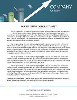 (790)
Increasing Schedule Letterhead TemplateID: #LT00908$8.00
(790)
Increasing Schedule Letterhead TemplateID: #LT00908$8.00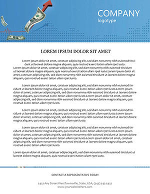 (518)
Secure Dollar Exchange Rate LetterheadID: #LT00857$8.00
(518)
Secure Dollar Exchange Rate LetterheadID: #LT00857$8.00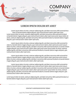 (168)
(168) Growth Chart Letterhead for Business ReportsID: #LT00839$8.00
 (400)
Secure Key Land Homes Letterhead TemplateID: #LT00836$10.00
(400)
Secure Key Land Homes Letterhead TemplateID: #LT00836$10.00 (191)
(191) Economic Recession Letterhead TemplateID: #LT00834$10.00
 (184)
Analyst Business Letterhead - Consulting 8.5x11 | ImagineLayoutID: #LT00833$8.00
(184)
Analyst Business Letterhead - Consulting 8.5x11 | ImagineLayoutID: #LT00833$8.00 (48)
Business Growth Strategies Letterhead TemplateID: #LT00823$8.00
(48)
Business Growth Strategies Letterhead TemplateID: #LT00823$8.00 (198)
Business Leaders Letterhead TemplateID: #LT00822$6.00
(198)
Business Leaders Letterhead TemplateID: #LT00822$6.00 (313)
Dollar Exchange Rates Letterhead TemplateID: #LT00821$8.00
(313)
Dollar Exchange Rates Letterhead TemplateID: #LT00821$8.00 (455)
Euro Exchange Rate Letterhead TemplateID: #LT00820$8.00
(455)
Euro Exchange Rate Letterhead TemplateID: #LT00820$8.00 (1077)
Growth of Business Letterhead TemplateID: #LT00817$12.00
(1077)
Growth of Business Letterhead TemplateID: #LT00817$12.00 (815)
Stock Market Analysis Letterhead TemplateID: #LT00816$12.00
(815)
Stock Market Analysis Letterhead TemplateID: #LT00816$12.00 (445)
Professional Monetary Reserves Letterhead DesignID: #LT00592$8.00
(445)
Professional Monetary Reserves Letterhead DesignID: #LT00592$8.00 (765)
Elegant Gold-Infused Letterhead TemplateID: #LT00589$8.00
(765)
Elegant Gold-Infused Letterhead TemplateID: #LT00589$8.00 (22)
Strategic Budget Planning Letterhead TemplateID: #LT00575$8.00
(22)
Strategic Budget Planning Letterhead TemplateID: #LT00575$8.00 (173)
Online Stock Trading Letterhead TemplateID: #LT00414$5.00
(173)
Online Stock Trading Letterhead TemplateID: #LT00414$5.00 (748)
Elegant Euro Finance Letterhead TemplateID: #LT00322$10.00
(748)
Elegant Euro Finance Letterhead TemplateID: #LT00322$10.00 (831)
Dynamic Making Deals Business LetterheadID: #LT00284$8.00
(831)
Dynamic Making Deals Business LetterheadID: #LT00284$8.00 (863)
Currency Converter Letterhead TemplateID: #LT00246$8.00
(863)
Currency Converter Letterhead TemplateID: #LT00246$8.00
Why finance letterheads feel different from generic business stationery
Finance documents carry a different kind of weight. It is not about decoration. It is about trust signals. When I worked on a set of audit-ready documents last year, the biggest issue was not the data. It was inconsistent headers across files. Small thing, but it made the whole package feel fragmented. These finance letterhead templates keep structure tight. Logo placement does not drift. Contact details stay predictable. The typography is restrained, which honestly helps more than fancy design ever would. The column alignment here actually saves you a lot of pain. Download a layout and test it with your real data. That is when it clicks.
Real scenarios where these letterheads actually matter
Accounting manager preparing year-end financial summaries for multiple clients. Deadlines are stacked. The numbers are correct, but the documents look slightly different across files. That inconsistency becomes the problem. Using a fixed letterhead removes that variable. Same header, same spacing, every time. It is one less thing to think about when the audit starts next Monday.
Internal finance team sending monthly updates to leadership. Not a formal report, but still needs structure. A clean letterhead gives just enough framing without overdoing it. You know that moment when the deck is due at 9 AM and you are still fixing alignment at 8:40. Same idea here, just in document form. The difference is that you notice the inconsistency only after sending the email - and by then it is too late.
Audit associate preparing client invoices. The invoice needs to look professional, but the accounting system exports raw text. Dropping that text into a pre-set letterhead turns a plain page into a branded document in under two minutes. The associate skips the awkward step of explaining why this month`s invoice looks different from last month`s.
CFO of a mid-size firm, quarterly board packet. The packet includes multiple reports from different departments. Without a unified letterhead, the packet looks pieced together. With a consistent template, the CFO hands over a controlled, professional document. The board reads numbers, not formatting chaos.
Finance department coordinator, recurring expense reports. The coordinator processes dozens of reports per month. A template with fixed logo placement and margin settings means no one has to resize a logo or reset tab stops. Process time drops from ten minutes per report to two. At scale, that adds up to real hours saved.
What actually holds up in real use (and what does not)
From experience, two things break fast in Word-based letterheads. First, logo scaling. Second, spacing when content runs longer than expected. These layouts handle both reasonably well. Logos are anchored properly, not floating. Margins are predictable. But if you push in too much text, you will still need to adjust. That is normal. At first it feels a bit much, but once you get the logic it becomes second nature.
When to use these letterheads vs other document formats
If you are preparing structured reports or invoices, this category makes sense. If you need marketing-heavy materials, you are better off with brochure templates. Different purpose entirely. For internal notes or less formal communication, even a basic document might be enough. But once the document goes external, especially in finance, consistency starts to matter more than you expect. And if you need simpler layouts, check general letterhead templates for broader options.
For full document systems that go beyond the first page, combine these with Word templates to maintain consistent branding across multi-page reports. For complete identity packages, pair with business card templates to align your stationery ecosystem.
Why these templates are easier than building from scratch
Honestly, the first time I tried building a finance letterhead manually, I underestimated how many small decisions were involved. Font pairing, header spacing, footer balance. It adds up fast. Here, most of that is already handled. You adjust the logo, tweak colors, and move on. Done. Also works for internal ops reviews, not just client-facing docs.
Editing pain points specific to finance letterheads
Logo scaling is critical. A logo that is too large throws off the entire header balance. If you replace the placeholder logo with a much larger file, the spacing breaks immediately. Resize your logo before inserting, or accept that you will be tweaking margins.
Content length matters. The header stays fixed, but long content can push layout balance. If your letter extends to a second page, the header should not repeat on page two in most finance contexts. That setting is usually controlled in the Word header/footer tools. Check it before you print fifty copies.
Font embedding. Finance documents often move between computers. If you use a non-standard font and do not embed it, the recipient`s Word will substitute a different typeface, and line spacing will shift. Always embed fonts or stick to standard finance-safe fonts like Calibri or Arial.
Technical observations from real work in Word
Word-based letterheads rely on anchored headers and footers. When you paste content into the main document area, the header stays in place - but if you accidentally double-click the header area and delete a logo anchor, the entire layout can detach. Lock the header after editing by closing the header/footer view. For finance documents that must print exactly, use the "Print Preview" function before final output. Word`s on-screen view sometimes hides margin issues that appear on paper. A quick print test on a single page saves a reprint of the whole batch.
Why this collection stands apart
Many letterhead templates pile on decorative elements that look good in previews but distract from financial data. This collection keeps structure tight and typography restrained. The tradeoff is limited heavy customization - you cannot rebuild the entire layout without effort. That tradeoff is intentional. You get a letterhead that works out of the box, not a design experiment. And for finance work, reliability matters more than novelty.
Navigate related templates
If you are working across multiple formats, combine these letterheads with business card templates for consistent branding across all client touchpoints. For more document types beyond letterheads - like multi-page reports or proposals - explore Word templates. Keep it consistent across materials. That is usually where things fall apart if you mix and match without a system.
Can I edit the logo and company details easily?
Yes, the templates are built for quick edits in Word. You replace the logo and text placeholders directly. In most cases, alignment stays intact, but if you use a very large logo, you may need to resize slightly to keep spacing balanced. The logo is anchored in the header, not floating in the main text area. To replace it, double-click the header area, select the placeholder logo, and insert your own. Close the header view when done. That anchor prevents the logo from drifting when you add content to the main document.
Are these compatible with all Word versions?
Usually yes, but it depends a bit on how old your version is. Most templates work smoothly in modern Word versions (2016 and later). In older versions, some spacing or font rendering might shift slightly, but nothing major. If you are using Word 2010 or earlier, test the template with your real content before committing to a large print run. The main issue in older versions is how they handle anchored graphics - the logo might not stay perfectly aligned after multiple edits. For critical documents, open the template in a current version of Word Online (free) to ensure stability before finalizing.
Can I print these without formatting issues?
So basically, yes. The margins and layout are set up for standard printing. Just double-check your printer settings and paper size before final output. Works fine. However, do not assume that what you see on screen is exactly what will print. Word`s print preview is more reliable than the editing view. Always do a single-page test print before running fifty copies of an audit report. And if you are sending the file to a commercial printer, export to PDF first. The PDF preserves margins and embedded fonts more reliably than the native Word file.
What if my content is longer than the template layout?
From experience, this is where people run into small issues. The header stays fixed, but long content can push layout balance. The fix is simple. Adjust spacing slightly or move to a second page. No major rebuild needed. However, note that most finance letterhead templates are designed for single-page letters. If your content regularly runs to three or four pages, consider using a full Word template instead of a single-page letterhead. Those are built for multi-page reports and handle longer documents more gracefully.
What is the licensing model for these finance letterhead templates?
It is the same license most marketplaces use. One purchase covers one project or organization use, but redistribution as a standalone file is not allowed. Pretty standard. For a finance firm, that means you can use the letterhead for all your client invoices and internal reports within that organization. You cannot sell the template file to another firm. If you are an accountant serving fifty different clients, each client likely counts as a separate project under the standard interpretation. When scaling across many external entities, check the license or consider a multi-seat option.
Can I share the template with my team?
Yes, internal sharing within your organization for the same project is generally fine. The license covers one buyer across a defined project scope. If your finance team of ten people all need to use the same letterhead for the company`s quarterly reports, that is covered. What is not allowed is taking the template file and posting it on an internal drive where every department can download it for unrelated projects, or sending the raw file to an external partner. When in doubt, assume that internal use for the original purpose is fine; anything beyond that requires a separate license.