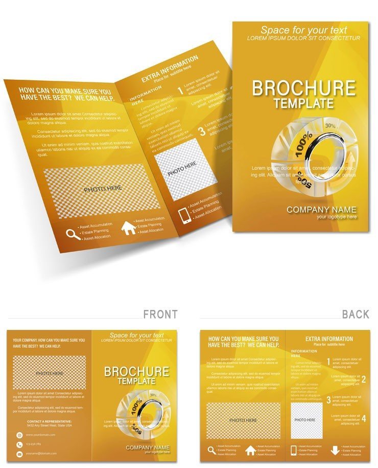
Percentage Pie Chart Brochure Template: Visualize Financial Insights Effortlessly
Type: Brochures template
Category: Finance - Accounting, Business
Fold type: Tri Fold
Sources Available: .ait, .dotx, .indt, .jpg
Page size: 11x8.5
Product ID: BT00965
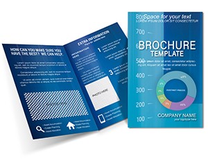
In the realm of finance and accounting, where data drives decisions, presenting information clearly can make or break an investment opportunity. Our Percentage Pie Chart Brochure Template is tailored for professionals who need to convey complex financial analyses through intuitive visuals. This tri-fold design, measuring 11x8.5 inches, supports formats including .ait, .dotx, .indt, and .jpg, making it accessible whether you`re using Adobe suites or Microsoft tools. Ideal for analysts studying key indicators like revenue distribution or market shares, this template turns raw percentages into persuasive narratives that guide stakeholders toward informed choices.
Picture this: At a board meeting, you unfold a brochure where pie charts vividly break down expense allocations, instantly clarifying where funds flow. Drawing from best practices in financial reporting, such as those endorsed by the CFA Institute, this template ensures your visuals are not only accurate but also engaging. It`s a game-changer for those weary of dense spreadsheets, offering a polished alternative that enhances comprehension and sparks discussions. Early adopters have noted a surge in engagement, with one investment firm reporting faster decision cycles after adopting similar data-focused brochures.
Standout Features for Data-Driven Professionals
This template excels in blending aesthetics with analytics, providing a framework that`s both beautiful and functional. The tri-fold structure offers three panels for layered storytelling: an introductory overview, detailed pie chart breakdowns, and concluding insights or calls to action. This setup promotes a natural progression, keeping readers hooked from start to finish.
- Editable Pie Charts: Insert your data directly into pre-built charts, adjusting segments for percentages that reflect real-time financials like profit margins or asset allocations.
- Flexible Customization: Modify colors to align with branding - think reds for risks and greens for gains - or add legends and labels for clarity.
- Multi-Format Support: Seamless editing across platforms, with vector-based elements in .ait and .indt for scalable quality.
- User-Friendly Guides: Embedded tutorials help you integrate data without hassle, ensuring even non-designers produce pro-level results.
Inspired by effective visualizations in reports from firms like McKinsey, these features prioritize precision, helping you avoid common pitfalls like overcrowded charts that confuse rather than clarify.
Practical Use Cases in Investment and Analysis
Versatility is key here, with applications spanning from corporate finance to personal investing. For example, an equity analyst might use it to present portfolio diversification, with pie charts showing sector breakdowns. Customize by inputting data from tools like Excel, then enhance with explanatory text on implications for risk-adjusted returns, adhering to standards from the Securities and Exchange Commission (SEC).
Another scenario: Fund managers distributing brochures at conferences to highlight performance metrics. A case in point - a boutique investment house utilized pie chart visuals to demonstrate year-over-year growth, resulting in a 30% uptick in client acquisitions. For educators in finance courses, adapt it to teach concepts like budget pie slices, making abstract ideas tangible for students.
Customizing Your Pie Chart Brochure: A Guided Approach
- Choose Your Tool: Open in .dotx for quick tweaks or .indt for advanced layouts.
- Data Integration: Populate charts with your percentages, using formulas if needed for dynamic updates.
- Design Refinements: Select complementary fonts and images, such as stock photos of financial graphs, with alts like "percentage breakdown of market shares."
- Quality Check: Ensure accessibility with high-contrast colors and test for print fidelity.
- Deployment: Print for handouts or digitize for webinars, incorporating links to deeper analytics.
This methodical process aligns with agile financial workflows, allowing rapid iterations based on new data.
Advantages Over Standard Chart Tools
Unlike basic PowerPoint slides or free online generators, this template offers a cohesive brochure format that feels premium and purpose-built. It avoids the fragmentation of separate charts by integrating them into a narrative flow, much like annual reports from Fortune 500 companies. The result? A tool that not only presents data but persuades, potentially increasing buy-in from skeptical investors.
Enhance with icons representing financial elements, like dollar signs or trend lines, to add depth without clutter. This draws from proven strategies in visual finance communication, ensuring your brochure stands out in a sea of text-heavy materials.
Expert Tips for Enhanced Financial Storytelling
To amplify your brochure`s effectiveness, focus on context: Pair each pie chart with a brief analysis, such as "This 40% allocation to tech stocks positions us for growth amid digital transformation." Use bold highlights for critical insights. For SEO in digital versions, weave in terms like "financial pie chart analysis" naturally. Experiment with layouts in test runs - studies show segmented visuals improve retention by 20% in financial contexts.
Empower your analyses today with a template that bridges data and decision-making. Step up your game and craft brochures that don`t just inform - they influence.
Frequently Asked Questions
How do I edit the pie charts in this template?
Simply input your data into the placeholders; the charts update automatically in supported formats like .dotx or .indt.
Is this suitable for non-finance users?
Yes, while optimized for finance, it`s adaptable for any percentage-based data, like market research or project budgets.
What software do I need?
Compatible with Adobe Illustrator, InDesign, Microsoft Word, or even image editors for .jpg versions.
Can I add more charts?
Absolutely; duplicate sections and customize as needed to expand your financial narrative.
How print-ready is the template?
Fully optimized with proper margins and resolutions for professional printing services.