Why the 10/20/30 Rule Fails B2B Sales Decks (And What to Use Instead)
Guy Kawasaki's famous pitch formula was never built for a deck that has to sell itself to eight people who weren't in the room.
Design tips, tutorials, product updates, and industry insights.

Tired of blank stares during your presentations? These 10 practical slide design rules help you keep attention without gimmicks or clutter.

Learn what separates pitch decks investors fund from ones that get ignored — structure, pacing, and the slides founders usually get wrong.
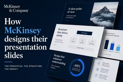
McKinsey's slide design isn't about polish — it's a structured argument system. Here's how the Pyramid Principle actually works in practice.

Guy Kawasaki's famous pitch formula was never built for a deck that has to sell itself to eight people who weren't in the room.

The "right" number of slides has less to do with a magic rule and more to do with what stage you're actually pitching.
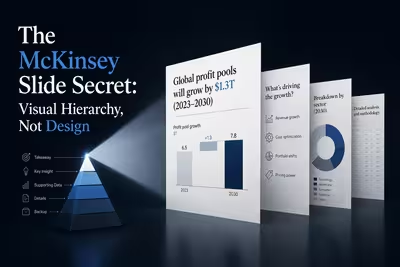
Copy McKinsey's fonts and spacing and the slide still won't land — here's the one thing that actually makes their decks readable in three seconds.

Everyone says bullet points are dying — but the research behind that claim is messier than the headlines suggest.

Nobody puts "drafted by AI" in the footer — here's what's actually happening inside the deck-building process at most companies right now.

Every few years someone declares PowerPoint dead — this time the killer has a name, and it's still not enough.

Everyone puts a line going up-and-to-the-right on their growth slide — here's why that's usually the least convincing part of it.

The "After X seconds" checkbox is the easy part — the part that actually determines whether your audience stays with you is the number you type into it.

You click a new theme, half your slides update, half don't — here's why, and how to actually fix all of them at once.