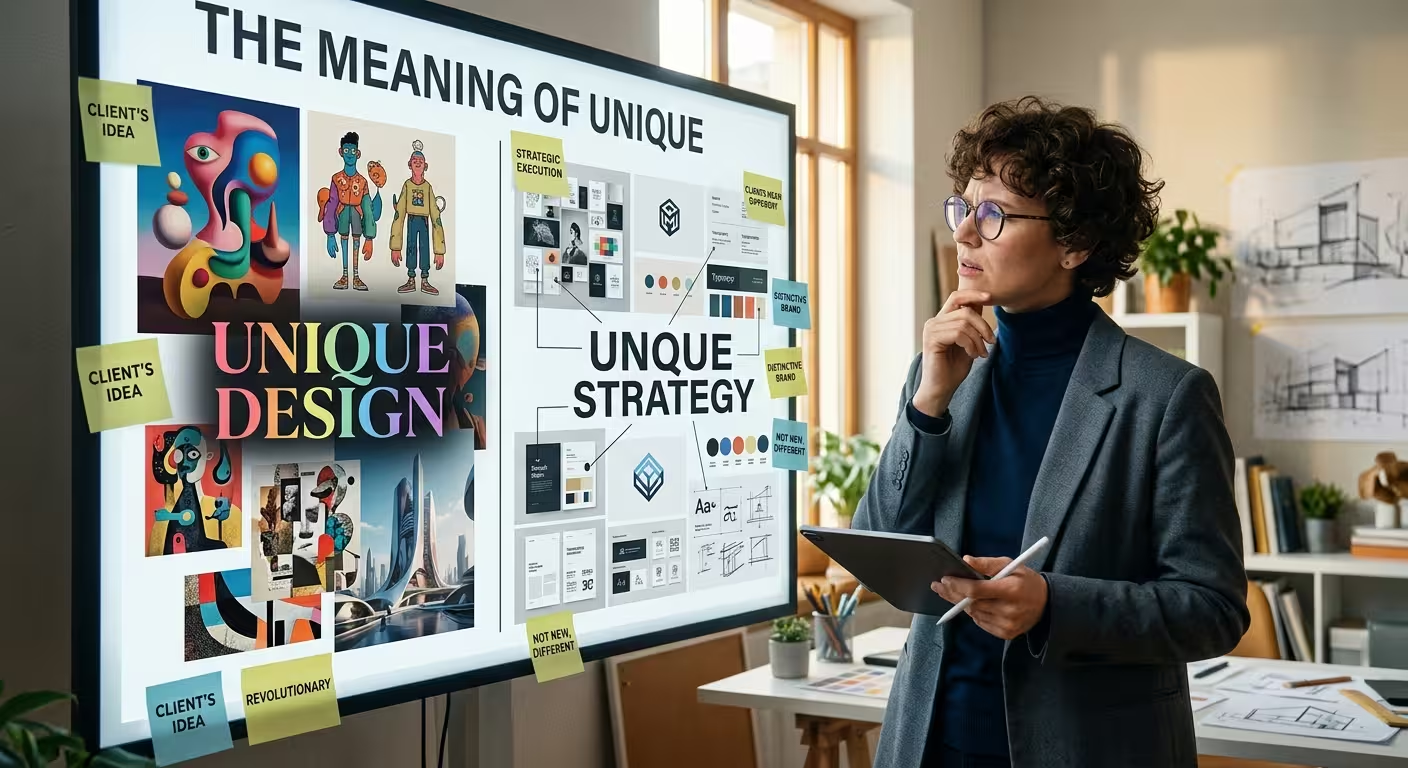
A client tells me they want something unique. I nod, take notes, ask what "unique" looks like to them. Two minutes later they're sharing their screen, and it's a competitor's homepage. "Something like this," they say, "but ours."
The first few times this happened, I treated it as a mixed signal — like the client hadn't quite decided what they wanted and I'd have to pin them down. It took longer than I'd like to admit to notice it wasn't a mixed signal at all. It was the actual brief, just split across two sentences instead of one.
The word "unique" is doing less work than it sounds like
In my experience, when someone says "unique," they almost never mean "unlike anything in our category." What they usually mean is closer to "recognizably ours, but not so far from what's already working that it feels risky." The word carries ambition, but the reference image carries the actual spec.
This isn't a client being difficult or contradictory. It's two different fears showing up in the same request. The word "unique" is fighting the fear of blending in. The competitor screenshot is fighting the fear of the new design flopping. Nobody says both fears out loud, so they arrive folded into one instruction that reads as confused when it's really just compressed.
Why the reference is almost always a competitor, not an inspiration board
Weidenhammer, a web design agency, wrote about this exact pattern in a piece on the questions clients ask during design projects, and one point stuck with me: when a client brings up a competitor's site or deck, it's usually less about wanting to copy the look and more about the client trying to lower their own sense of risk in a decision they don't feel equipped to judge.
That reframes the whole request. A competitor's design has already survived contact with an audience — it launched, nobody revolted, the business kept operating. To a client without a design background, that's the closest thing to proof they have access to. Asking for "something like that" isn't a style preference. It's borrowing someone else's already-validated judgment because they don't trust their own yet.
What actually gets flagged as "not unique enough"
Here's where it gets specific enough to be useful. When a client pushes back after a first draft with "this doesn't feel unique," I've learned to ask what, exactly, made them say that — and the answer is almost never the overall concept. It's a structural echo of a specific competitor: the same three-column feature grid, the same hero-image-then-logo-wall sequence, the same chart type used the same way on the same slide number.
Which means the fix usually isn't "start over and be bolder." It's finding the one or two structural choices that are quietly borrowed and changing just those, while leaving the rest of the layout — the part that's actually working for the client's confidence — alone. I wouldn't recommend touching color, typography, and layout structure all in the same revision when the complaint is this specific. That treats "unique" as a total rebuild instruction when it was really pointing at one borrowed decision.
The trade-off nobody mentions when they ask for "unique"
There's a ceiling on how far you can actually take this before the same client who asked for unique starts getting nervous. Push the design far enough from the category norm and the reassurance the competitor reference was providing disappears — now there's nothing familiar left to anchor the client's confidence, and "unique" quietly turns into "this feels off," even though it's exactly what they asked for on paper.
That's the part that makes this genuinely tricky rather than just a communication gap. The client wants distance from the competitor and the safety of resembling something proven, and those two things shrink each other. The right amount of departure depends on what the audience needs to do with the design, not on how original the client says they want it to feel in the brief — a pitch deck audience and a board audience have very different tolerances for "unfamiliar."
Reading the brief instead of the word
A more useful discovery question than "what does unique mean to you?" is "show me two or three things in your space you don't want to look like." Clients are almost always faster and more specific about what to avoid than what to aim for, and the avoid-list tells you where the real boundary sits — the space between "too close to that" and "too far from what's already working."
From there, the differentiation usually doesn't need to come from a completely different concept. It can come from a handful of deliberate, contained choices — a typography pairing that reads as more distinct without touching the underlying structure is often enough to satisfy "unique" without triggering the anxiety that comes from changing something the client subconsciously found reassuring.
When the request is bigger than a revision
Sometimes the honest answer is that a template-based starting point can't hold both halves of the brief — recognizably different and provably safe — without a from-scratch structure built around the client's own brand from the first slide, rather than adapted from someone else's layout after the fact. That's a different conversation than a round of feedback, and it's worth naming as one instead of trying to force it through another revision cycle. A custom-built deck designed around the client's brand and goals from the start sidesteps the whole "unique, but like theirs" tension, because there's no borrowed structure underneath it to accidentally echo.
Next time a client says they want something unique, it's worth asking what they're actually showing you a screenshot of — because that image usually contains the real brief, and the word "unique" is just the part they said out loud.
Comments (0)