Animation Is Not the Problem — Unnecessary Movement Is
A PowerPoint slide can look completely ordinary until you press the next button and half the screen starts moving. A title fades in, three icons fly from different directions, a chart grows, and a decorative shape spins into position.
The presentation suddenly feels more “dynamic,” but that does not necessarily mean it communicates better.
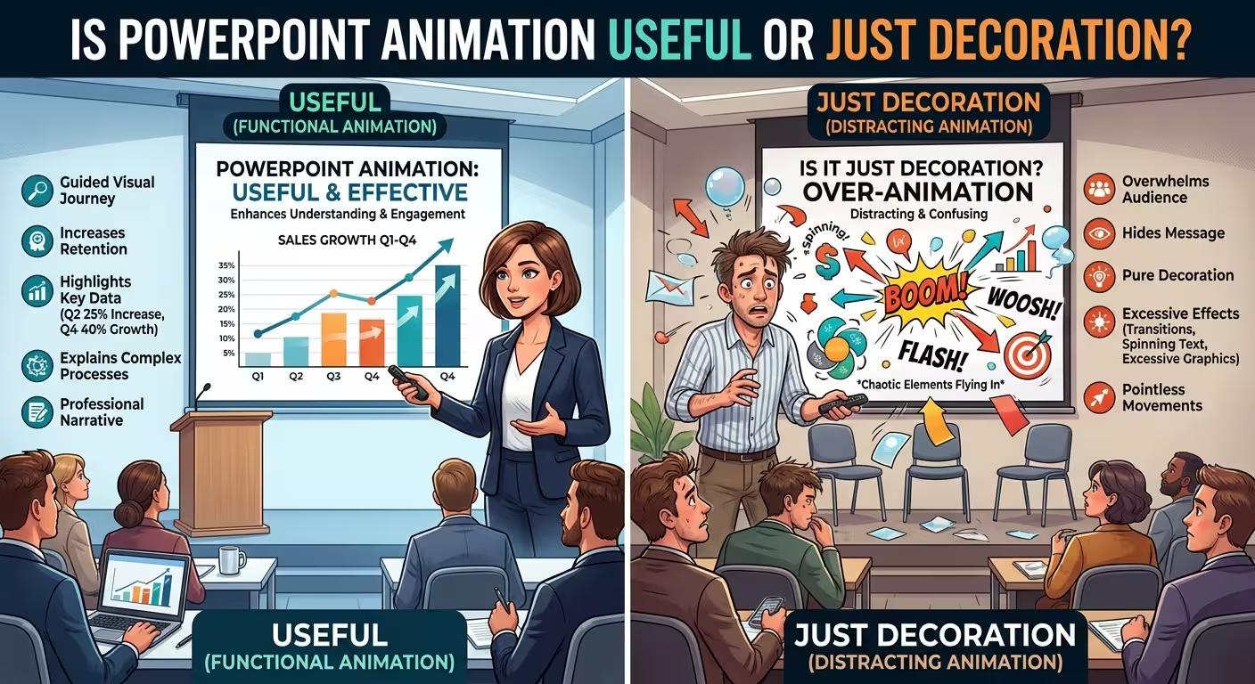
So, is PowerPoint animation useful or just decoration? The honest answer is both. Animation becomes useful when it controls the order in which the audience understands information. When it does not perform that job, it is usually decoration — and decoration can easily become a distraction.
Ask What the Animation Is Supposed to Do
The easiest mistake is to choose an animation first and invent a reason for it afterward. PowerPoint gives you plenty of effects, so it is tempting to experiment until something looks interesting.
A better starting point is the information itself.
Ask one question: What becomes easier to understand because this object moves?
If the answer is “nothing,” you probably do not need the animation.
For example, imagine a slide explaining a four-stage approval process. Showing all four stages at once may force the audience to read ahead while you are still explaining the first stage. Revealing the stages in sequence can solve a real communication problem.
Now imagine a slide with one large revenue figure and a short explanation underneath. Making the number bounce onto the screen does not reveal a hidden relationship. The audience can understand the slide immediately without the movement.
The difference is not subtle once you frame animation as a communication tool rather than a visual effect.
Where PowerPoint Animation Actually Helps
Animation has a particularly strong case when the content contains sequence, change, or relationships.
These are situations where seeing information appear progressively can be more useful than seeing everything simultaneously.
- Processes: reveal each stage in the order it happens.
- Diagrams: introduce one relationship or connection at a time.
- Charts: highlight how a value changes or which comparison matters.
- Step-by-step explanations: keep the audience focused on the current step.
- Before-and-after states: show a meaningful change without displaying every state at once.
This is where a restrained animation can do something a static slide cannot do as efficiently: control the sequence of attention.
For example, a complex process diagram may contain six stages. Showing all six simultaneously gives the audience permission to jump ahead. Revealing them in the same order as your explanation creates a stronger connection between what you say and what the audience sees.
That does not mean every process diagram needs animation. If the finished diagram is already simple enough to understand immediately, movement may only add time.
The Effect Matters Less Than the Sequence
PowerPoint users often spend too much time choosing between Fade, Fly In, Wipe, Float In, and other effects when the more important decision is what appears first.
A restrained Fade used in the wrong order can be less effective than a simple Appear effect used in exactly the right order.
Consider a presentation explaining why a project is losing money. The slide contains three causes and one major consequence. If the consequence is the main point of the slide, it may make sense to build toward it rather than simply reveal the objects from top to bottom.
The animation sequence should follow the logic of the explanation, not necessarily the physical reading order of the slide.
This is one reason microanimations can be useful when they are carefully planned. They can reveal a diagram, chart, or process without turning the presentation into a collection of visual tricks. See practical examples of microanimations for slides.
When Animation Becomes Decoration
There is a simple warning sign: if the audience has to notice the animation before they can notice the information, the animation is probably doing too much.
Common examples include:
- Every bullet entering with a different effect.
- Icons bouncing or spinning without a functional reason.
- Text appearing letter by letter.
- Decorative shapes moving independently from the content.
- Large transition effects between ordinary business slides.
- Animations that delay a simple point the audience already understands.
None of these effects is automatically forbidden. A dramatic animation can have a legitimate role on an opening or closing slide where visual impact is part of the purpose.
The problem appears when the same visual treatment is applied to information slides where the audience needs to read, compare, calculate, or make a decision.
A useful test is to remove the animation temporarily. If the slide communicates exactly the same idea at exactly the same speed, the animation probably was not carrying information.
Do Not Confuse Animations With Slide Transitions
PowerPoint has two different kinds of motion that are often treated as the same thing.
Animations control objects inside a slide. A title can appear, a chart can build, or a connector can move.
Transitions control how one slide changes into the next.
This distinction matters because a presentation can feel polished without having many object animations at all. A restrained transition between slides may be enough to create continuity, while the individual slides remain static.
For many professional presentations, a simple transition is a safer starting point than adding motion to every object. The transition should connect the ideas rather than become an event of its own. Learn how to use smooth PowerPoint slide transitions.
There is also a practical difference in how the two systems affect the audience. An object animation changes what the audience sees within the argument. A transition changes the movement between arguments. They should therefore be evaluated separately.
The Presentation Context Changes the Right Answer
The same animation can be useful in one presentation and annoying in another.
Consider a live presentation. The speaker controls the pace and can use a click to reveal the next part of a diagram exactly when it is mentioned. Here, animation can become part of the speaking rhythm.
A self-running presentation has a different problem. There may be no speaker explaining why the next element appears. The timing itself has to communicate the progression.
There is another constraint: the file may eventually be exported to PDF, opened in another presentation application, or handed to somebody else. In those situations, sophisticated animation becomes less dependable because the presentation may no longer be experienced in the environment in which it was designed.
That is why I would never make the core meaning of a slide depend entirely on an animation. The fully revealed slide should still make sense.
Animation should improve the delivery, not rescue an otherwise confusing slide.
A Practical Rule for Deciding Whether to Animate
Before opening PowerPoint's Animation Pane, classify the slide.
- Static information: leave it static unless movement solves a specific problem.
- Process: consider sequential animation if the order matters.
- Complex diagram: reveal relationships progressively when showing everything at once would overload the audience.
- Chart: animate only the change or comparison that matters.
- Key statistic: usually keep it simple; the number itself should carry the emphasis.
- Opening or closing slide: more expressive motion can be appropriate because visual impact may be part of the purpose.
This is also why animation should usually come after the slide structure is working. If the layout is confusing, animation can hide the problem temporarily without solving it. A strong presentation starts with structure, hierarchy, and relationships between elements; motion comes later. See how professional PowerPoint slide design approaches animation as part of the larger visual system.
So, Is PowerPoint Animation Useful?
Yes — but only when it has a job.
Animation is useful when it reveals sequence, demonstrates change, directs attention to a specific relationship, or helps the audience follow a process. It is decoration when removing it leaves the explanation unchanged.
The best presentation is therefore not the one with the most animation. It is the one where every movement has a reason that would be difficult to achieve with a static slide.
Before adding the next effect, ask yourself a slightly harder question than “Does this look good?” Ask: What does the audience understand because this moved?
If you have a clear answer, keep the animation. If you do not, the slide may already be better without it.
Comments (0)