Why Lectures Without Slides Are Still So Boring
There's a reason your brain checks out the moment a teacher starts talking at a blank wall — and it's not laziness, yours or theirs.
Design tips, tutorials, product updates, and industry insights.

Tired of blank stares during your presentations? These 10 practical slide design rules help you keep attention without gimmicks or clutter.

Learn what separates pitch decks investors fund from ones that get ignored — structure, pacing, and the slides founders usually get wrong.
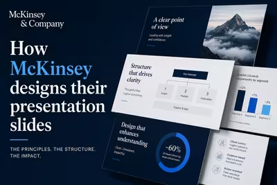
McKinsey's slide design isn't about polish — it's a structured argument system. Here's how the Pyramid Principle actually works in practice.

There's a reason your brain checks out the moment a teacher starts talking at a blank wall — and it's not laziness, yours or theirs.

The slide meant to scare your audience into caring is usually the exact reason they stop listening.

Your deck has a gradient background, a parallax entrance animation, and a B-minus — here's the disconnect nobody explains before the presentation.

The slides aren't what gets people laughing — it's the five seconds before you've said a word.

Some of the worst decks I've ever built were the ones where the client got exactly what they asked for.
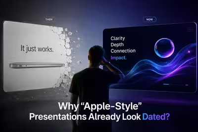
The look that once made a deck feel exceptional is now the thing making decks feel exactly like everyone else's.

Most decks get built once, presented once, and then quietly disappear into a folder nobody searches — here's why.

The number that keeps showing up in every PowerPoint survey is bigger than most people admit out loud — and it hasn't moved much in a decade.

Every third slide deck gets outsourced to an algorithm now — so why are agencies still hiring designers?