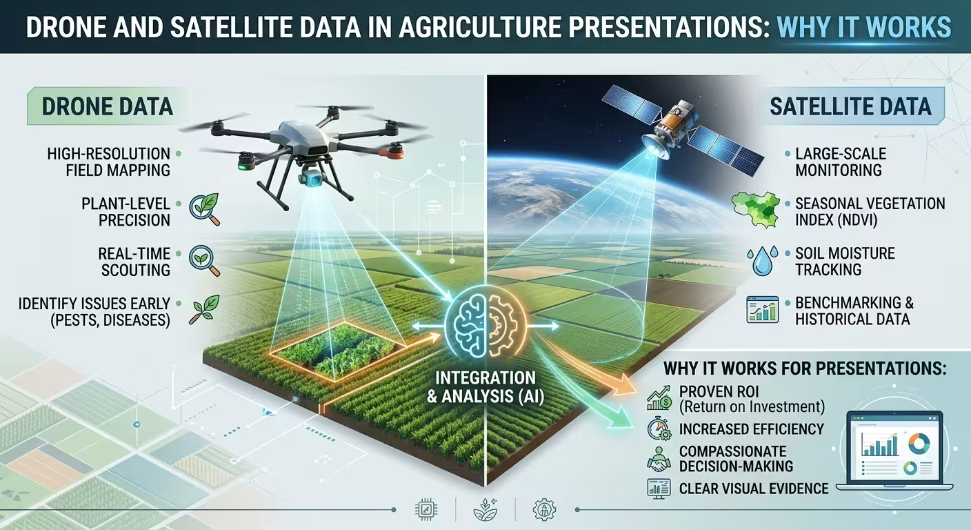
A soil-moisture heat map lands on the screen and the room goes quiet in a different way than it did for the last four slides. Nobody asked a question during the yield-by-hectare bar chart. Nobody leaned forward for the fertilizer-cost line graph. But show the same field from four hundred feet up, colored by chlorophyll stress, and the agronomists in the back row start pointing at the screen before you've finished the sentence.
The information is technically the same. Soil, plants, weather — all of it eventually reducible to a spreadsheet. So why does it behave so differently depending on whether it arrives as a number or as a picture of the actual ground?
The data was never the problem — the altitude was
Most agricultural decks present field data the same way a retail deck presents quarterly sales: tables, a couple of bar charts, maybe a trend line. That format works fine for revenue, because revenue doesn't have a location. Soil nitrogen does. Pest pressure does. Drainage problems absolutely do — they cluster in the low corner of the field every single year, and a spreadsheet has no way to show "corner."
Averaging a field into one yield number is a real loss of information, not just a simplification. A 40-hectare block that averages 9.2 tons per hectare might be hiding a 6-ton dead zone and an 11-ton zone right next to it, and the farmer standing in the room already knows exactly which patch is which — they just haven't been shown it on a slide before. If you're building the base layout for that kind of section, it's worth starting from a ready map layout rather than redrawing field boundaries from scratch every time.
Satellite imagery gets you partway there — indices like NDVI from public missions are genuinely useful for a season-long trend. What they don't do well is small-plot detail: a lot of that public satellite data comes in pixels tens of meters wide, which is fine for flagging a stressed zone but useless for telling you it's a irrigation nozzle, not a disease. That's the gap drones exist to close, and it's also where a presentation gets to do something a spreadsheet structurally can't.
What a thermal map does that a bar chart can't
The easy explanation is "pictures are more engaging than tables," and that's true but it's not the interesting part. The interesting part is what the audience does with the image once it's on screen.
A farmer or agronomist looking at a spatial map isn't reading a legend — they're pattern-matching against a field they already know the shape of. They recognize the low corner. They recognize the old irrigation line. That recognition happens in under a second, faster than anyone could read and process "Zone C: 62% moisture deficit" off a table. One thing I've noticed sitting in on these sessions: the questions change completely once a map is up. Instead of "what does that number mean," people start asking "why is it doing that there" — which is a much better conversation to be having in a strategy meeting.
That only holds, though, if the map actually resembles the field people know. A poorly oriented, badly cropped aerial shot with no scale reference doesn't trigger recognition — it just reads as an abstract blob of color, and you lose the exact advantage you were reaching for.
The novelty is doing more work than the accuracy is
Part of why this lands so well in a room is that it's still genuinely uncommon. The Iowa Farm and Rural Life Poll 2025 found that roughly 22% of Iowa farmers had used a drone or a drone service in the 2024 season — a meaningful number, but still a minority, and Iowa is one of the more tech-forward agricultural states in the US. A 2024 global review of precision-agriculture adoption found that even in Denmark, where uptake of drones, satellites, and aerial imagery combined runs ahead of most countries, that figure topped out around 30% of farmland as of 2023.
So when this kind of imagery shows up in a presentation, a good chunk of the room hasn't seen their own operation from this angle before, or hasn't seen a peer's data presented this way. That novelty is doing real work — probably more than the underlying pixel accuracy is. Which is worth knowing, because it means the bar for "good enough" imagery is lower than a GIS specialist would tell you, and the bar for "don't oversell this as more current or precise than it is" is higher than most presenters assume.
Where this breaks down in the room
Here's the part that gets skipped in most pitches for this kind of visual: raw drone or satellite output is often too messy to put directly in front of a mixed audience. Cloud shadows fake out an NDVI reading. Uncalibrated color balance makes a healthy crop look stressed under the wrong light. Someone with actual GIS or remote-sensing experience usually needs to clean and classify the imagery before it's presentation-ready, and that step gets left out of a lot of "just drop a drone photo in your slide" advice.
Timing is the other trap, and it's a worse one because it's invisible until someone in the room catches it. Satellite imagery has a revisit cycle — days, sometimes over a week depending on the mission and cloud cover — so a map captioned "current field conditions" might be showing conditions from ten days ago. If a farmer in the audience walked that field yesterday and it doesn't match what's on screen, the credibility of everything else in the deck takes the hit, not just that one slide. Drone imagery avoids the revisit-cycle problem but reintroduces a labor and weather-window one: you fly when conditions and staff allow, not necessarily the week before the presentation.
Building the slide without turning it into a GIS tutorial
The layouts that hold up in front of a non-technical audience tend to share a few habits, none of which are about the imagery itself:
- One overlay per slide — stress index, or moisture, or elevation, not all three stacked, which forces the eye to pick a story instead of reading one
- A visible capture date on every map, not buried in a footnote, so nobody in the room mistakes a two-week-old scan for live conditions
- Before-and-after pairing rather than a single frame, since a single map only proves a state exists — a pair proves something changed
- Consistent orientation across every field slide in the deck, because flipping north-up to south-up between slides quietly breaks the pattern recognition that made the first map work
For the base cartography itself, most presenters don't need to build country- or region-level context
Comments (0)