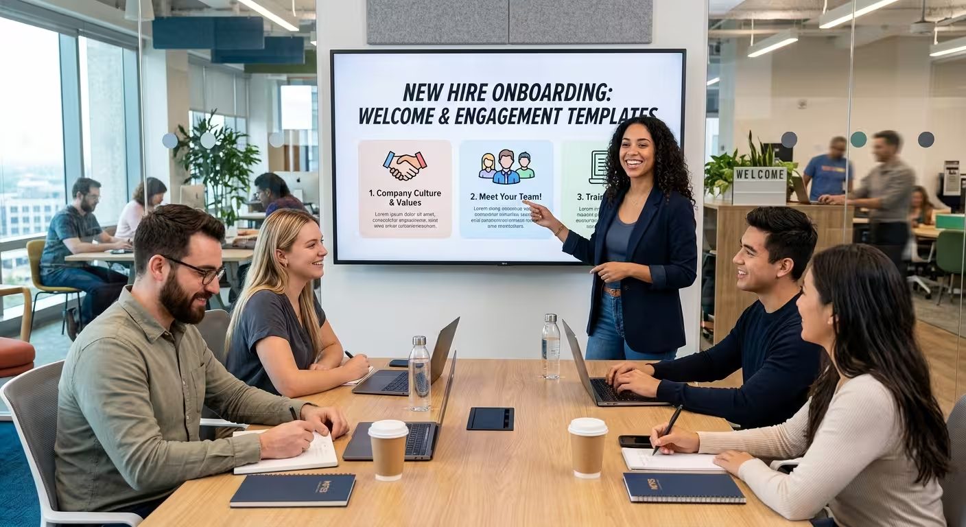
Ask a new hire what was in their onboarding deck three weeks after they saw it, and most of them will describe a blur — a logo, maybe a benefits slide, a photo of the leadership team. That's not because the content was bad. It's because the deck was built to be presented once and then filed away, when the thing new hires actually need is something they can reopen in week six when they've forgotten which system approves expense reports.
That mismatch is the real design problem with onboarding and training presentations, and it's mostly invisible until someone asks a question the deck was never built to answer twice.
The deck built for a room, not for a desk
Most onboarding presentations are designed the way a keynote is designed: big statement slides, one idea per screen, a live narrator filling in the gaps out loud. That works fine for the ninety minutes someone is sitting in the room. It falls apart the moment the room is gone and the deck is the only thing left — because a slide that made sense with someone talking over it usually makes no sense read cold.
I've sat through this exact failure from both sides: presenting a beautifully sparse deck live, then getting a message two weeks later asking what half the icons on slide 12 actually meant. Nobody remembered, because nobody had written it down anywhere except in the presenter's head.
Not every part of onboarding needs a template — and that's the part people skip
Templates are genuinely useful for the structural, repeatable half of onboarding: role overviews, tool walkthroughs, org structure, compliance steps, the first-90-days timeline. These are the sections that follow the same shape for every new hire, which is exactly what a template is for.
The part that shouldn't be templated is the culture and mission narrative — the "why we exist" section. That content works because it sounds like a person talking, not a layout. Force it into the same three-bullets-per-slide structure as the tools section and it reads as filler, which is often exactly why new hires tune it out. One thing I've noticed: teams that template everything usually end up diluting the one section that was supposed to feel human.
Building slides that still make sense with nobody narrating them
Once you accept the deck has to work as a standalone reference, a few structural choices stop being optional:
- One process per slide, not one topic per slide — "How to submit expenses" is a slide; "Finance" is not.
- Written context on the slide itself, not just in the speaker notes nobody outside the room ever sees.
- Sequential visuals for anything procedural — a flowchart for an approval process communicates more, cold, than a bulleted list ever will.
For that last point specifically, structured layouts do more work than plain text bullets. Diagram-based PowerPoint templates — process flows, org charts, cycle diagrams — hold up far better as reference material than a wall of text a new hire has to reconstruct into a mental flowchart themselves.
Design that reads as "training," not "pitch deck"
A lot of onboarding decks get built off a repurposed sales template, and it shows: heavy gradients, oversized stat callouts, the visual language of "convince someone to buy something." New hires already worked here technically — nobody needs to be sold on day one. What they need is something closer to a manual: calmer palettes, generous label text, consistent iconography across every module so the visual language doesn't reset each time they open a new section.
This is where a category built specifically for the job earns its place over a generic corporate deck. Education and training–focused PowerPoint templates are laid out for exactly this — content-dense, low on decoration, built to be read rather than watched.
Where Keynote's polish becomes a liability
Here's the trade-off people rarely plan for: Keynote's smooth transitions and motion-driven builds look genuinely great live, but most of that value disappears the moment a new hire is scrolling the file on their own laptop at their own pace. Reveal animations that felt satisfying in the room just become extra clicks in a self-paced review — friction, not polish.
If your training content is genuinely going to be presented live and repeatedly — a recurring compliance briefing, a live product walkthrough for new sales hires — that's a different case, and native Keynote builds are worth using well. Keynote templates built for education and training are worth starting from there rather than adapting a generic business theme, since the pacing is already tuned for instructional content instead of a pitch.
The gap almost nobody measures
Gallup's long-running workplace research has repeatedly found that only around one in eight employees feels their company actually did onboarding well — a number that's stayed stubbornly low even as onboarding budgets have grown. That gap usually isn't a content problem. Most companies say the right things on day one. It's a reference problem: the material that would have answered someone's question in week four was never built to be reopened, so it wasn't.
Worth checking before you touch a single slide: pull up your current onboarding deck and try to answer a real week-three question using nothing but what's written on the slides, no narrator, no memory of the room. If you can't, the deck doesn't have a design problem yet — it has a purpose problem, and that's the one worth fixing first.
Comments (0)