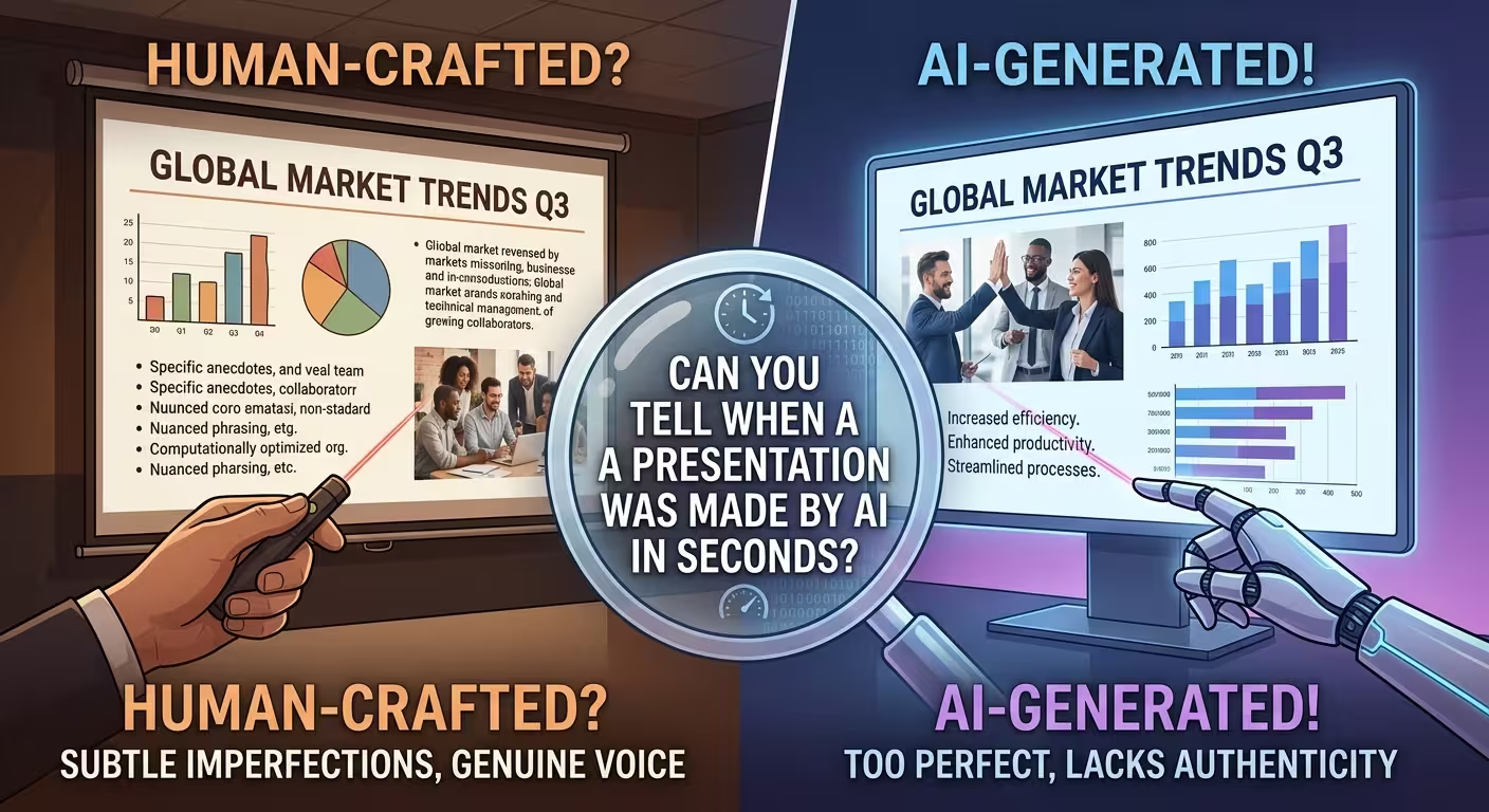
Someone in your office has probably done this: pasted a prompt into an AI tool, watched twelve slides assemble themselves in under a minute, and then asked the room, only half-joking, "can you tell?" Usually nobody can — not right away. Which is the wrong question to be asking, and also why so many people walk away from that demo overconfident about what they just watched happen.
The AI didn't fool anyone into thinking a designer built that deck. It just hadn't been looked at closely enough yet.
The Giveaway Isn't the Design — It's the Pacing
Ask an AI tool for a twelve-slide deck and it will hand you twelve slides that all carry roughly the same visual weight. Same amount of text per slide, same size of headline, same density of bullets, same confident layout repeated with the enthusiasm of someone who hasn't yet noticed that some of these points matter more than others. It's not sloppy. It's the opposite — it's suspiciously tidy, and that tidiness is the tell.
A person building the same deck almost never does this on purpose, but they do it instinctively: the slide with the bad quarter gets more white space and fewer competing elements, because some part of them knows that number needs room to land. The slide recapping something the audience already agrees with gets compressed, because it doesn't need the same runway. That uneven pacing — heavier here, lighter there, one slide that's obviously the pause in the argument — is something audiences register without being able to name it. Even a slide with a slightly off color palette reads as "made by someone in a hurry." A deck where every slide gets identical treatment reads as "made by something that doesn't know which parts matter."
What People Actually Trust AI to Do (and What They Still Don't)
think-cell's State of AI in Business Presentation Creation 2026 survey, which polled more than 1,200 professionals across a dozen countries, found a split that lines up with the pacing problem above almost exactly. Respondents were comfortable letting AI act as a thinking partner — reviewing a draft, brainstorming an outline, tightening a paragraph. Full decks and charts got noticeably less trust.
That gap makes sense once you separate what a chart actually is from what it looks like. A chart is a decision about which number the room needs to sit with the longest, dressed up as a picture. Getting that decision wrong in front of a client or a board carries a much higher cost than a clumsy paragraph does, so people are warier of handing it off — and think-cell's team frames this less as "AI isn't good enough yet" and more as AI being asked to operate at the wrong layer of the workflow, generating a finished slide from nothing instead of refining something built on real data. Interestingly, three out of four respondents still said they expect to lean on AI more over the next year. The hesitation isn't about the technology losing its appeal — it's about exactly which parts of the job people are willing to hand over.
The Compliance Gap Nobody Budgets For
Here's a complication that doesn't show up in any single slide, only across a whole company's worth of them. empower's Ultimate Global PowerPoint Study found that almost all respondents — 96% — consider it important to follow their company's design guidelines, and more than 60% call it very important. And yet the same research found that close to half of all presentations produced inside these organizations don't actually comply with those guidelines.
That's not an AI problem on its own — it predates AI by years, and it's a symptom of people building slides ad hoc instead of from a governed system. But an AI tool doesn't close that gap by default; it will cheerfully generate a deck in whatever aesthetic the prompt implies, brand guide or not, because nothing in a blank prompt tells it what your fonts, colors, or slide masters are supposed to be. Whether that gap needs a person or a locked-down template system is really a question of scale — a one-off internal deck can survive some inconsistency, but a company generating dozens of AI-assisted decks a month without a shared template is just producing that 47% noncompliance figure faster.
Three Places People Actually Look, Whether They Realize It or Not
Pacing and brand consistency are the structural tells. Underneath those, there are a few smaller habits that experienced eyes catch almost reflexively.
- Chart labels that are technically correct and practically useless. AI-generated charts tend to label every axis and every data point with textbook precision and no editorial judgment about which number the eye should land on first. A human-built chart usually has one thing visually louder than the rest.
- Transitions that restate instead of build. "Next, let's look at pricing" is a placeholder for a transition, not an actual one. Decks built slide-by-slide by a generator tend to string sections together this way because there's no larger argument being tracked across them — just a sequence of topics.
- Icons and imagery that match the topic but not each other. A generated deck will often nail "this icon represents growth" on every slide individually while missing that the icon style, weight, and color treatment shift slightly from slide six to slide seven. One inconsistent icon set is invisible. A whole deck of them, compared side by side, isn't.
None of these three is fatal on its own. Stacked together across a full deck, they're what makes a room go quiet in a slightly different way than a genuinely messy human draft does — not bad, just oddly frictionless.
Where "Good Enough" Actually Holds Up
None of this means the minute-long draft is a waste of the minute. For a weekly status update or a training recap nobody outside the team will see, evenness of pacing isn't a flaw worth fixing — it's irrelevant, because nobody's scrutinizing the argument that closely. The honest fix for the tells above, when they do matter, usually isn't rebuilding from scratch. It's swapping the generated chart or diagram slide for one built with actual editorial hierarchy already baked in — pre-built diagram layouts and chart templates designed with that "one number matters more" judgment already in place, then repopulated with your own data. That gets you most of the speed of the one-minute draft without the flat, everything-matters-equally pacing that gives it away.
Worth asking before your next AI-generated deck goes in front of a room isn't "can people tell this was made by AI" — it's "does anything in this deck actually need someone to have decided it mattered more than the rest," and if the answer is yes, whether that decision got made by anyone at all.
Comments (0)