PowerPoint does not really have layers — but your slides behave as if it does
A photograph covers the title. A shape suddenly appears in front of an icon. You click the same area three times and keep selecting the wrong object. Eventually, the temptation is to move everything around until the slide looks right again.
That approach works until the slide becomes complicated.
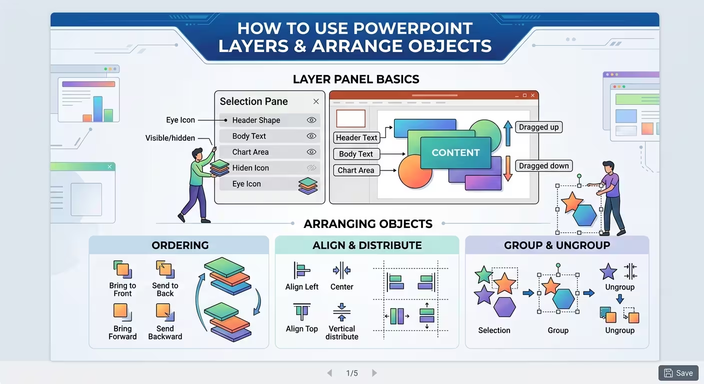
PowerPoint does not use Photoshop-style independent layers. Instead, objects exist in a stacking order. Shapes, pictures, text boxes, icons, charts, and other elements can sit above or below one another, and that order determines what the audience sees.
Once you start thinking about that order deliberately, many “design problems” stop being design problems. An object that looks misplaced may simply be behind the wrong object. A hidden icon may not need to be moved at all. A title that disappears under a shape may only need to be brought forward.
Microsoft PowerPoint provides four core commands for this: Bring to Front, Bring Forward, Send to Back, and Send Backward. The Selection Pane adds another level of control when clicking directly on the slide becomes unreliable.
Understand the stacking order before you start moving things
Imagine building a slide from transparent sheets of paper. The first sheet is the background. Another sheet contains an image. Another contains a semi-transparent overlay. Text sits above that, followed by an icon or small decorative element.
That is essentially how object stacking works in PowerPoint.
A simple presentation cover might contain this order:
- Background color or image
- Large decorative shapes
- Transparent overlay
- Main photograph or visual
- Title and subtitle
- Icons and small details
The exact order will change from slide to slide. What matters is that every overlapping object has an intentional position in the stack.
One thing people overlook is that a slide can look correct while its stacking order is poorly organized. You may not notice the problem until you need to edit the slide two weeks later.
For example, imagine a dashboard with a large background panel, three KPI cards, several icons, and multiple text boxes. Everything looks fine. Then you need to change one icon that happens to sit underneath a transparent rectangle. The visual problem suddenly becomes an editing problem.
This is why it helps to think about object order while constructing the slide, not only when something goes wrong.
A useful rule is to build from back to front: establish the background first, then large structural elements, then the main visual content, then text and finally small details.
This does not mean you should never insert something into the middle later. It simply gives you a predictable starting structure.
Know the difference between Bring Forward and Bring to Front
These four commands sound almost interchangeable until a slide contains twenty overlapping objects.
They are not.
- Bring to Front: moves the selected object above all other objects in its stacking context.
- Bring Forward: moves it one position forward.
- Send to Back: moves it behind all other objects in its stacking context.
- Send Backward: moves it one position backward.
Microsoft documents the same distinction in its PowerPoint guidance.
Consider a slide with a background image, a transparent overlay, a chart, a text box, and an icon. If the icon is behind the chart but should sit above the chart, Bring to Front may create a new problem by placing it above the title and other elements as well.
Bring Forward may be the correct move because it changes only one relationship in the stack.
This is an important practical distinction: use the smallest stacking-order change that solves the problem.
When working on complex diagrams or presentation layouts, moving an object all the way to the front can destroy several carefully established relationships at once. Moving it one step can preserve them.
ImagineLayout's detailed guide to PowerPoint layers covers the same four commands and shows why the distinction becomes particularly useful when several objects overlap. See the practical PowerPoint layers guide for more examples of stacking order and hidden objects.
Use the Selection Pane when clicking stops working
There is a point where clicking directly on the slide is no longer an efficient way to edit objects.
Maybe a large rectangle covers a small icon. Maybe several text boxes occupy almost the same area. Maybe a background image keeps getting selected when you are trying to edit the title.
This is exactly what the Selection Pane is for.
In PowerPoint, open Home → Select → Selection Pane. Microsoft also documents the Alt+F10 shortcut in supported desktop versions. The pane lists objects on the slide and lets you reorder, hide, and show them.
The Selection Pane changes the editing experience because you no longer have to identify an object by clicking on its visible pixels.
Instead, you can select the object from a list.
That becomes especially useful when the object is completely hidden.
Suppose you have a title underneath a large semi-transparent shape. You could move the shape temporarily, edit the title, and then move the shape back. But that creates unnecessary layout changes.
A cleaner workflow is to open the Selection Pane, temporarily hide the shape, edit the title, and then show the shape again.
Microsoft specifically recommends using the Selection Pane to manage hidden objects and reorder them.
Rename important objects
The Selection Pane becomes much more useful when the objects have meaningful names.
“Rectangle 17,” “TextBox 24,” and “Picture 8” do not tell you much when a slide contains fifty objects.
Names such as these are considerably easier to work with:
- Background Image
- Dark Overlay
- Main Title
- Revenue Chart
- KPI Revenue
- KPI Growth
- Source Note
You do not need to rename every tiny decorative line. Focus on the objects you are likely to edit, hide, lock, or move later.
This small organizational step becomes particularly valuable when you are working with a reusable presentation template. The more editable objects a template contains, the more important it becomes to know what those objects actually are.
Do not confuse layers with grouping
Grouping and layering solve two different problems, and confusing them is a common source of frustration.
Grouping answers: “Which objects should behave as one unit?”
Layering answers: “Which object should appear in front of which?”
Imagine a KPI card made from four objects:
- a rounded rectangle;
- an icon;
- a large number;
- a descriptive label.
You can group those objects so the entire card moves as one component. But the group still has a position relative to other objects on the slide.
You might then place the complete KPI card above a background panel but below a foreground annotation.
Grouping therefore does not replace arranging. It changes the unit that you are arranging.
There is also a practical downside to over-grouping. If you group an entire slide because it is convenient to move everything at once, you may make future editing harder. A designer who needs to change one title or chart will first have to enter the group or ungroup the entire composition.
A better rule is to group objects that form a meaningful component, not objects that merely happen to be close together.
Good candidates include:
- KPI cards;
- diagram nodes;
- icons with their labels;
- small annotation systems;
- reusable visual components.
Keep major slide regions separate when they need to remain independently editable.
Use transparency to make layers work together
Layering becomes much more interesting when objects are not completely opaque.
A common example is a photograph with a transparent rectangle above it and text above both.
The photograph remains visible, but the overlay changes the visual conditions behind the text.
The stack might look like this:
- Photo
- Semi-transparent dark rectangle
- Title
- Subtitle
The order matters. If the rectangle sits behind the photo, it cannot darken the photo. If the title sits underneath the rectangle, the text may become partially hidden or visually weakened.
Transparency therefore does not eliminate the need for correct stacking. It makes stacking more powerful because objects can influence one another without completely covering what is underneath.
The same principle works for diagrams. You can place a diagram or map at the back, then add transparent circles, arrows, labels, or highlight shapes above it to direct attention toward a specific area.
One warning: transparent objects are easy to forget.
If a slide suddenly looks darker or flatter than expected, check the Selection Pane. A large transparent rectangle may still be sitting above the content and changing how everything underneath it appears.
Arrange objects as a visual system, not one object at a time
Professional slides often contain more overlapping objects than they initially appear to.
A polished consulting slide might combine a background panel, several cards, a chart, icons, labels, callouts, and decorative elements. If every object is arranged independently, editing quickly becomes fragile.
Instead, think about the slide in structural levels.
For example:
- Level 1 — Environment: background, image, large color fields.
- Level 2 — Structure: panels, containers, frames, major shapes.
- Level 3 — Content: charts, diagrams, tables, images.
- Level 4 — Explanation: titles, labels, annotations, source notes.
- Level 5 — Accent: icons, highlights, small decorative elements.
This is not a PowerPoint feature. It is a way of reasoning about the composition.
Once you think this way, you can often diagnose a broken slide faster. If a chart disappears, look at the structural layer above it. If a title becomes unreadable, inspect the overlays and panels beneath it. If an icon seems impossible to select, look at the Selection Pane rather than repeatedly clicking the slide.
This approach also makes templates easier to customize. Instead of treating the template as one flat picture, you can understand which objects create the background, which create the structure, and which are actual content.
For presentations where recurring structural elements need to remain consistent, it is also useful to understand what belongs in the Slide Master and what should stay editable on individual slides. This practical guide to PowerPoint Slide Master explains how to separate presentation-wide structure from slide-specific content.
Build the back of the slide before the front
When creating a complicated slide from scratch, the easiest way to reduce layer problems is to establish depth intentionally.
Start with what should remain behind everything else.
Then progressively add the elements that need to sit above it.
A practical construction sequence might be:
- Set the background.
- Add large background images or color fields.
- Add major structural shapes and panels.
- Add the primary chart, diagram, or image.
- Add titles and supporting text.
- Add icons and annotations.
- Add small visual accents last.
This approach has an additional benefit: you can often avoid using Send to Back and Bring to Front repeatedly.
If you build a slide in approximate depth order, the stacking order develops naturally.
Of course, real presentation work is rarely perfectly linear. You will insert something in the middle, duplicate a component, or discover that an element needs to sit between two existing objects. That is where the Arrange commands and Selection Pane become useful.
The point is not to avoid rearranging objects. It is to make the rearrangement intentional instead of constantly repairing accidental stacking problems.
Know when the problem is actually the layout
Layers can solve many problems, but they cannot rescue a composition that contains too many objects.
If a slide requires a dozen overlapping rectangles simply to create a background effect, the problem may not be the stacking order. The design itself may be unnecessarily complicated.
The same applies to decorative objects. If you keep moving shapes forward and backward because they are competing with the content, consider whether some of them should disappear entirely.
Layering is useful when objects need to interact. It becomes a maintenance burden when layers exist only because the slide accumulated visual decoration.
This distinction matters especially in editable presentation templates. A template should give you enough structure to build the intended composition without turning every small visual adjustment into an archaeological exercise.
ImagineLayout's broader presentation-design guidance makes a related point: professional slides depend on relationships between elements — hierarchy, positioning, spacing, and structure — rather than simply collecting attractive individual objects. See the guide to making PowerPoint slides look more professional for a broader look at how those relationships affect the finished slide.
A simple workflow for fixing a complicated PowerPoint slide
When an object disappears, cannot be selected, or appears in the wrong place, do not immediately rebuild the slide.
Run this short diagnostic sequence:
- Identify the symptom. Is the object hidden, unselectable, or simply behind the wrong element?
- Open the Selection Pane. Inspect the objects instead of relying on direct clicking.
- Find the object. Rename it if its current name is meaningless.
- Check grouping. Determine whether the object belongs to a larger group.
- Check the stacking order. Decide whether it needs to move one position or all the way to the front/back.
- Check transparency. Look for an overlay that is affecting the visual appearance.
- Check the result. Make sure the slide still works when viewed as a complete composition.
This is usually faster than dragging objects around until something happens to look correct.
More importantly, it fixes the underlying relationship rather than only the visible symptom.
The best way to think about PowerPoint layers is therefore not as a hidden feature you need to master for its own sake. They are simply the logic behind overlapping objects.
Once you know which object belongs in front, which belongs behind, which components should be grouped, and which elements should remain independently editable, complicated slides become much easier to control.
The next time a PowerPoint object seems to have disappeared, resist the instinct to move everything around. Open the Selection Pane, inspect the stacking order, and ask a more useful question:
Which object is supposed to be in front of this one?
Very often, that is the entire problem.
Comments (0)