Australia Keynote Maps
Formerly known as australia keynote maps templates - this collection now includes editable vector maps of Australia optimized for Keynote presentations.
These maps let you adjust colors for different regions, add labels for cities, and highlight territories with ease.
They serve consultants and managers who present Australia-specific information in board meetings or stakeholder sessions.
Turn to these when you need accurate geography instead of piecing together basic shapes. A logistics coordinator, for example, can show delivery routes across states in a quarterly operations review to help the team spot patterns quickly.
Pick the layout that fits your data and make adjustments to support your key points.
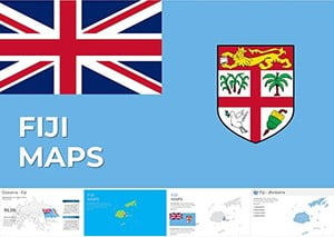 (475)
(475) Fiji Islands Keynote Map Template - Instant DownloadID: #KM00231$30.00
 (920)
(920) New Caledonia Keynote Maps: Designing for Island InnovationID: #KM00230$18.00
 (575)
Papua New Guinea Keynote Maps: Architecting Across Diverse TerrainsID: #KM00229$38.00
(575)
Papua New Guinea Keynote Maps: Architecting Across Diverse TerrainsID: #KM00229$38.00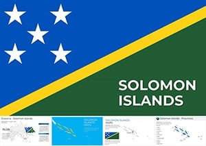 (651)
(651) Solomon Islands Keynote Maps Template: Mapping Architectural VisionsID: #KM00228$17.00
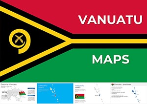 (492)
(492) Vanuatu Keynote Maps: Comprehensive Collection for Island InsightsID: #KM00227$25.00
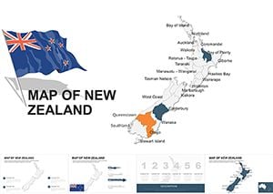 (214)
New Zealand Editable Maps Keynote Template: Islands of Innovation UnveiledID: #KM00045$52.00
(214)
New Zealand Editable Maps Keynote Template: Islands of Innovation UnveiledID: #KM00045$52.00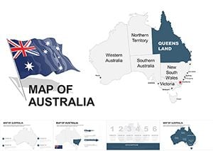 (661)
Australia Editable Maps Keynote Template: Charting Down Under's StoriesID: #KM00043$48.00
(661)
Australia Editable Maps Keynote Template: Charting Down Under's StoriesID: #KM00043$48.00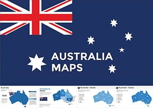 (112)
Australia Keynote Maps Template - Editable & ProfessionalID: #KM00020$45.00
(112)
Australia Keynote Maps Template - Editable & ProfessionalID: #KM00020$45.00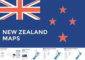 (998)
New Zealand Maps Keynote Template: Kiwi Visions in Vibrant DetailID: #KM00018$40.00
(998)
New Zealand Maps Keynote Template: Kiwi Visions in Vibrant DetailID: #KM00018$40.00
Use Cases
These templates fit multiple business situations. A sales director in the retail industry uses one during a national performance review to color code states based on quarterly results for the executive team. This approach makes regional differences clear without confusion. The map allows the director to focus the discussion on specific actions for underperforming areas while keeping the audience engaged with visual context. A strategy consultant in the resources sector presents exploration sites to potential investors by highlighting specific areas on the map. The visual helps explain scope and potential impact while answering questions about location advantages during the pitch. A policy advisor in the public sector displays program reach across territories in a funding proposal. Stakeholders see the coverage at a glance and can discuss adjustments based on the visual data presented in the meeting. An analyst in the agriculture industry shows crop yield variations by state in an annual report meeting. The map supports data comparison effectively and allows the team to identify trends tied to geographic factors. In each case the templates provide a structured way to present complex location data that keeps the audience engaged and supports informed decision making.
Comparison vs. Default Keynote Shapes or Blank Slides
Default shapes in Keynote require manual adjustment to match Australia's outline, often resulting in inaccurate proportions and wasted time during preparation. Our templates provide pre-defined regions for every state and territory that scale perfectly without distortion even when resized for different slide layouts. Blank slides usually involve imported images that lose quality when resized or cannot be colored by section easily for data emphasis. With these templates, you gain the ability to change individual areas independently for data visualization without affecting the overall structure. The result is a cleaner slide that focuses attention on your message rather than design flaws that can distract the audience. This difference becomes obvious in high-pressure situations where every minute counts and accuracy matters for credibility. Additionally, default tools lack the built-in labels for cities or territories that these templates include, saving additional steps in the process. You avoid the common issue of misaligned borders that can occur when trying to build maps manually from scratch. Overall, the templates deliver a more reliable starting point for any presentation that involves Australian geography and data overlays.
Best-Practice Advice for Using the Templates in This Category
Start by selecting a map version with the level of detail your presentation requires, such as major cities or state borders only, to match the audience expectations. Apply a limited color palette based on your company branding to maintain consistency across the entire deck and reinforce corporate identity. Limit visible labels to the most relevant regions to avoid clutter that could overwhelm viewers during a fast-paced discussion. Combine the map with a simple bar chart on the same slide for context and allow the audience to connect numbers with locations instantly. Always test the slide in presentation mode to ensure readability from the back of the room or on different screen sizes. These steps help the audience grasp the geographic information without distraction from excessive elements. Follow the same approach for any animations to reveal regions one at a time and build the story progressively. Prepare backup versions with different detail levels in case the audience requests more or less information during the meeting. This preparation ensures the presentation flows smoothly regardless of the direction the discussion takes and demonstrates thorough planning.
Technical Tip for This Category
A useful technical tip is to group the map elements after initial customization in Keynote. This keeps all states aligned when you resize the entire graphic for different slide layouts without losing relative positions. You can then ungroup specific sections later if you need to animate one region separately or apply unique effects. This method saves time when you revise the presentation later and need to maintain consistency across multiple versions. It also prevents accidental movement of individual pieces during editing sessions that could ruin the accuracy. Consider duplicating the grouped map on a hidden slide as a backup before making major changes. This practice protects your work and allows quick recovery if an edit does not produce the desired result. The approach works particularly well when combining maps with charts that need to align precisely.
Why ImagineLayout Versions Differ from Competitors
Our collection stands apart because each map is built considering actual business needs reported by teams at large organizations. Other marketplaces often provide basic outlines that require extensive rework before they fit real presentation contexts. We offer multiple versions with varying levels of city markers and data ready structures that align directly with common reporting requirements. The vector quality supports clean printing or screen sharing without loss even when projected in large conference rooms. This focus on practical use cases makes the templates more efficient for real client work and internal meetings compared to standard options available elsewhere. The templates also include suggested color schemes that align with common corporate palettes, reducing the time spent on design decisions during tight deadlines. Teams report faster preparation times when using these compared to generic alternatives from other sources that lack the same level of business relevance.
FAQ
Are these Australia map templates compatible with the latest Keynote versions?
Yes, every template in this collection is built using standard Keynote features and has been tested with recent releases. You can open the files directly and begin editing without compatibility issues on Mac computers. The elements use native shapes and text boxes that respond well to updates in the software. This ensures you can focus on content rather than troubleshooting file issues during tight deadlines. The templates also retain all editing capabilities even after multiple saves and exports to different formats if needed for sharing.
How do I customize the colors for different regions on the map?
Customization is straightforward in Keynote. Select the region you want to change, use the format panel to pick a new fill color, and adjust opacity if needed for emphasis on key areas. You can apply the same color to multiple regions by holding the shift key during selection to speed up the process. This process allows you to match your company branding or data categories quickly without starting over. Test the colors in slide show mode to confirm they stand out on different backgrounds and lighting conditions. Save a version with your custom colors as a separate file for future presentations to maintain consistency across the team.
What licensing applies for commercial use of these templates?
The templates come with a standard license that allows commercial use in client presentations and internal company meetings without additional fees. You can modify them freely for your projects and distribute the finished presentations to your audience as needed. The license does not permit reselling the templates themselves or using them to create competing products for the market. This arrangement supports business teams that need reliable tools for ongoing work without additional restrictions on usage within the organization. Contact support if your use case falls outside standard commercial scenarios for clarification.
What file formats are available for download?
Each template downloads as a native Keynote file that opens directly in the application on your Mac. The package includes the main file along with any supporting assets like icon sets if applicable for the map version selected. No additional formats are needed because the native file preserves all editability and vector quality for professional results. This setup ensures you can start working immediately after download without conversion steps that could affect the design integrity. The files are also compatible with export options within Keynote for sharing purposes.
Can I edit the labels and add my own data points to the templates?
Yes, all text labels and data placeholders are fully editable in Keynote. Click on any label to change the text or font size to fit your specific information and branding guidelines. You can add new data points by inserting additional text boxes or icons that align with the existing map structure. This flexibility supports any level of customization required for your presentation. The vector nature ensures that additions maintain quality when scaled or animated. Test the updated slide in presentation mode to confirm the data displays clearly for the audience.