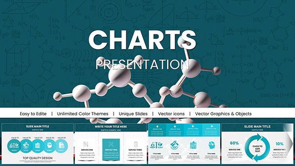
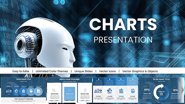
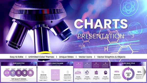
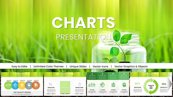
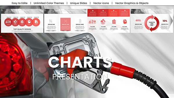
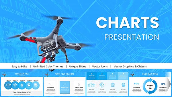
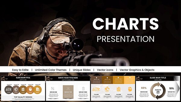
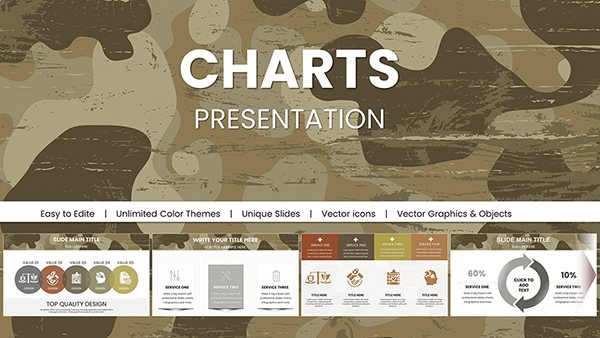
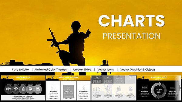
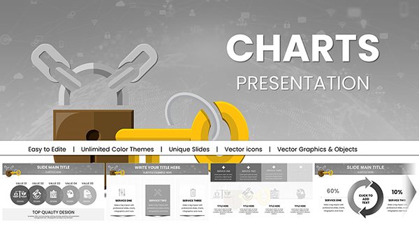
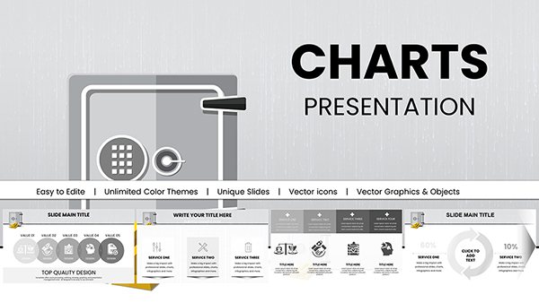
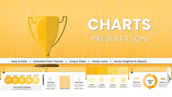
Our extensive collection of professional-grade PowerPoint templates offers a variety of configurable graph and chart themes, enabling you to craft visually stunning presentations. Whether you're presenting corporate data, academic research, or marketing insights, our templates are the perfect choice for effectively communicating your message. Select from a range of designs and layouts to suit your needs and captivate your audience.
What Are Graphs PowerPoint Chart Templates?
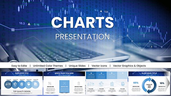
Graphs PowerPoint chart templates are pre-designed graphical representations used in presentations to convey facts and information. These templates offer a systematic and visually appealing approach to displaying various types of data using charts such as bar graphs, line graphs, pie charts, and more. Users can easily create visually appealing and professionally structured charts, ensuring their data is clear and effective.
Advantages of Using Graphs PowerPoint Chart Templates
- Time Efficiency: The use of pre-designed templates speeds up the chart creation process. Rather than starting from scratch, users can modify existing designs to meet their individual needs.
- Consistency: Templates provide a uniform appearance across the presentation, contributing to a professional impression and making the presentation more cohesive.
- Ease of Use: Templates are user-friendly, even for individuals with minimal design experience. Most designs include clear instructions and customizable areas, making data entry and display straightforward.
- Professional Design: Professionally made templates use design principles to enhance the visual appeal of charts, making data more engaging and understandable.
- Data Clarity: Templates highlight significant data points, making complex information more accessible and understandable. This clarity helps audiences quickly grasp key themes.
Types of Graphs PowerPoint Chart Templates
- Bar Graphs: Ideal for comparing different categories and tracking changes over time. Bar graph templates come in various designs, including clustered, stacked, and horizontal bars.
- Line Graphs: Useful for visually displaying trends over time.
- Pie Charts: Ideal for displaying proportions and percentages. Pie chart templates represent data as slices of a whole, making it easy to compare sections to the whole.
- Area Charts: Useful for visualizing changes and trends by showing cumulative data over time.
- Scatter Plots: Useful for identifying relationships and patterns between two variables.
- Doughnut Charts: Similar to pie charts but with a blank center, providing a unique way to show proportional data.
- Radar Charts: Useful for evaluating multiple variables or performance measures, offering a visual representation of strengths and weaknesses.
Examples of Using Graphs and PowerPoint Chart Templates in Different Situations
- Business Meetings: Presenting sales data, market analysis, or performance indicators using bar or line graphs helps stakeholders quickly understand business trends.
- Education: Teachers and students can use pie charts or bar graphs to present research findings, survey results, or statistical data in reports and presentations.
- Finance: Financial analysts often use line and bar graphs to show financial performance, budget forecasts, and investment analysis.
- Project Management: Project managers can use Gantt charts and other visual templates to track project deadlines, milestones, and progress.
- Marketing: Marketers may use charts to demonstrate campaign results, market segmentation, and consumer behavior data.
Where and Who Needs Graphs PowerPoint Chart Templates?
- Businesses of any size for internal reporting, sales presentations, and client meetings.
- Educational institutions for conveying research findings, student achievements, and educational trends.
- Financial institutions, such as banks and investment firms, for showing financial data, market trends, and economic projections.
- Marketing professionals for analyzing campaign performance, market research, and customer data.
- Project managers and teams for measuring progress, managing resources, and communicating project status.
User Reviews of Graphs PowerPoint Charts Templates
Users often appreciate the convenience and efficiency provided by Graphs PowerPoint chart templates. Reviews frequently highlight the following points:
- Ease of Customization: Users can easily adapt templates to meet their needs, allowing for quick updates and revisions.
- Professional Quality: Many reviews note that the high-quality design of templates enhances the overall professionalism of their presentations.
- Variety and Flexibility: The wide range of available templates allows users to choose the best options for their data display needs.
- Time Savings: Users value the time saved by using ready-made templates rather than creating charts from scratch.
Graphs PowerPoint chart templates are valuable for anyone presenting data effectively. By offering various style options and streamlining the creation process, these templates help users communicate information clearly and professionally.
Questions & Answers
- What are Graphs PowerPoint Chart Templates? They are pre-designed slides that include various charts and graphs for visually representing data in a PowerPoint presentation.
- Why Should I Use Graphs PowerPoint Chart Templates? These templates save time and effort by providing professionally designed charts, ensuring consistency, and enhancing the visual appeal of your presentations.
- What charts are commonly used in these templates? Common types include bar charts, pie charts, line graphs, area charts, scatter plots, and combination charts.
- Can I edit the charts in these templates? You can modify the charts' colors, fonts, data, and layout to suit your specific needs and branding.
- How do graphs, PowerPoint charts, and templates help with data presentation? They help present complex information concisely and visually appealingly, allowing the audience to understand and remember it better.
- Are these templates suitable for various industries? Yes, Graphs PowerPoint Chart Templates are versatile and can be used in various fields, including business, education, healthcare, and finance.
- Can these templates be used with Microsoft PowerPoint and Google Slides? Most Graphs PowerPoint Chart Templates are compatible with both Microsoft PowerPoint and Google Slides, but it's always best to check compatibility before using them.