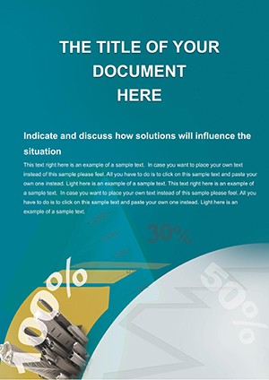
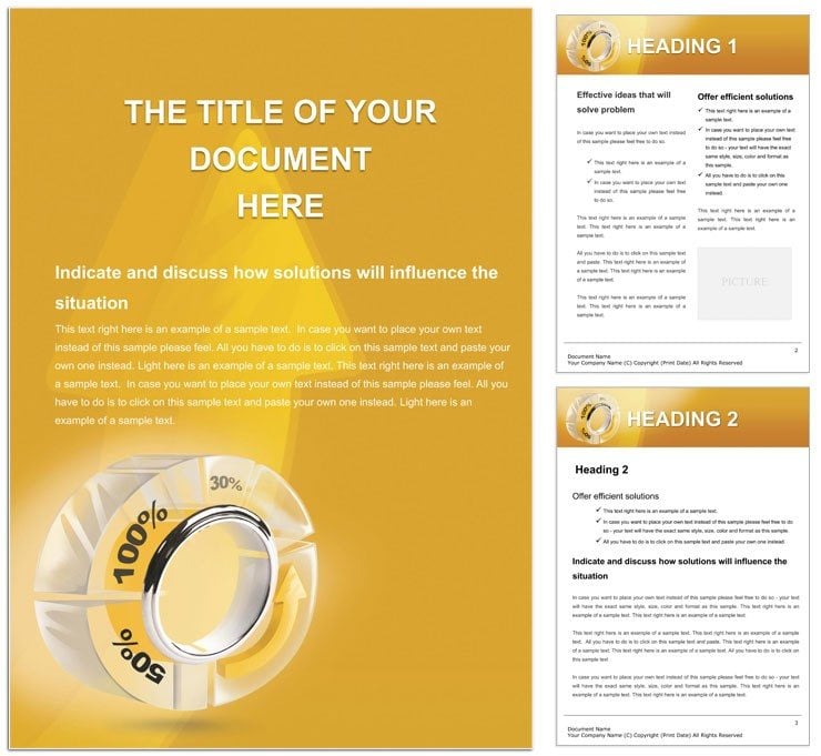
Percentage Pie Chart Word Template: Visualize Financial Data with Precision
Type: Word templates template
Category: Finance - Accounting
Sources Available: .dot, .dotx, .jpg
Product ID: WT00965
In the fast-paced world of finance and accounting, where numbers must not only add up but also illuminate trends at a glance, the right visual tool can make all the difference. Enter the Percentage Pie Chart Word Template - a specialized resource crafted for professionals who need to convey complex data like bank interest rates or budget allocations through intuitive pie charts embedded right in their Word documents. This isn't your basic clipart filler; it's a thoughtfully designed asset that turns spreadsheets into storytelling devices, ideal for financial statements that demand both accuracy and aesthetic punch.
Targeted at accountants, financial analysts, and bank managers, this template streamlines the creation of reports where percentages paint the full picture. With its core featuring a prominent, fully editable pie chart structure, you can slice and dice data on revenue shares, expense breakdowns, or investment portfolios effortlessly. Supporting elements include complementary text blocks for annotations, formatting options for consistent branding, and image placeholders for supplementary visuals like trend lines. Available in .dot for reusable setups, .dotx for enhanced compatibility, and .jpg for previews, it integrates smoothly into your existing workflow across Windows, Mac, or even web-based editors.
The beauty here lies in its problem-solving prowess: Ever struggled to make a dense accounting ledger visually engaging without exporting to PowerPoint? This template bridges that gap, letting you stay within Word while delivering impact. For example, a bank teller preparing monthly rate summaries can populate the pie with tiered interest figures, add color-coded segments for clarity, and wrap it in professional styles that align with regulatory standards. It's about empowering your insights to resonate, whether in client meetings or internal reviews.
Core Components That Drive Data-Driven Documents
At the heart of this template is the percentage pie chart itself - a scalable vector graphic ready for your inputs. Beyond that, discover a toolkit of features that elevate everyday docs:
- Editable Chart Mechanics: Drag to resize segments, input values directly, and watch percentages auto-calculate for instant updates.
- Style Synchronization: Unified fonts and colors that propagate across the doc, ensuring your financial visuals harmonize with textual narratives.
- Drawing Enhancements: Overlay lines or labels on the pie for deeper context, like highlighting outlier categories in expense reports.
Customization is straightforward: Launch in Word, select the chart object, and link it to your data source if pulling from Excel. Adjust via the format pane for gradients or shadows that add subtle depth without garishness. This setup contrasts sharply with vanilla Word charts, which often feel clunky - here, everything flows with intent, saving you from reformatting headaches.
Layering Text and Images for Comprehensive Reports
To build a full financial statement, weave the pie chart into broader layouts. The template's text parameters guide bullet-point explanations beneath the visual, while image slots accommodate logos or icons for categories like "savings" or "loans." For bank rate docs, position the pie centrally on a page, flank it with descriptive paragraphs, and use drawing objects to arrow-point key slices - transforming a static figure into an interactive guide.
- Insert your dataset into the chart fields.
- Format labels for readability, opting for outside placement on larger pies.
- Integrate surrounding text with hyperlinks to source files for audit trails.
Such integration makes it a staple for quarterly accounting overviews, where visualizing allocations can spotlight efficiencies or red flags early.
Practical Scenarios: Pie Charts in Action Across Finance
Envision an accounting firm auditing a client's portfolio: The template's pie chart breaks down asset classes by percentage, with adjacent tables detailing values - a combo that clarifies diversification at a glance. In banking, it's perfect for rate comparison flyers; color the slices by product type, annotate with fine print, and distribute digitally or in print.
For budget planning, a financial planner might use it to illustrate client spending habits, fostering discussions on reallocations. Or in compliance reporting, embed multiple pies for year-over-year comparisons, leveraging the styles to denote changes visually. These applications highlight the template's versatility, adapting to transactional docs as readily as strategic analyses, all while maintaining a clean, trustworthy look that professionals rely on.
Guided Workflow: From Data to Delivered Doc
Here's how to harness it step by step:
- Prep Phase: Gather your percentages and open the template.
- Chart Build: Enter data, tweak segments for emphasis on high-impact areas.
- Context Add: Draft explanatory text, insert relevant images.
- Finalize: Proof for alignment, export options as needed.
- Share: Send via email or cloud for feedback loops.
This methodical approach ensures your financial visuals not only inform but inspire action, far surpassing ad-hoc creations.
Elevating Your Reporting Game with Smart Design
In a field where precision meets persuasion, this template distinguishes itself through thoughtful details - like responsive layouts that reflow on different screen sizes or pre-optimized print settings for crisp outputs. Unlike generic tools, it anticipates finance nuances, such as space for footnotes on calculation methods, building credibility without extra effort.
Financial pros appreciate how it facilitates storytelling: A pie chart isn't just data; paired with the template's elements, it narrates fiscal health, aiding everything from loan approvals to investment pitches. Grab this Percentage Pie Chart Word Template for $22 now and turn your numbers into narratives that stick.
Frequently Asked Questions
Can the pie chart handle more than 10 segments?
Yes, it scales up to 20 segments comfortably, though for clarity, we recommend limiting to eight for detailed docs.
Is this template suitable for Mac users?
Definitely, it's fully compatible with Word for Mac, including .dotx format support.
How do I update percentages after initial setup?
Click the chart, edit values in the data table, and changes reflect automatically.
Does it include color themes for branding?
It offers three default themes, easily customizable via Word's color palette.
Can I convert the chart to grayscale for printing?
Easily - select the chart and apply grayscale formatting in the picture tools.
Are there tutorials for advanced edits?
The template includes inline tips; for more, refer to Word's built-in help on shapes.