Orange Pie Charts Word Template: Slice Through Financial Insights with Style

Type: Word templates template
Category: Neutral - Abstract, Finance - Accounting
Sources Available: .dot, .dotx, .jpg
Product ID: WT00883
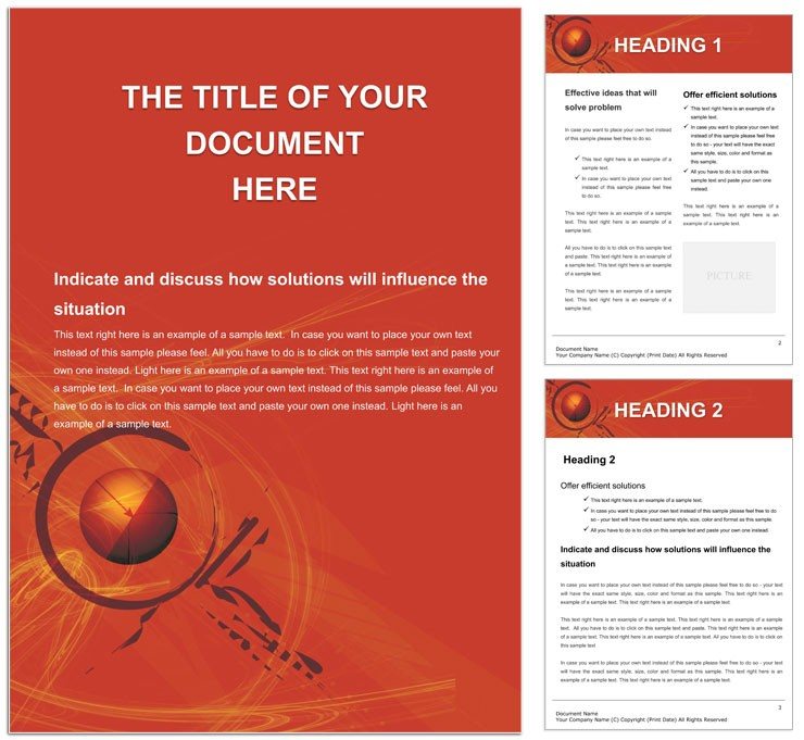
Financial documents often drown in spreadsheets and stark tables, but what if your reports could pop with color and clarity, turning numbers into compelling stories? Enter the Orange Pie Charts Word template, a vibrant tool for finance whizzes, accountants, and analysts who crave precision wrapped in visual appeal. This template isn't just a layout - it's your secret weapon for budgets, performance reviews, and investor summaries that demand attention without sacrificing professionalism.
Designed with an energetic orange backdrop that evokes warmth and growth, it features meticulously crafted pie charts ready to dissect revenue streams or expense allocations. In A4 portrait mode, the pages flow logically from executive summaries to detailed breakdowns, all while maintaining a neutral abstract vibe that fits any corporate palette. Editable vector segments let you adjust slices on the fly, ensuring your data always tells the exact tale you intend.
Core Components: Building Blocks for Data-Driven Narratives
The template's backbone is its suite of professionally drawn pie variations - simple wedges for quick overviews, exploded views for emphasis on key metrics, and nested designs for hierarchical data like departmental spends. Each chart integrates seamlessly with Word's table tools, allowing you to link values directly from Excel imports for real-time updates. Surrounding these are styled text blocks with bold headers like "Q4 Revenue Distribution," formatted in clean sans-serif fonts that enhance readability on screens or paper.
Unlike generic Word charts that require endless tweaking, these come pre-optimized with gradient fills and subtle shadows, giving depth without distraction. Image placeholders flank the charts for contextual visuals - think stock icons of rising graphs or currency symbols - customizable to reflect your firm's branding. The overall structure promotes scannability: short paragraphs interspersed with visuals keep readers engaged through dense fiscal content.
Mastering Customization: From Raw Data to Polished Report
- Launch and Load: Open in Word 2019 or newer, and use the embedded wizard to select chart types based on your dataset size.
- Input Intelligence: Paste your figures into linked cells; watch segments resize proportionally, with labels auto-formatting to percentages.
- Color Calibration: Swap the orange theme to blues for conservative reports or greens for sustainability-focused audits - vectors ensure crisp results.
- Enhance Engagement: Add callout boxes for insights, like "Marketing led growth by 25%," using the template's predefined shapes.
- Proof and Publish: Run a quick style check via Word's reviewer tools, then export to PDF for secure sharing.
This workflow streamlines what used to be a weekend chore into an afternoon triumph, freeing you for strategic analysis. Envision a CFO unveiling quarterly results: the orange hues signal optimism, making tough numbers feel approachable.
Versatile Use Cases: Accounting Audits to Boardroom Briefs
For accounting teams, this template excels in audit trails, where pie charts map compliance categories against risks, providing auditors with at-a-glance assurance. Budget planners leverage the multi-page setup to compare projected versus actual spends, with side-by-side charts highlighting variances. In finance consulting, it powers client proposals - dedicate a page to portfolio allocations, using the abstract neutrality to keep focus on facts over flair.
Extend it to educational contexts, like training modules on financial literacy, where vibrant pies illustrate compound interest in ways textbooks can't. A mid-sized firm's controller might use it for internal memos, embedding charts that track overhead reductions, fostering transparency across departments. These applications draw from the template's modular design, akin to how financial illustrators in outlets like The Economist employ color to demystify markets.
Pro Tips for Impactful Financial Visuals
- Limit slices to five per pie to avoid clutter; use legends for deeper dives.
- Integrate hyperlinks to source spreadsheets, enabling interactive reviews in shared docs.
- For print runs, opt for the high-res export option to retain orange vibrancy on glossy paper.
Accessibility is baked in - charts include descriptive alt text like "Pie chart showing 40% sales allocation," aiding screen readers in compliance-heavy environments. Pair with Word's collaboration features for team edits, and your reports become living documents that evolve with feedback.
Elevating Your Fiscal Storytelling
This template transcends basic diagramming by fostering trust through clear, confident visuals - essential in high-stakes finance where misreads cost fortunes. Its compatibility spans platforms, ensuring seamless handoffs from drafter to approver. With elements that scale from memos to annual reports, it's a staple for any data handler aiming to impress.
Don't let bland layouts dim your insights. Secure the Orange Pie Charts Word template for $22 and start carving out clearer paths to understanding.
Frequently Asked Questions
Can I import data from Excel directly?
Yes, copy-paste into linked tables triggers automatic chart updates for dynamic reporting.
Is the orange theme fixed, or fully customizable?
Fully editable - change backgrounds and fills to align with any corporate color scheme.
Does it support multiple chart types beyond pies?
While pie-focused, it includes adaptable shapes for bars and lines via vector edits.
How does it handle large datasets?
Efficiently, with segmented pages to prevent overload and maintain performance.
Are there mobile optimization tips?
Yes, use landscape views and simplified legends for better viewing on tablets.
What's included in the download?
.dotx master file, sample data pages, and a quick-start guide PDF.


