Navigate international data with precision using our world chart PowerPoint templates. Geared toward analysts, consultants, and global teams, these feature embedded maps, heatmaps, and geospatial visuals that turn numbers into narratives.
From population bubbles to trade flow Sankeys, designs prioritize clarity with color-coded continents and zoomable regions. Save effort on manual charting; plug in your datasets for instant global overviews. Perfect for board meetings or research shares.
Chart your course to compelling stories. Explore our world chart selection and visualize boldly.
World chart templates in PowerPoint democratize complex data, using geographic contexts to reveal patterns invisible in flat tables. They excel in showing disparities - like GDP gradients across nations - boosting comprehension by 45%, as per visualization experts.
Envision supply chain decks with animated route maps tracing commodities. Scalable vectors maintain detail in large formats.
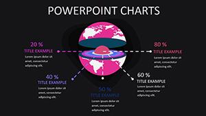
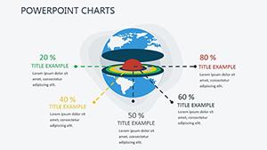
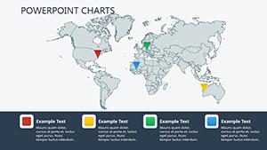
Market researchers deploy choropleth maps for consumer trends, shading by demographics. NGOs illustrate aid distribution with proportional symbols on world bases. Executives review expansions via bubble charts sizing by revenue.
Unlike generic charts, these integrate topography for layered analysis - elevation tints for resource talks. Superior storytelling emerges.
Practices: Normalize scales for fair comparisons. Use legends consistently. Opt for divergent colors like blue-red for positives-negatives.
Combine with GIS plugins for real-time feeds. Animate transitions between views - Europe zoom to Asia pan. Accessibility: Label continents audibly for narrated decks.
Innovate: Overlay AR previews for hybrid events. Voice search: Queries like "show EU growth charts" trigger slides.
Sequence logically: Overview globe, then regional deep dives.
Basic PowerPoint charts ignore geography; ours contextualize, with UVPs like pre-built projections (Mercator to Robinson) and API hooks for fresh data.
Adaptable for widescreen or square exports. Secure a world chart template today to globalize your data.
How accurate are the maps?Sourced from reliable projections, customizable for needs.
Support for custom datasets?Yes, CSV uploads populate charts dynamically.
Works with Excel?Seamless linking for automated refreshes.
Export to PDF?High-res with interactive links preserved.
Beginner-friendly?Tutorials cover basics to advanced.
Copyright © 2009-2026 ImagineLayout All rights reserved.