Waterfall charts are essential when you need to explain how numbers change step by step. This PowerPoint waterfall chart collection is built for clear financial storytelling and professional reporting.
Each template helps your audience instantly see increases decreases and final totals making complex financial data easier to understand.
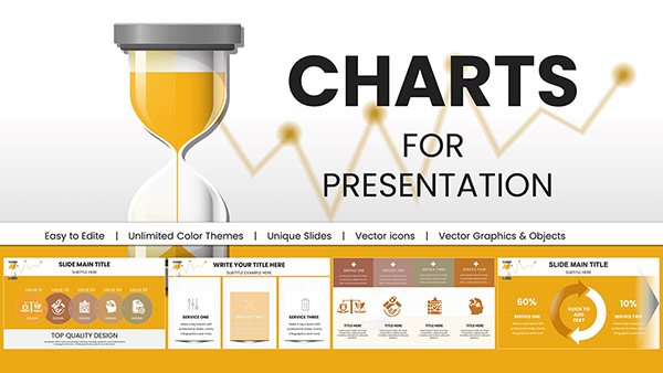
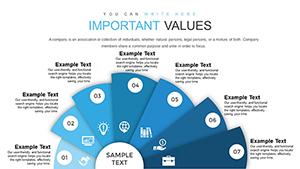
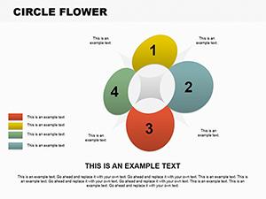
Eye-Catching Circle Flower PowerPoint Charts Template
ID: #PC00097
$10.00
When to Use Waterfall Charts
Waterfall charts are especially useful when explaining how an initial value is affected by a series of positive and negative changes. They are widely used in finance analytics and executive reporting where transparency is critical.
Common Use Cases
Profit and loss analysis
Budget planning and variance reports
Revenue growth explanations
Marketing performance breakdowns
Why These Templates Outperform Default Charts
Standard PowerPoint waterfall charts often require manual fixes and lack visual polish. These templates are pre structured with clear color coding connectors and labels so your data tells a story without extra formatting work.
Clear positive and negative value distinction
Consistent spacing and alignment
Easy data replacement for quick updates
Design Tips for Stronger Slides
Limit the number of steps to keep charts readable. Use contrasting colors only where change matters. Add short captions to guide interpretation especially for executive audiences.
Choose these waterfall PowerPoint templates to present financial data with confidence and clarity.
Frequently Asked Questions
Can I edit the data directly in PowerPoint
Yes all values can be changed using standard PowerPoint chart tools.
Are these charts suitable for financial reports
They are designed specifically for finance business and analytical presentations.
Do the templates work with different PowerPoint versions
Yes they are compatible with modern desktop and online versions of PowerPoint.