Waterfall charts are unmatched when you need to show how starting values transform through a series of increases and decreases to reach an end result. Our Keynote collection makes building these insightful visuals simple and beautiful.
Expertly crafted for precision and style, each template features color-coded bars, automatic subtotals, floating connectors, and optional animations that guide viewers through the flow.
Perfect for finance teams, project managers, and executives who want to tell clear stories about performance drivers.

Unlike standard bar charts, waterfall designs visually bridge initial and final values through intermediate steps. This makes them ideal for explaining variances, profit contributions, cash flow movements, or project budget changes.
A well-executed waterfall chart turns potentially confusing numbers into an intuitive narrative that stakeholders immediately grasp.
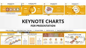
Over 70 carefully designed templates offer variety in layout, color themes, and complexity levels.
All fully compatible with current Keynote versions.
Break down profit from revenue to net income, showing cost impacts and margin contributions in earnings presentations.
Illustrate planned versus actual spending with clear variance explanations for management reviews.
Track cost accumulations, change orders, and final project totals in status updates.
Show starting pipeline value through wins, losses, and adjustments to closing figures.
These templates help professionals communicate complex financial stories with transparency.
Built-in Keynote waterfall charts are limited in design and automation. Our templates include pre-built formulas, professional color coding (green for positive, red for negative), elegant connectors, and polished typography that elevate your credibility.
Find your ideal waterfall chart today and transform how you present financial changes.
Best practices include:
Creative variation: Use gradient fills or patterned bars to differentiate categories while maintaining readability.
For longer sequences, consider breaking into multiple linked charts with summary connectors.
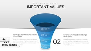
Waterfall charts show cumulative effects with floating bars and connectors between starting and ending totals.
Many include linked data tables that update totals and subtotals automatically.
Yes, every template is fully editable including colors, fonts, and layout.
Yes, several templates offer horizontal layouts for different presentation needs.
Yes, the collection features both free and premium waterfall designs.
Copyright © 2009-2026 ImagineLayout All rights reserved.