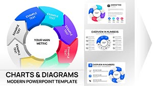
Presenting large datasets with clarity and style has never been easier. Our curated collection of volume chart templates for Keynote helps you transform raw numbers into compelling visual stories that your audience will instantly understand.
Professionally designed with modern aesthetics, these templates feature intuitive layouts, harmonious color schemes, and smooth animations that reveal data progressively. Fully editable, they let you adapt every element to your brand and message in minutes.
Whether you're preparing a business review, marketing update, or educational lecture, these ready-to-use templates save hours of work while delivering polished, presentation-ready slides.

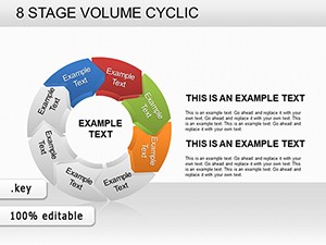
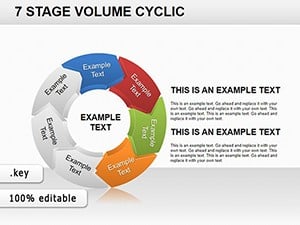
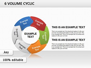
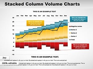
Volume charts excel at showing magnitude and comparisons across categories or time periods. Bar and column formats make it easy to highlight growth patterns, market shares, or performance metrics at a glance. Well-crafted volume charts guide the viewer's eye to key insights without overwhelming them with numbers.
In professional settings, they turn complex spreadsheets into clear, memorable visuals that support better decision-making.
With more than 80 unique designs, you'll find everything from minimalist flat bars to sophisticated 3D columns, stacked series, and clustered comparisons.
All templates are optimized for Keynote performance and seamless editing.
Illustrate monthly or quarterly sales volumes by product, region, or channel. Highlight top performers and identify trends instantly.
Display website traffic, social media reach, conversion volumes, or campaign results with clear visual comparisons.
Present survey responses, population data, experimental outputs, or historical volumes in lectures and academic reports.
Track production volumes, inventory levels, or supply chain metrics to support operational reviews.
These versatile templates adapt to any industry while maintaining professional polish.
Default charts lack visual sophistication and customization depth. Our templates deliver pre-designed excellence with trend-forward colors, custom icons, balanced typography, and animation sequences that engage audiences longer.
Browse the collection now and download the perfect volume chart for your next Keynote presentation.
Follow these tips to maximize effectiveness:
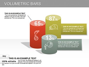
Creative suggestion: Incorporate relevant icons atop bars for a pictorial volume effect that adds visual interest without clutter.
Consider horizontal layouts when category names are long to improve readability on slides.
Bar, column, stacked, clustered, 3D, and horizontal variations in multiple styles.
Yes, many feature smooth build-in and transition effects optimized for Keynote.
Edit colors, fonts, data, and shapes directly in Keynote's inspector panels.
Yes, several high-quality free volume chart templates are part of the collection.
All templates are licensed for both personal and commercial presentations.
Copyright © 2009-2026 ImagineLayout All rights reserved.