Make your data stand out with our collection of professional PowerPoint chart templates. These visually appealing designs turn numbers into compelling stories perfect for business reports marketing decks and educational presentations.
Each template is fully editable allowing you to adjust colors fonts and layouts to match your brand or presentation style. From sleek minimalistic charts to vibrant 3D visuals these templates make your slides memorable and impactful.
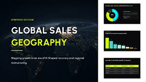
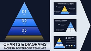
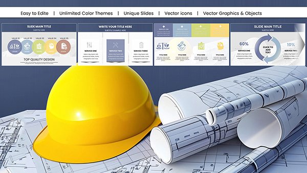
Architectural PowerPoint Charts Template: Elevate Your Design Presentations
ID: #PC01066
$24.00
(694)
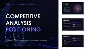
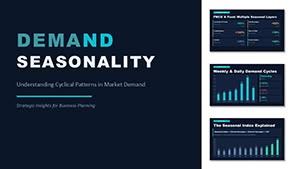
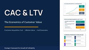
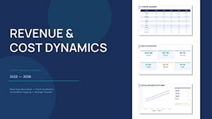
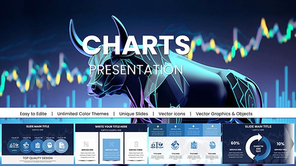
Market Trend PowerPoint Charts: Navigate Business Landscapes
ID: #PC01063
$25.00
Why Choose Our PowerPoint Chart Templates
Our chart templates are designed for professionals who want to communicate data clearly and effectively. Unlike default PowerPoint charts these templates offer modern designs fully customizable elements and creative layouts that enhance audience engagement.
Real-World Use Cases
Business Reports and Financial Analysis
Marketing and Sales Presentations
Educational Lessons and Research Data
Project Planning and Strategy Decks
Benefits Over Default Charts
Visually engaging with modern color schemes
Fully editable elements for brand alignment
Professional layouts that save time
Enhanced audience retention and comprehension
Creative Tips and Best Practices
Use consistent color palettes and fonts
Combine multiple chart types for storytelling
Integrate charts with images or icons
Apply subtle animations to highlight key data
Explore our collection and download the templates that best fit your presentation needs.
Frequently Asked Questions
How do I make charts more visually appealing?
Focus on color contrast whitespace and simplified labels to enhance readability.
Can I customize the colors and fonts?
Yes all templates are fully editable to match your brand style.
Are these templates suitable for education?
Absolutely they are perfect for lessons research presentations and academic reports.
Can I use these templates for client presentations?
Yes they are professional and suitable for all business environments.
Do these charts include animations?
Many templates include subtle animations to highlight key data points without distraction.