Great presentations capture attention through strong visuals. Our library of more than 150 visual diagram templates for PowerPoint helps you turn ideas into memorable images.
Bold colors dynamic layouts and smooth animations make these designs perfect for creative storytelling data highlights and concept explanation.
Whether you need mind maps cycle diagrams or abstract concepts visualized these templates offer endless inspiration.
Break free from boring bullet points and create slides that people actually remember.
Scientific Review PowerPoint Diagrams: Illuminate Insights with Elegant Precision
ID: #PD00157
$25.00
(910)
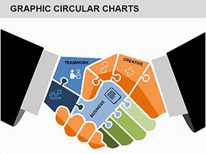
Partnership PowerPoint Diagrams: Visualize Synergies with Puzzles
ID: #PD00151
$20.00
(981)
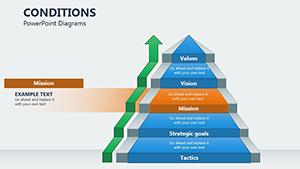
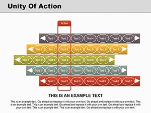
Unlock Sequence Mastery with Unity of Action PowerPoint Diagrams
ID: #PD00147
$20.00
(668)
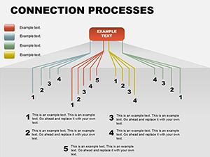
Connection Processes PowerPoint Diagrams
ID: #PD00064
$15.00
(691)
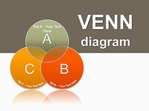
Probability Venn PowerPoint Diagrams: Master Set Visuals with Ease
ID: #PD00042
$28.00
(709)
Medicine Test Tube PowerPoint Diagrams: Visualize Data Dependencies
ID: #PD00040
$20.00
(754)
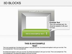
3D Blocks PowerPoint Diagrams: Downlaod PPTX
ID: #PD00014
$20.00
Why Visual Diagrams Matter
Audiences process visuals 60,000 times faster than text. Creative diagrams help you convey messages quickly build emotional connection and improve retention.
Our templates combine artistic flair with practical structure so your slides look professionally designed without requiring design skills.
Popular Use Cases for Visual Diagrams
Creative Brainstorming & Ideation
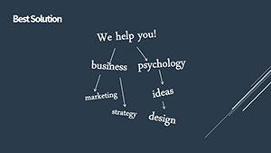
Mind maps for idea generation
Concept clustering diagrams
Creative process flows
Marketing & Branding Presentations
Brand ecosystem visuals
Customer journey infographics
Emotional benefit diagrams
Education & Workshop Materials
Concept relationship maps
Comparison infographics
Abstract theory illustrations
Benefits of Our Visual Diagram Collection
Vibrant contemporary color palettes
Unique hand-crafted icon sets
Multiple layout variations for every concept
Easy-to-adjust elements for quick personalization
Creative Tips for Maximum Impact
Use negative space intentionally
Combine photography with diagram overlays
Apply subtle gradients for depth
Experiment with asymmetrical layouts
Match visual style to your message tone
Unleash your creativity - browse our visual diagram collection and download your favorites now.
Frequently Asked Questions
What styles of visual diagrams are included?
We offer mind maps cycle processes Venn diagrams pyramids funnels abstract flows and artistic infographics.
Are the designs suitable for formal presentations?
Yes - we include both creative bold styles and cleaner versions suitable for corporate settings.
How many free visual templates are there?
Dozens of high-quality visual diagrams are completely free with premium packs adding exclusive designs.
Can I change colors and icons easily?
Yes - all elements are individually editable with organized layers for quick changes.
Do they include animated versions?
Many templates feature built-in entrance and path animations for dynamic reveals.