Master the nuances of comparison with our Venn diagram collection for PowerPoint. These templates illuminate shared traits and distinctions, turning dense data into digestible visuals that drive decisions.
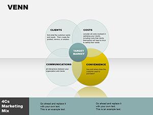
Geared toward analysts, educators, and planners, they handle everything from SWOT intersections to audience segmentations with poise. Visualize policy overlaps in government decks or skill matrices in training modules, all with PowerPoint`s familiar interface.
SmartArt-enhanced for easy morphing and color syncing, these diagrams support hyperlinks for expanded views. Tailor shadows, strokes, and fills to fit any theme, making your arguments airtight and aesthetically appealing.
Connect the dots - discover our Venn PowerPoint diagrams today.
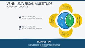
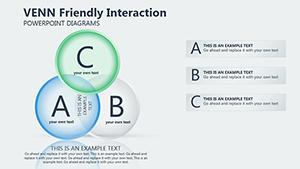
Venn diagrams distill relationships into elegant overlaps, ideal for debates, analyses, and syntheses that reveal hidden synergies. Our PowerPoint templates utilize gradient meshes and connector snaps for fluid, professional constructions that export flawlessly.
Project leads Venn risk factors against mitigations for contingency planning. Journalists overlap news sources for bias mapping. Designers compare UI paradigms, intersections birthing hybrid solutions.
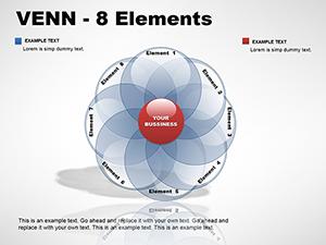
Standard SmartArt feels generic; ours layers textures and variants like elliptical Venns for modern twists.
Finance Venns investment vehicles, overlaps signaling diversified portfolios. Environmentalists diagram habitat conservations versus developments. Sales teams compare lead sources, unique channels spotlighted.
Therapists overlap coping strategies for personalized plans. Tech reviewers Venn gadget specs for buyer guides.
Integrate with PowerPoint`s zoom for close-up intersection explorations, deepening engagement.
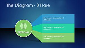
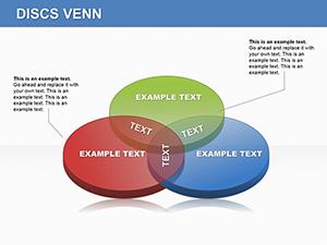
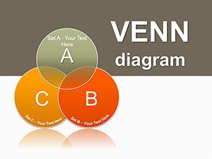
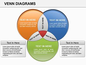
Craft Edwards-style for three-set logics or bubble variants for fluid groupings. Animate fills to "merge" sets, metaphorizing collaborations. In reports, use for A/B test outcomes, overlaps quantifying commonalities.
Innovation lies in the union.
Bridge ideas seamlessly - pick your Venn PowerPoint diagram now.
Use the template`s layered circles, adjusting overlaps via handles.
Yes, hyperlink text or shapes to external sheets.
Patterns and textures included alongside colors.
Apply entrance effects to intersection groups.
High-res exports optimized for print.
Vector-based for scalable integrity.
Your PowerPoint Venns now converge clarity and creativity. Venture into more templates for continued connections.
Copyright © 2009-2026 ImagineLayout All rights reserved.