Bring clarity to comparisons with our PowerPoint Venn diagram templates, expertly designed to illustrate relationships and intersections between sets. These versatile tools are perfect for business strategists, project managers, and classroom facilitators who need to convey overlapping concepts without overwhelming their audience.
From two-circle basics to intricate multi-set designs, our templates feature smooth curves, customizable fills, and shadow effects that add depth. Edit text, adjust sizes, and incorporate icons - all within PowerPoint`s familiar interface - to create slides that resonate.
Whether highlighting product features or historical events, these diagrams make abstract ideas tangible. Download today and watch your presentations gain focus and flow.
Start overlapping success - explore Venn diagram templates for PowerPoint.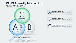
Venn diagram templates for PowerPoint are graphical frameworks using overlapping circles to depict similarities and differences among groups. Rooted in set theory, they excel at simplifying multifaceted topics, like market segment overlaps or biological classifications, into visually digestible formats.
Our collection offers variations such as shaded intersections for emphasis and labeled segments for precision, all optimized for PowerPoint`s vector editing. This means your diagrams remain sharp when scaled, ideal for large-screen projections.
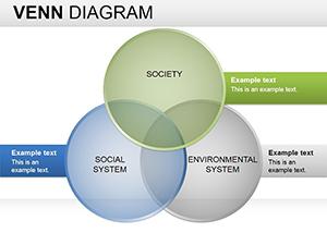
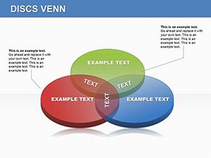
In corporate settings, sales teams use three-circle Venns to compare vendor options, spotlighting shared benefits to justify choices. Educators employ them in literature classes to map character motivations, fostering deeper discussions.
Creative agencies adapt these for mood boards, blending visual elements to inspire design directions.
PowerPoint`s built-in SmartArt Venns often lack finesse, with rigid shapes that resist reshaping. Our templates introduce flexible connectors and gradient fills, enabling nuanced storytelling without extra plugins.
They also bake in alignment tools, ensuring circles nest perfectly even after edits, saving hours compared to manual drawing.
| Aspect | Default SmartArt | Our Templates |
|---|---|---|
| Shape Flexibility | Fixed proportions | Freely resizable |
| Visual Polish | Basic outlines | Gradients, shadows |
| Edit Speed | Slow regrouping | Instant tweaks |
This polish elevates professionalism, making your slides stand out in competitive environments.
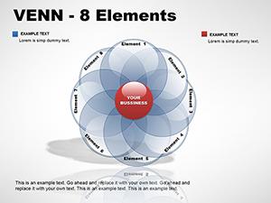
Limit circles to three or four to prevent visual chaos; use contrasting colors for distinctions. Add legends sparingly and focus on key intersections with bold text.
For data-heavy uses, pair with adjacent tables for supporting figures.
A tech startup showcased feature overlaps in a pitch deck using our four-set template, securing funding by clarifying unique value. In nonprofits, Venns mapped donor interests, optimizing outreach for higher engagement.
Science fairs benefit too - a student`s ecology project used animated Venns to link habitat factors, earning top marks for clarity.
Ready to connect the dots? Download your Venn diagram PowerPoint template and innovate.
Explore more tips in our design resources.
Copyright © 2009-2026 ImagineLayout All rights reserved.