Charts are the backbone of informative PowerPoint decks, turning raw data into actionable insights. Our PowerPoint chart templates streamline this process, offering polished alternatives to monotonous defaults. Geared toward analysts, managers, and presenters, they ensure your visuals resonate.
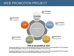
Encompassing histograms, flow diagrams, and radar plots, these templates integrate flawlessly with Microsoft PowerPoint. Edit data sources directly, apply themes, and export for any format.
Business pros, researchers, and consultants benefit from the precision and style. Scan our collection for the chart that amplifies your narrative, and elevate your slides without delay.
Default charts often lack flair, but our templates infuse energy with gradients, icons, and smart layouts. A marketing report with animated column charts can spotlight trends vividly, holding attention longer.
Integration with Excel means live updates, ideal for iterative reviews.
Enhanced with morph transitions for fluid data reveals.
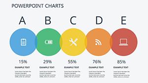
Finance teams plot equity curves with candlestick templates. Educators use Venn diagrams for concept overlaps. E-commerce dashboards track KPIs via gauge charts.
Startups pitch valuations with waterfall models, clarifying financials.
Guidelines: Anchor data stories with titles, avoid clutter with whitespace.
Link to external datasets for dynamism. Customize via VBA for interactivity. Test on varied resolutions.
Packs include seasonal variants for timely reports.
Chart your path to clarity - secure a PowerPoint chart template now. Empower decisions with visuals that stick.
Users value the robustness, adapting for global teams. Future-proof your toolkit.
Embed Power BI for advanced analytics. Color-blind modes ensure inclusivity. Analyze viewer feedback to iterate.
Copyright © 2009-2026 ImagineLayout All rights reserved.